Circles, triangles, points, straight lines.... Geometry is present in nature and in everything we see around us. It connects us to the most obvious and natural side of perceiving the world. Using geometric shapes in the bathroom to emphasize certain elements is the best way to ensure balance and harmony. How can we achieve this effect?
Monochromaticity
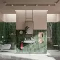
White tiles - a choice you can always bet on. White introduces orderliness, harmony and cleanliness into the interior - the greater the shinier the surface of the tiles.
Such walls or floors in one color do not have to be boring! This time it's not the color, but the structure that can be the eye-catching element. Thanks to the structures on single-color tiles, we can shape the interior in an interesting way. One of the most fashionable forms are brick rectangles. The timeless shape of bricks allows us to arrange interiors in different styles: classic, industrial, contemporary, glamour or retro. Let's keep this in mind when planning a bathroom renovation!
Contrasting colors add character to our bathroom
© Ferro
Contrasts
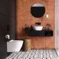
Black and white is the strongest and at the same time the most effective contrast that has always been present in fine art. Monochromatic combinations, based on the use of white, black and gray, are one of the proven methods for an elegant bathroom. Geometric forms find their way there perfectly, introducing unusual and mesmerizing impressions.
When designing a bathroom with such expressive "special effects", it is worth balancing the proportions so that the effect is not overwhelming for users. If, for example, the floor is very strong in expression, for balance on the walls we can put single-color tiles - smooth or structured (but "calmer" than the floor). We can also always add contrasting black accessories to complement the interior.
Irregular geometric motifs in muted colors
Geometry does not always have to take the typical, familiar forms of lines, circles, triangles, rectangles or rhombuses. Irregular shapes, combining elements of different figures, can also be the basis for interesting arrangements.
Geometric fixtures in black will give the bathroom a distinguished look.
© Ferro
Geometric mixers
Less is more - this motto is often used by interior designers. This is why geometric forms work so well. Usually, even when they are small elements, they are subtle enough to look delicate and light together. This is because it is hard to over-saturate the interior with them. Another way to incorporate them into the bathroom design are faucets. Square, angular, round.... There are many different shapes of faucets. A geometric universe driven by the power of metal.
Unusual furnishings
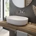
Designers introduce geometry not only on walls and floors. Through the elements we choose, we can communicate a lot in our bathroom. If we forget the conventional shape, we can find a wide range of options. We can, instead of the usual shower handset, introduce some luxury by using rainfall showerheads. For several years there has also been a trend for unconventional washbasins: round, rectangular or square washbasins have become the best option for any bathroom.


