An ideal modern workplace is not only an office space, but also an environment in which functionality, aesthetics and greenery, so important these days, coexist in harmony. The design of Dargo's new headquarters from under the dash of the BIURO KREACJA studio reflects its commitment to nurturing green spaces not only in the daily work, but also at the heart of it.
green
Photo: Alka Murat
Dargo's new headquarters posed an extremely unique challenge for both the architects and the investor involved. Dargo, a company specializing in the distribution of products that support the care of green spaces, decided on the ambitious undertaking of moving to a new location. Not surprisingly, they entrusted the realization of their new headquarters to the Biuro Kreacja studio, which was responsible for the design of the company's previous office space.
The wayfinding design is an integral part of the interior
Photo: Alka Murat
The project was a challenge for us, as we were involved from the very beginning until the very end of the project. The narrow and long shape of the building meant that every design decision we made had to be carefully planned. Our goal was to create a place where the architecture would not only meet business needs, but also convey Dargo's history and mission in the language of form and space," says Dorota Terlecka, of BIURO KREACJA studio, about the project.
The light-colored ash can be seen both on the furniture fronts and in the form of wall cladding
photo: Alka Murat
The main stylistic guidelines for the office were minimalism and timeless solutions. Both we and the investor wanted durable solutions and modernity. Interior design trends have it that after a few years the projects already seem outdated and obsolete. Together with the investor, we opted for minimalism and simplicity, which will always be in fashion," adds Paula Banasik of BIURO KREACJA studio.
office interiors
photo: Alka Murat
The offices and common spaces were carefully designed with a large number of windows and high glass doors, allowing light to penetrate freely and adding lightness to the entire space. The glazing, in addition to its aesthetic function, illuminates the long corridors, giving them a pleasant character. The color scheme of the project is centered around a range of grays and beige, where the colors flow seamlessly from the walls to the ceiling, creating elegant geometric compositions. Black details in furniture, lighting and graphics create an original contrast and add depth.
The wayfinding design was created by Anna Gawron
Photo: Alka Murat
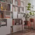
The project takes into account not only visual aspects, but also functional aspects, which is evident in the particular approach to signage. The wayfinding design, created by Anna Gawron, is an integral part of the interior. A pleasant feeling of warmth to the industrial aesthetic is introduced by wood. Ash in a light coloration is visible both on the furniture fronts and in the form of wall coverings. Natural plants, placed in each office and conference room, are also an integral part of the space. This is not only a decorative addition, but also an organic element that gives the interiors the freshness of nature and emphasizes the company's commitment to supporting the building of green spaces.
One of the key architectural elements of the building is the glass staircase
photo: Alka Murat
One of the key architectural elements of the building is the impressive glass staircase, which provides an attractive vantage point for both interior users and outside passersby. Lighting elements and acoustic panels have been integrated into the geometric form of the building, penetrating through the ceiling as well as the walls. This striking treatment not only gives the space a unique character, but also plays a key role in improving acoustics and lighting, creating a harmonious whole.
conference room
photo: Alka Murat
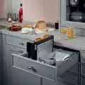
The last floor of the building, almost entirely serves a conference function. Keeping in mind the needs of the company, which regularly organizes training sessions for clients, this space was exceptionally carefully designed. Separated by a glass wall, the dining room can be adapted to flexible needs. The ability to fold down the wall also allows the conference space to be enlarged. In addition, the conference room is equipped with a kitchenette, which has been cleverly hidden behind sliding fronts, taking care of aesthetics and maintaining order in daily use.
The kitchenette is hidden behind sliding fronts
Photo: Alka Murat


