Office architecture
basic elements of office architecture
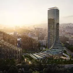
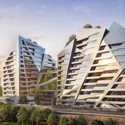
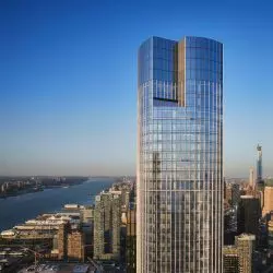
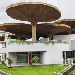
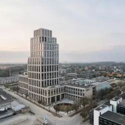
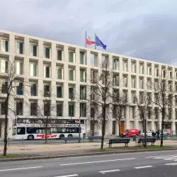
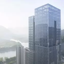
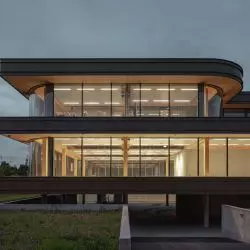
Office spaces and their design can be divided into two main aspects. The first - "packaging", i.e. the body of the building itself, its surroundings and related aspects of locational attractiveness. The second - the "content", i.e. the internal spatial layout - office space, communications and all the supporting infrastructure, i.e. - office interior architecture.
assumptions of good office space
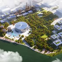
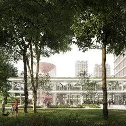
The question of how to create good office spaces nowadays should be answered simply - pro publico bono. Nowadays, it's no longer just about creating isolated/functionally specialized facilities in the fabric of the city. Sustainable development of polis should take place in a multifaceted way. Office architecture should be a manifestation of this, as it develops most rapidly driven by private investment. It should be multifunctional to avoid urban monoculturalism of development quarters. It should be a social urban catalyst for services and offices by integrating surrounding residential developments. The idea is to create facilities that, in addition to their dedicated and airtight office function, will open up in the ground floor to the idea of publicly accessible service spaces, representative common spaces, recreational zones and perhaps a parking system, which is so lacking in large cities. Features that, in addition to just working for the direct users of the office building, will also allow them and the surrounding residents to spend their free time there.
On the other hand, going back to the "packaging" and "content" of office architecture we can, nay, even must, however, put a thick boundary line between the two sides of this architecture. While the former is supposed to be the investor's showcase and his "logo" in the fabric of the city and be open to the outside literally and figuratively, the latter is supposed to serve a purely practical function, but by insulating it from what's outside - creating an enclave, an office space attractive to employees and conducive to their creativity.
>Where to start when designing the body of an office building?
When creating the body of a building, we are, as a rule, limited by a number of zoning restrictions, decisions of conservationists, city architects, the existing urban fabric, etc. As a rule, this locational polemic between the idea of the architect, the creator and the necessity of the place, is subjected to additional bending by the investor, who, for known reasons, wants his building to be a "pearl". Will we end up with pearl-throwing or an actually ambitious project resulting from a fruitful dialogue between the parties? That will already be the result of the architect's hard and often stressful work. Generally speaking, it should be remembered that rarely will even the grandest, most original project succeed if the cost of implementation is abstractly high. Office architecture is supposed to be mainly utilitarian. Yes, it is supposed to be a showcase for the investor, but.... in a limited budget. Unless we happen to be designing office buildings for mega-corporations, we should expect that the investment cost will be eagerly defined and sliced wherever possible.
So we have a paradigm - office architecture should be designed economically. This, of course, is not about using the cheapest design solutions and materials, but about moderation. The object being created is indirectly to be a tool of the investor. A tool for making a profit. It is an investment, and like any investment, it requires financial outlays that are assumed to pay off for the investor with a return. Therefore, the facility must have a certain amortization period for the cost of its creation relative to the investor's potential profits from this investment. There is no rule clearly stating that the richer investor will "give more." This will result mainly from the internal policy of this company and will be as a rule clearly defined at the pre-design stage. If not - it is worth exploring the ground. Out of pure laziness and pragmatism, in order not to add unnecessary design work, clearly define in advance the assumptions and what we can afford at the stage of creative work.
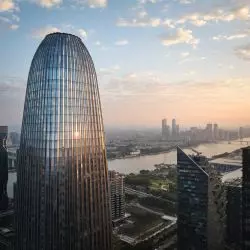
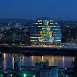
With these mundane aspects taken care of, one can move on to the author's solutions for the architecture of the building itself, trying to find the golden mean between the usually conflicting assumptions of the investor and the local plan. Of course, everyone cares about the attractiveness of urban space and even iconic buildings inscribed in it. Sometimes the result of this clash is office buildings that will be timeless.
how to design interiors in office architecture?
To answer the question of how to create good and attractive office spaces, one would have to look at the development of this architecture over the last century. Over such a long interval of time, one can see a revolutionary change in office spaces, but the changes in the approach to office space design themselves occurred through evolutionary, though significant steps each time. The change has occurred mainly in the approach of the employer himself to the subject of work - the employee. The human being, from the point of view of the labor machine, is the material that the architect, with the help of the investor's vision and the material of his architectural vision, transforms into a creation - the office space. From this perspective, the human being is only a piece of the puzzle and, unfortunately, for many decades, was not the most important part of it. As a rule, the problem was the space itself, or actually...the lack of it. We had small or chaotic spaces of crowded rooms, or claustrophobic cubicles of workers' halls. Only a change in the approach to man himself and interdisciplinary research on him in the context of work and the psychology of work made us realize that man is not a machine. The drive for continuous, exponential increases in productivity cannot be realized by shuffling the worker. In the method of stick and carrot - the stick no longer works.
More freedom had to be given to the worker. Hence the idea of open space (open space). An example of the search for the form and function of such an idea can be seen in the completed project Next Hydroponic Plant. It turned out that a person who feels good in his work is much more productive and creative, which has a measurable effect on a company that was able to create the right working conditions for employees. Hence, in subsequent years, further loosening of the idea of work itself has brought to life something like the construct of remote work. If we stopped here, we would conclude that in this case, office architecture is no longer needed by anyone, because the idea of distributed work has devalued the value of the office and office building. However, recent research in this area leaves no doubt that this is not the case. Remote work is, yes, a certain alternative or substitute from the point of view of the employment model, but for the employee himself and the employer it is not necessarily the best option. Why for the employer - it is known, mainly control over the work. But why for the employee?
Well, it has been found that the remote work model is quite a mental burden for many people after several years of work. There is even depression caused by the lack of clearly separated sections of the day devoted to work and other activities of life. Then there is the social aspect of real or imaginary exclusion; the aspect of "not having a home" when our home turns into a place of work; the aspect of not having free time - when there are no clearly defined working hours and the employee becomes a prisoner of working time without a defined daily rhythm, etc.
the latest trends and the future of office architecture
The remote work model has not proven to be a panacea and the ultimate solution. I wouldn't call it perhaps a dead end, because it is the only solution in many cases, but it is rather a spur in the mainstream approach to work, the employee and the workspace itself. On the other hand, what next? How do we then design office spaces and do we do it at all? It is worth looking here at the experience of mega-corporations, which have had the problem of managing people, so to speak, written into the status of their functioning for decades, and by trial and error, are looking for the ideal solution to this problem.
The answer is short, which is not to say simple in interpretation - office space is supposed to resemble home.
This is not a recipe, but rather a guideline on how to create good office architecture. For each of us, home will mean something different, while it is possible to find a common denominator for all of us, or at least for a particular professional group that will use a particular office space. And that's how we come to the conclusion that such home space should be, so to speak, a fusion of open space and home remote work. Give space, but not necessarily with clearly assigned workstations - it can be spatial arrangements of "rooms" - living room, kitchen, bedroom, workout room. All this to create for us the illusion of home, a second home, in which we work, but without the unpleasant consequences of working remotely - we can leave it.
Of course, not every type of office space can be arranged in such an ambitious way. Some of the office architecture of offices, banks and institutions, so those appearing at the interface between clerk and petitioner, will be organized quite differently from the office architecture we discussed a moment ago. In these cases, where these spheres of influence of both sides of the office contact intersect, it is necessary to be more conservative and conservative in design.
