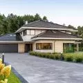
The House Behind the Wall, the latest project by Magda Morelewska and Przemek Kaczkowski of Warsaw-based studio STOPROCENT Architects, is a minimalist single-family house, whose simple mass on the street side is inscribed into the fence line, thus creating a clear division between the private and public parts of the plot.
The shape of the plot on which the building was designed is the result of ownership divisions and the grid layout of internal access roads. Due to the proximity of the road leading to neighboring buildings with the northern boundary of the land where the new house is to be built, the architects decided to keep the neighbor's fence line and merge the body of the building with it. In this way, according to the authors of the project, the exterior wall became an integral part of the building, providing a physical boundary between the public and private parts of the plot.
The 


The exterior wall has become an integral part of the single-family house
© STOPROCENT Architects
On the north-public side, the windowless smooth white facade seems to float above the glazed part of the first floor, into which the entrance area is inscribed. Aligning the lower floor with the fence line gives the effect of an elongated, horizontal mass, protecting the privacy of the house's inhabitants. On the garden side, meanwhile, the lower, wider part of the building is almost entirely glazed and open to the wooden terrace surrounding the house from the south.
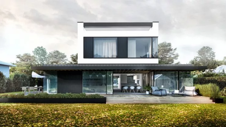


South elevation, view from the garden side
© STOPROCENT Architects
On the first floor, the living part of the residential function has traditionally been located. In this case, it was extended to include a studio, because the clients are designers and often work from home. On the first floor, three bedrooms and a bathroom were placed, constituting the night part. The garage was hidden behind the fence line, and its front elevation was finished identically to the fence, so that they form a coherent whole. The garage and the building's living room have been placed slightly lower to maintain a clear horizontal division of the building, without compromising its functionality. On the roof, the installation of a solar power system hidden behind the raised attic of the building is planned," write architects from STOPROCENT studio.
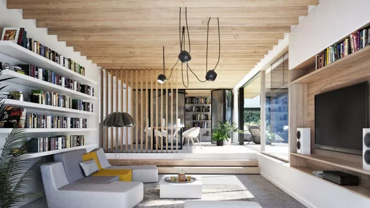


living room
© STOPROCENT Architects
In addition to the color contrast between the white upper body and the black part of the first floor, the designers also decided to vary the structural layer - the main body is designed in reinforced concrete construction, while the outgoing elements and part of the living room will be made in wooden construction. The first floor will be finished with vertical aluminum facade panels combined with large glazing and exposed wooden structure of the terrace canopy, while the first floor will be finished with white plastered cement board panels.
