{tag:studenci} has taken on the difficult subject of designing a museum space related to the history of the death camps - her thesis is an attempt to commemorate such places. The Cracow University of Technology graduate's project is a response to the architectural competition for the concept of a museum and educational facility on the grounds of the Treblinka Museum, which was settled at the end of 2021.
Kinga Ruszaj's diploma project titled Concept of an exhibition and educational facility on the grounds of the Treblinka Museum was created at the Department of Architecture, Workplaces, Sports and Services of the Cracow University of Technology, under the direction of Dr. Bartosz Dendura.
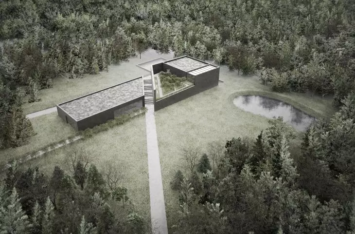
View of the building from the side of the former death camp
© Kinga Ruszaj
A very important landmark at the Treblinka museum is the memorial site designed by sculptor Franciszek Duszeńka and architect Adam Haupt. It is considered an outstanding work of monumental architecture, full of metaphors and references to Jewish tradition and culture. It is one of the most moving commemorations of the Holocaust not only in Poland, but also in the world. Therefore, when designing, it was important for me to connect the new museum building with the site of the death camp, and in this way I generated a key compositional axis, largely shaping the final form of the building," explains the author.
The project is divided into two compositional axes
© Kinga Ruszaj
two compositional axes
The design plot designated for the new building is located on the grounds of the Treblinka Museum, but is far removed from the former camp grounds. According to the author, the only landscape context is the dense forest surrounding the site. The student began her design work by determining a base rectangle derived from the proportions of the plot. She superimposed two compositional axes on this rectangle. One is the axis on the line between the museum building and the former camp grounds, and the other connects the site to the existing parking lot. In this way the rectangle was divided into two trapezoids, which, the author gave different heights. The roofs of both blocks have slight slopes, which relate to the sloping terrain of the plot. In the larger block, a green viewing terrace is located in the cutout.
The author wanted to create a simple and austere object
© Kinga Ruszaj
An important part of the premise was to create a simple and austere object, with its form not competing with the content it is intended to convey. For this reason, the architect finished the facades with boards imitating shuttering boards, and the only cuts in the monolithic body are large-format glazing. The contrast to the dark and heavy exterior are the bright, glazed and open interiors.
Two pedestrian routes lead to the new building
© Kinga Ruszaj
forest motif
Two pedestrian routes lead to the new museum building. The first, from the side of the existing parking lot, is flanked by a line of olive trees - in this way, the author alludes to the motif of the forest road followed by the camp prisoners. The second access is a path on the line of the compositional axis of the museum building - the Holocaust Victims' Monument, continued in the form of an open-air staircase leading to the viewing routes located on the second floor. At the intersection of these two directions, the student placed the main entrance to the building.
foyer and educational area
© Kinga Ruszaj
The motif of the forest has its continuation inside the building in the form of two-level green ravines permeating the individual floors. One of them is located just opposite the entrance door, being an extension of the forest path. The green alley is terminated by a monolithic concrete wall, and the visitor's gaze is directed to the light that enters the building through a large skylight in the roof. The second alcove opens the view from the first floor to the -1 level, thus making all public spaces in the building intermingle and encouraging users to go deeper into the building, Kinga Ruszaj adds.
The exhibition hall is divided into three sections
© Kinga Ruszaj
exhibition and ecumenical prayer zone
On the first floor, in addition to the service and administration area, the author placed the exhibition zone, which visitors reach through a passage located under the open-air staircase. The exhibition hall is divided into three parts: the permanent exhibition, the changing exhibition and the Samuel Wallenberg halls. On the second floor, which is also accessed by an open-air staircase, there is an ecumenical prayer area and an adjacent green terrace.
On the first floor there is a prayer room and a green terrace
© Kinga Ruszaj
This location of the prayer room is intended to ensure its autonomy, to allow users to disconnect from the temporality, noise, commotion prevailing on the lower floors and enable contemplation. Also, the terrace next to it is to provide a kind of calming buffer zone," says the author.
Kinga designed the terrace along the lines of an olive garden, and on its floor she placed divisions referring to those found on mass graves, to which the view from the second floor of the building is framed. On the other hand, on level -1 there is a technical and educational zone, consisting of public spaces and educational rooms. Thanks to the large amount of glazing, the individual rooms create, one common, bright space.
The outdoor staircase is a continuation of the path and leads to the green terrace
© Kinga Ruszaj
Read also about the project by the Bujnowski Architekci studio, which received first prize in the competition for the construction of an exhibition and educational facility on the grounds of the Treblinka Museum, and the proposal by the Lahdelma & Mahlamäki and KXM office, awarded second place.
