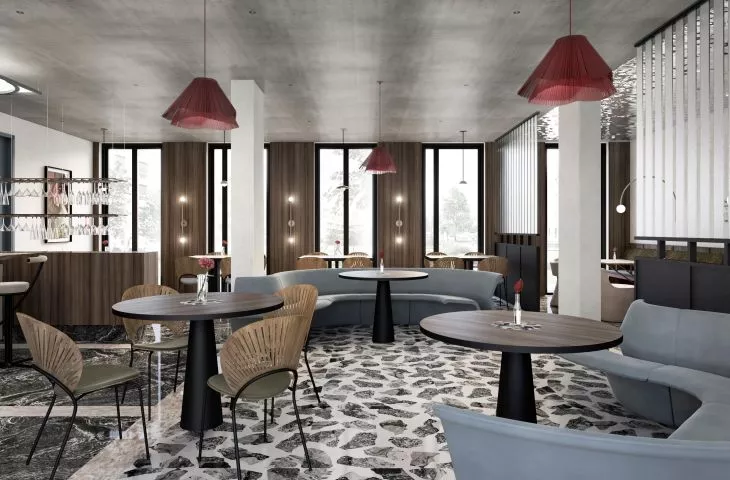
An interior full of intriguing shapes, lights and colors is the design of Krakow's Connections restaurant by Diana Zurek and Gutek Girk of the IN studio. When creating the eclectic interior, the architects wanted to reflect the character of molecular gastronomy, combining flavors from every corner of the world.
The interior of the Connections restaurant
© IN
The Connections restaurant will occupy an area of 150 square meters, and its open layout allowed the architects to open up the space and delicately zone it. Referring to Eastern culture, the interior uses colors symbolizing earth, fire and air, creating a mix of shapes and textures. The background is made up of raw walls devoid of plaster, contrasting with the colorful floor. The interior of the restaurant is filled with a bent metal structure with decorative glass. It was used in the partitions, light coffers and wall cladding in this way connecting the entire space. The furniture was jointly designed by the architects and the investor. Comfortable sofas and seats interesting in form were also not forgotten. Wooden claddings decorate the walls and form the lamellas. Their warm hue blends with the corrugated sheet metal placed on the ceiling.
The architects juxtaposed wood with metal elements
© IN
Dobrawa Bies: What were the design inspirations and what requirements did the investor set for you?
Diana Zurek: Together with the investor, we came up with the assumption that it was necessary to create a space that would not have one characteristic style, but rather would be a somewhat eclectic collection of forms, from different corners of the world. However, one that is coherent and does not overwhelm with an accumulation of elements. It was important to refer to the eastern direction, but not in a very literal version.
The walls were left raw, and the space is divided by a metal structure
© IN
Dobrawa: The interior is a contrast of raw elements with rounded shapes of furniture. Why such a design decision?
Diana: This combination was strongly in line with our leading slogan. That is, a mix of seemingly very different, mutually contrasting things, which in juxtaposition show this very dissimilarity, and yet are able to neutralize, complement, conquer each other. The idea was also to build an austere atmosphere, but filled with comfortable spaces for sitting, and the obtuse forms for the human eye and body seem to perform this function perfectly.
In public interiors, more abstract solutions can be allowed
© IN
Dobrawa: How does the design of public interiors differ from private ones? Does it allow more freedom?
Diana: First of all, comfort is perceived differently here. It is not tailored to the style of a particular investor or family, but must be accessible to and acceptable by everyone. Everyone should feel pleasant and safe, but also a little different than in normal conditions. Precisely in order to visit this type of place with curiosity. Does it allow for more freedom? Usually, yes, you can prance around a bit, with solutions that are more abstract, which in everyday life, would probably arouse a lot of controversy, and in public places they are an asset.
Dobrawa: Thank you for the interview!
