The apartment in a two-family house from 1936 in Warsaw's Zoliborz district required considerable changes - the designers from the Loft Kolasinski office, who were entrusted with the interior metamorphosis project, decided not only to renovate all the rooms, but also to partially rebuild allowing to open up the cramped spaces, connect the kitchen and dining room with the living room, and adapt the attic for an additional office.
The interior is kept in warm, subdued colors, but the most is happening in terms of shapes and textures - the space is decorated with a hairy carpet, more or less regular concavities, colorful mosaics on countertops, geometric shapes of furniture and stylish accessories designed by leading designers.
A variety of patterns and textures in the living room
Photo: Joel Hauck
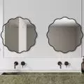
In addition to a gray sofa designed by Patricia Urquiola, a dining table designed by Jean Prouvé, hanging lamps by Verner Panton, a desk in the study designed by Helmut Magg to steel jugs by Henning Koppel and cutlery from Arne Jacobsen, the interior is made up of furniture designed by designers from the Loft Kolasinski studio and made by Wood Maker: bed, mirrors, dressers, desk, kitchen furniture, bathroom furniture, closets, dressing tables. Special steel door frames and steel ventilation grilles were also designed for this project. The whole is complemented by photographs by Erwin Olaf adorning the walls, prints by Bernard Buffet and Ivan Sterzinger, and decorative coffers placed in the living room, which were designed by a pair of artists Jaroslav Otruba and Jiří Rathouský to decorate the Prague metro station in 1972.
Left: view from the living room to the kitchen and dining room; right: a table designed by Jean Prouvé
Photo: Joel Hauck
Ola Kloc: What was the investors' priority?
Jacek Kolasinski: The apartment is located in a very attractive location, unfortunately the interior itself was not very attractive - a lot of small rooms, small doors between them, poor lighting and bad communication - rather poor design :) The basic requirement of the investor was to change this situation.
Ola: This is another of your projects to remodel a historic interior. When discussing the Ochota apartment, you mentioned that your priority in such cases is to interfere as little as possible with the historic structure of the rooms. How was it in this case? Did the layout of the 1936 apartment require changes?
Jacek: We made quite bold changes - eliminating a considerable part of the partition walls, changing the door frames to steel high (about 2.5 meters high) doors with frosted glass. These changes radically changed the appearance of the apartment, allowed us to create open spaces and plenty of light. Visually, the interior gained a lot of meters. Throughout the apartment, we restored traditional plaster and rounded cornices, characteristic of this type of apartment. The wooden floor was renovated and covered with white oil. The issue of decor and furnishing the apartment in its entirety was accepted by the investor, he trusted us. He is very satisfied with the results.
Left: a tall steel door with frosted glass was created especially for this interior; right: the bedroom
Photo: Joel Hauck
Ola: What was the main inspiration for the project?
Jacek: The apartment included classic furnishings, designs from the 50s, 60s (lamps, desk, armchairs, chairs), a lot of furniture designed by Loft Kolasinski, a few recent designs by the world's elite designers (sofa, carpet, coffee maker). The whole composition was intended to give the impression of communing with unique objects and at the same time create pleasant and comfortable living spaces.
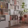
Left: the dresser in the living room; right: part of the attic was converted into an additional study
Photo: Joel Hauck
Ola: What was the most difficult part of this project, and what are you most satisfied with?
Jacek: I'm most satisfied with the design of the dresser in the living room (it had to wait about three years to be realized :) The inspiration for this piece of furniture came from modernist buildings from Brazil. The most difficult in the project was the adaptation of part of the attic for an additional study, it was a very unattractive room, but in the end it came out OK, I think? :) I am very pleased with the satisfied client, the reaction to the already finished apartment was very enthusiastic.
Ola: Thank you for the interview.


