The Polish-Spanish studio James&Mau is already known from the realization of single-family houses (House in Mława) and office buildings (The Office in Niepołomice). It's time to see what their interiors look like, but before we get into the details, we can reveal one thing: all these projects share a common element — exposed brick, treated with great reverence.
The Goethe-Institut headquarters is located in one of the buildings of the former city slaughterhouse in Cracow
photo: Jakub Certowicz
The challenge was not small, as it concerned the renovation and interior design of one of the buildings of the former municipal slaughterhouse located in Kazimierz in Cracow (1877-1878). The complex of brick buildings of the plant consisted of, among others, a water tower, halls where slaughtering was carried out, a margarine factory and residential and administrative buildings. The author of the project was Maciej Moraczewski, the initiator of the Cracow Technical Society. The slaughterhouse functioned until 2003, two years later a shopping mall was opened on the site, and of the old buildings, numbering a dozen or so, only six remain, all dating back to 1910.
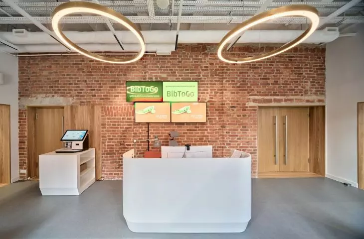
reception area of the institute
photo: Diego Llorente
The decision to move the headquarters of the Cracow branch of the Goethe-Institut, an institute dedicated to teaching German and organizing numerous cultural events, to one of the surviving buildings was made in 2019, and the project to adapt the building to the institution's needs was commissioned from the James & Mau team.
The building's facades and roof were in very good condition. Its interiors, on the other hand, had lost their original character due to multiple transformations. For this reason, we set a goal of restoring the historic image in combination with high standards and the needs of the Goethe Institute — the architects mention.
The starting point for the designers was the massive arcade on the first floor
photo: Jakub Certowicz
At the very beginning of the design process, the architects enlisted the help of experts dealing with historical monuments. This cooperation resulted in a concept approved by the City Conservator of Monuments.
The starting point for the designers was the massive arcade on the first floor. In time it turned out that originally there were more of them, and although restoring these elements involved changing the layout of all planned installations, the architects had no doubts — they had to be reconstructed. The original color of the arches was also restored, and the whole is kept in bright colors broken by wooden elements (light ash wood was used to make portals leading to the main spaces of the building — the cultural hall, office rooms and classrooms, as well as elements of doors, stairs and library furniture) and the shade of the already mentioned exposed brick, which, used in the reception area, refers to the facade of the building.
The room space on the first floor
photo: Jakub Certowicz
Vertical communication in the building is provided by two, completely different staircases. The first reminding us of the building's history, with its original black and white floor, sandstone tiles, decorated balustrade and handrail, and the contrasting second staircase — contemporary, minimalist, with wooden treads and simple black handrails.
historic and contemporary staircase
Photo: Diego Llorente, Photo: Jakub Certowicz
The Goethe Institute's commitment to sustainability resulted in the use of 100% eco-friendly materials throughout the building, such as linoleum for the floors and natural wood. A highly energy-efficient ventilation system with energy recovery was also used — the project's authors explain. — Designing installations in historic buildings is a challenge for architects. In this case, we decided to leave all installations visible, emphasizing their composition with the historic structure, thus providing a contemporary chapter in the building's history — the designers add.
upper floor
photo: Jakub Certowicz
Adjacent to the institute's new headquarters is a small brick gateway building — an exhibition and workshop space. Its entrance is adorned with the neon sign "Kuns(z)t" designed by Mirosław Bałka, combining the German word Kunst (art) with the Polish word kunszt, referring to artistic excellence.
Brick gate building, exhibition and workshop space
photo: Jakub Certowicz
Ola Kloc
Illustrations provided courtesy of James&Mau studio


