The calendar autumn is already more than a month away, although at times we can still feel like an August evening. Catching those last rays of sunshine, we present a space that is primarily associated with summer.
The name of the Wroclaw ice cream shop Krasnolód is a rather interesting combination of two terms - dwarves and ice, which becomes even more evident when we look at the company's logo. In its visual identity we can find a dwarf who, instead of the classic hat, wears an ice cream cone.
The ice cream shop's logo shows a dwarf with a cone on his head
photo: Krzysztof Strazynski STUDIO | © Dżem Studio
The Wroclaw ice cream parlor was designed by Daria Wach and Ewa Mądry from the architecture studio - Dżem Studio, whose project for the Szum and Rosa restaurant in Karpacz we showed on the architekturaibiznes.pl portal. On a small area of thirty-five square meters they managed to place ice cream parlors and places for consumption.
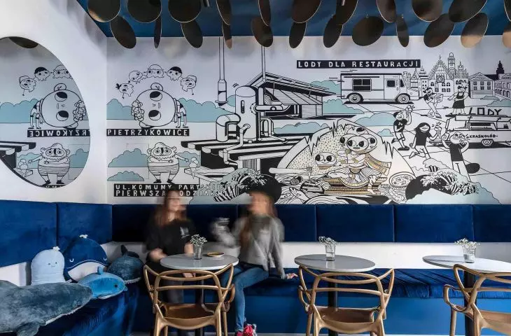
In the interior it is worth noting above all the history of the company, which was presented in a rather unusual way. Above the heads of customers was a mural depicting the history of the ice cream shop - from the first ice cream made to the Wroclaw chain of points. The mural was designed by Krzysztof Galek.
The interior primarily combines brick with deep navy blue. Gold colors can also be seen in the form of plates attached to the ceiling or the color scheme of the logo.
In the interior you will find a combination of brick, white and navy blue
photo by Krzysztof Strazynski STUDIO | © Jam Studio
Daria Wach and Ewa Mądry of Dżem Studio talk about the process of creation, the choice of color scheme and the most important touches in creating this space.
Wiktor Bochenek: It's worth starting with the name itself - "Dwarf". Did the name of the restaurant (ice cream shop) influence the design?
Daria Wach, Ewa Mądry (Dżem Studio): By designing the interiors in a "cold" color scheme, we referred to the product. The graphics on the wall of the ice cream shop were designed by illustrator Krzysztof Galek and tell the story of the ice cream shop's creation. To warm up the interior of the establishment, the ceiling was designed with an installation of gold plates.
The illustration depicting the establishment of the ice cream shop was created by Krzysztof Galek
photo by Krzysztof Strazynski STUDIO | © Jam Studio
Wiktor: The color scheme of the interior is dictated by navy blue - why the choice of this color?
Daria, Ewa: Ice-water-ocean-grenade. In the interior there are plush toys - toys just from the ocean: whale, shark and other sea creatures.
On the ceiling it was decided to use gold plates
Photo: Krzysztof Strazynski STUDIO | © Jam Studio
Wiktor: How was the space of the ice cream shop divided?
Daria, Ewa: The space of the ice cream shop was divided into zones: sales-purchasing and consumption. The sales-purchasing zone was clearly separated by a counter, which is to be the heart of the interior of the premises. Tiles and conglomerate on the countertop have been used for finishing.
Here you will also find a space for children
photo by Krzysztof Strazynski STUDIO | © Jam Studio
Wiktor: What is the main thing worth noting about this restaurant?
Daria, Ewa: In the design phase, the main goal was to design the ceiling in the first place, which is often overlooked in both gastronomic and residential spaces. We wanted it to become an integral part of this interior.
Victor: What was the most difficult part, and what are you most proud of?
Daria, Ewa: Of the fact that we were able to create an atmosphere that reflects the "ice world", but is nevertheless warm to the audience. Gold accessories were used in the space and the existing brick wall was exposed.
Wiktor: Thank you for the interview.
Wrocław ice cream shop chain Krasnolód
photo by Krzysztof Strazynski STUDIO | © Jam Studio


