Lukullus is a confectionery with traditions, its origins dating back to 1946, when Jan Dynowski opened a confectionery workshop on Stalowa Street, drawing on the knowledge and experience gained at the Wedel factory, where he was a confectioner and chocolate master. Established in Warsaw, which was being rebuilt after the war, the company survived the reality of communist Poland, and then adapted to market rules in free Poland. Currently, the confectionery is in the hands of the third generation of the family, the owners being Jacek Malarski and Albert Judycki, grandson of the founder, graduates of the so-called Harvard of gastronomy - the French École Grégoire-Ferrandi or the culinary academy Le Cordon Bleu in Paris, among others.
The brand has reached eight outlets and is primarily, but not exclusively, famous for its delicious sweets. It is also distinguished by the unusual arrangements of the locations where Lucullus delicacies are sold. Each of them is unique, designed by talented architects. Suffice it to mention the establishment on Mokotowska Street, designed by Agnieszka Busz, or the one on Chmielna Street, designed by Jan Strumillo (or the no less original island-sculpture in Zlote Tarasy by the same author). [cf. A&B 04/2018].
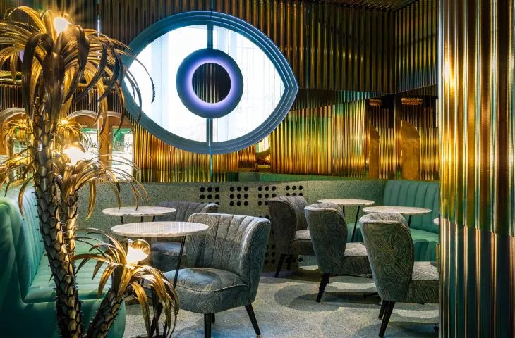
The glowing pupil and the multiplication of the image in the reflective materials are downright mesmerizing
Photo: Tomo Yarmush © Pracowania Architektoniczna Aleksandra Wasilkowska
A year ago, Lukullus ice cream shop in St. Tropez joined the honorable group, only... it's Warsaw's Powiśle. You will ask: but how so? As the owners themselves say, the name is meant to be a metaphor for vacation, with a touch of snobbery and luxury as well. This is the first ice cream shop under this brand. The interior design is primarily the responsibility of architect Aleksandra Wasilkowska, not without influence on the result were also the investor's clearly defined expectations and their infatuation with the Italian design group Memphis starring Ettore Sottsass.
The ice cream shop consists of two rooms for consumption,
the one hidden deeper is more mysterious and intimate in relation to the first one, seen from the street
© Pracowania Architektoniczna Aleksandra Wasilkowska
Out of this mix came an extremely photogenic place that attracts lovers of excellent ice cream with sophisticated flavors and catchers of instagram frames. You don't have to go inside to remember this place - already the shop window catches your eye. It's a colorful, neon mouth with a protruding tongue and "dripping saliva." The glazing on the street side announces what to expect inside, nevertheless, once you cross the threshold, the wow effect is guaranteed. Countless unobvious combinations and details. Among them, sculptures of the eye, mouth, tongue, etc., so characteristic of Aleksandra Wasilkowska's studio and adding spice. There is even a golden bottom surrounded by mirrors, acting as a hand dryer in a surreal toilet.
the shop window of the ice cream parlor catches the eye with its graphic motif and expressive colors alone;
thanks to large glazing, it also reveals what to expect from the interior
Photo: Tomo Yarmush © Pracowania Architektoniczna Aleksandra Wasilkowska
Forget the polite, candy-colored ice cream shop with repetitive elements. Regulars at the older Lukullus outlets may also be surprised by the lack of distinct yellow, buttery accents running through all the candy shops. The ice cream shop is a separate entity, so to speak. Those hoping for glitter and gold will not be disappointed! The walls and ceilings are taken over by iridescent corrugated sheet metal. This proprietary material gives an amazing effect of vibrating planes, three-dimensionality and splendor shimmering with the colors of a drop of gasoline in a puddle. The sensation is heightened by the lights reflected in these wavy planes: colorful neon and led violet backlights.
The ice cream shop consists of two consumption rooms and a restroom accessible to customers, as well as a back room. Uniquely, I'll start with the restroom, which is absolutely out of the ordinary. It was designed in a circular plan and camouflaged in the wall lining; the entrance to it is indicated by a glowing pictogram. Its interior evokes associations with some experimental capsule from science fiction films. The floor and the lower part of the wall are finished in mint terrazzo, which from a certain point turns into a cladding of mirrors. They cause endless reflections of the circular interior. Against this backdrop hangs the aforementioned golden bottom, one of the more photographed and recognizable details of the interior.
A golden bottom surrounded by mirrors, acting as a hand dryer in a surreal toilet and a golden blob on the floor
Photo: Tomo Yarmush © Pracowania Architektoniczna Aleksandra Wasilkowska
And there is no shortage of interesting details here. Right at the entrance, in the first of the two rooms, there is a long ice cream bar with two sculptures, humorous images of the owners of Lucullus. The bar is an unconventional combination of pink marble, rainbow-colored corrugated metal and gold mirrors. In this room, the floor and radiator surrounds are finished in dirty pink terrazzo. The seating repeats this palette, with the long upholstered bench taking on a more intense, near-purple hue. The transition to the second room, the one with celadon color accents and seating, is an archway, with a large brass blob marking the boundary of the different floor colors. In the deeper room we still have this controlled chaos. Two elements in particular draw attention here. The first is a huge eye through which we can glimpse the courtyard. The glowing pupil and the multiplication of the image in the reflective materials are downright mesmerizing. In addition to this dominant feature, the brass sculpture-lamp in the shape of a palm tree is interesting.
Longitudinal cross-section of the Lukullus ice cream shop
© Pracowania Architektoniczna Aleksandra Wasilkowska
***
I think that cooperation with such a bold investor is the dream of many an architect. Each of Lukullus' premises is unique and a separate article could be written about each. In this case, branding consciousness is associated not only with attention to the highest quality of the product sold, but also with carefully selected packaging - literally. It's not just the packaging in the form of interior architecture, but also the packaging for the cakes and ice cream sold at this iconic pastry shop. Talented artists are invited to design the graphics for the packaging, talented architects are invited to design the interiors, talented and open-minded owners take care of the quality of the products. A sweet recipe for success.


