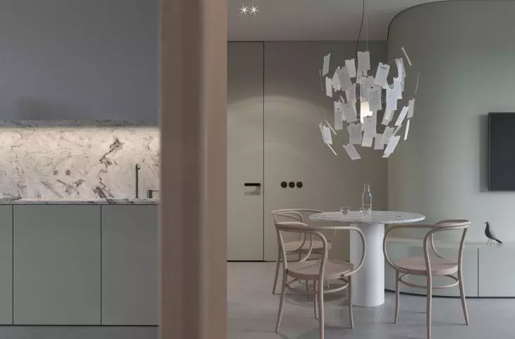
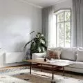
Architects from Disegno Studio, a young interior design studio, undertook the design of an apartment located in Zablocie - a former industrial district in Cracow. As they say, their concept is an attempt to polemicize with the popular loft style. In the interior they gave up fashionable brick motifs, glass partitions and sliding doors, in favor of minimalist solutions. Natural veneer, granite and a muted green inspired by the shade of a Fiat 126p reign here.
The 41-square-meter apartment is to be built in Krakow's Zabłocie district. In the concept, the architects consciously abandoned brick veneer wall cladding, glass partitions with black hardware and austere sliding doors in favor of other industrial inspirations, the implementation of which seemed more honest to them.
The architects designed a furniture development that ties the different zones together
© Disegno Studio
Our project in Zabłocie is an attempt to polemicize with the so-called loft style, which has grown into a wildly popular pastiche in the conditions of the local multifamily housing. What today's loft interiors lack in the first place is the abundant industrial spaces. Pretending to have such a character seems foolish, to say the least. It is worth noting that currently every aspect of furnishing and decorating a home is strongly connected with industry. The once artisanal work has been almost completely supplanted by mass production. So it may turn out that the true loft apartment for 2022 is one that has been filled with the materials and furniture of one of the markets," says Maciej Szlachta of Disegno Studio.
The interior is characterized by tranquility, minimalism and a limited range of colors
© Disegno Studio
interview with Maciej Szlachta
Dobrawa Bies: The project we are talking about is your attempt to polemicize with the loft style. So what were your assumptions and design inspirations? Where did you start your work from?
Maciej Szlachta: Wanting to avoid the pastiche that reigns in loft projects, we looked for less obvious inspirations. Of course, we couldn't miss the fantastic concrete floor, which, in addition to its timeless look thanks to its high resistance, allowed us to unify the flooring in all areas of the apartment. While browsing through the icons of the industry, we came across a Fiat 126p, produced in Poland, in whose paint scheme we found a great range of faded colors. One of them, Grigio Oslo, was used in the apartment. The apartment is also furnished with chairs by Michael Thonet, who developed an experimental and pioneering method of bending wood and initiated the world's first industrial production of furniture. The idea of bending also accompanied us in building the form of the partition wall in the center of the proposed space, which contrasts brilliantly with the other rectangular forms.
Grigio Oslo color is the interior theme of the apartment
© Disegno Studio
Dobrawa: Did the investors approach the studio with a specific idea and special requirements?
Maciej: The overriding requirement of the investor was to separate a lockable bedroom area while maintaining the greatest possible spaciousness in an apartment with an already quite modest square footage. Thanks to our great openness to our ideas, the stylistic agreement with the investor was almost identical. Of course, in the equation of this particular agreement there had to be a corresponding condition, namely a mutual liking for minimalism.
Dobrawa: The interior is characterized by tranquility, minimalism, a limited range of colors - mainly gray and greenish tones. Where did these decisions come from?
Maciej: These decisions were dictated by the conviction that the most effective and at the same time impressive solutions are those that are reduced to a minimum. They can be summed up by the somewhat hackneyed maxim that, "less is more."
Granite is also one of the recurring materials in the design
© Disegno Studio
Dobrawa: How do you arrange the space of an apartment if you want to achieve visual consistency?
Maciej: The simplest solution to obtain such coherence is consistency in the use of chosen materials, as well as proposing furniture development that "unites" different zones. In the case of this project, such a unifying body is a large-sized box furniture, which combines the functions of a bench, TV cabinet and storage space.
Dobrawa: Thank you for the interview.
