"I don't want a white color in our house". - said designer Natalia Gurak of the Nanovo studio and... she kept her word. Her apartment in Ruda Śląska is full of dark colors, unusual material solutions and refined details. An interesting fact is that it is located in the New Verdon building by MAŁECCY design office. How did the architect refer to this distinctive building? See for yourself.
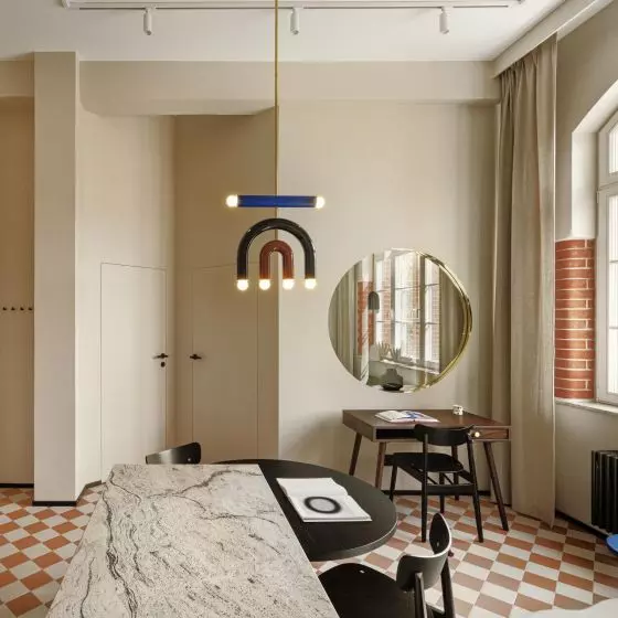
Apartment in Ruda Slaska, living area
Photo: Patryk Polewany © Nanovo
At the same time, I wanted to make the apartment tailor-made with unusual details, designed and made by our friendly contractors. My Nanovo studio deals with turnkey projects in addition to designs, so it is important to us that as the company grows, so do our contractors. We like the perfect fit of projects and unusual solutions, which we first test at home before offering them to clients. And since we move often, and real estate is our hobby, there is somewhere to test," says Natalia Gurak.
apartment in Ruda Śląska, first floor plan
© Nanovo
open space
The design and implementation of the apartment was created in a duo, in addition to Natalia, Mateusz Kasprzyk worked on it. The architects were very keen on having the most open space possible. To achieve this effect, they decided to change the functional layout, demolished several walls and put up new ones. On the first floor they introduced an additional bathroom and dressing room, and enlarged the outline to also accommodate an office separated by glass partitions.
The apartment space is as open as possible
photo: Patryk Polewany © Nanovo
It's also worth mentioning that we didn't want to divide the space with a standard door, so there is only one door in the apartment, to the bathroom on the first floor, the designers emphasize.
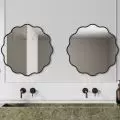
The clinker on the wall and the tiles in the bathroom relate to the building's facade
Photo: Patryk Polewany © Nanovo
non-standard materials
Other non-standard solutions include the lack of typical sinks, maximum open space and unusual finishing materials, such as the clinker on the wall with the TV.
The building is designed by Małeccy Biuro Projektowe and finished with clinker, which also permeates the common areas of the building. Hence the clinker, with its texture and color referring to Silesia, appeared in our apartment, the authors say.
The kitchen countertop was made of tombstone granite
Photo: Patryk Polewany © Nanovo
Each element of the apartment was made according to the author's design. In the bathrooms, the paint was covered with varnish, the kitchen countertop was made of... tombstone granite, and the floors were made of microcement. You will also find a lot of steel and glass here.
We even made the toilet button from a friendly locksmith company," the architects add.
The staircase is made of steel
Photo: Patryk Polewany © Nanovo
dark, yet bright
The designers also wanted to limit the number of colors used and focus on one shade of gray, which they created by mixing different tones, by trial and error. The same color also appears on the built-in carpentry and steel elements. In keeping with the idea of creating a unified, open space throughout the house, the bathrooms are also a continuation of the design.
The dining room combined with the kitchen kept in gray
Photo: Patryk Polewany © Nanovo
I can guarantee that the apartment, despite the raw materials used with dark color tones, is cozy and bright. It is good to live here! - assures Natalia Gurak.


