Modern workspaces have undergone a huge revolution in recent years. Companies are outdoing themselves with more and more new ideas, solutions and attractions for employees. A slide at work? Why not! A wall lined with keyboards? Sure! How about a ceiling decoration in the form of hanging computer mice? Sure! These are just a few elements creating an unusual atmosphere for the office of an IT company in Katowice. The spaces for Massive Pixel Creation were designed by Anna Struska and Henryk Struski of Silesian studio 8486 architects.


first floor and first floor plans
© 8486 Architects
The arrangement of the two-story space was created from the beginning according to the investor's guidelines and was implemented in two stages. The floors were connected through an openwork, industrial, winding staircase with a steel structure and.... a slide!
Left: highlighted in yellow, the slide and hammock; right: highlighted in black, the staircase
Photo: Bartosz Dworski
The fruit of cooperation with designers is an open space layout adapted to work in various configurations - rooms for working in smaller groups, in pairs, as well as for individual work requiring silence and concentration have been included. All marked with a consistent visual identity and playful names. A conference room was planned in a free-standing glass container, as well as four small call boxes (the ones with white mice;)). Care has also been taken to provide places for employees to relax - a relaxation room, a canteen, a cafeteria and smaller areas where one can, if only for a moment, "break away" from the desk.
left : first floor, view of the chute; right: canteen
Photo: Bartosz Dworski
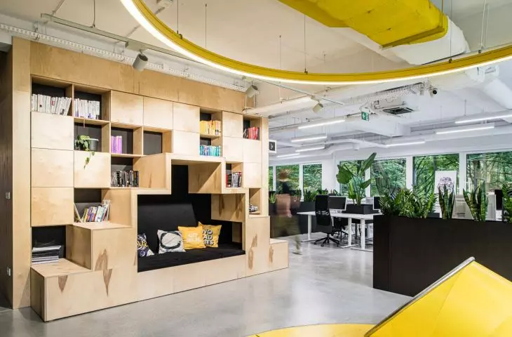
Natural-colored plywood was used as the leading material, which is clearly visible already in the foyer area, where the counter and the spacious ceiling plafond were designed in this very material. The multifunctional pavilion in the first floor zone and furniture elements in the first floor zone were also made in plywood," explain architects from studio 8486. "The character of the space is also created through the contrasting use of colors. The black color appears in a holistic way - floor, walls, ceiling, installations - introducing dynamics and a surprising division of rooms.
The 


natural-color plywood was used as the leading material of the office
photo: Bartosz Dworski
The black color is contrasted by the aforementioned light-colored plywood, but also by the gray of the floors, the whiteness of the walls, yellow color accents that emphasize individual elements, such as the slide zone with a net-hammock for relaxation or selected rooms, and natural greenery, which is not lacking in the office. A green wall is planned for the first floor, and rows of steel pots for the first floor.
The 


open space layout adapted to work in different configurations}
photo: Bartosz Dworski
A characteristic thread appearing in the interior is the motif of computer elements used in the design of individual spaces, the authors conclude. - You can pay attention to the wall coverings made of keyboards or computer motherboards. You can notice the decoration of ceilings made of mice or interactive installations made of USB ports, they add.
Left: one of the call boxes; right: a wall decorated with computer keyboards
photo: Bartosz Dworski
