The investors asked designer Malgorzata Bacik of MM Architekci to create an arrangement of the living area in their new home. The most important thing was to arrange the interior properly, taking advantage of the large opening to the sun.
The kitchen fronts were made in two colors
photo by Yassen Hristov, © MM Architekci
The clients turned out to be a young married couple with children, who decided to entrust the interior design of the living area in their newly designed house in Tarnow to the designers from MM Architekci. The living room, kitchen and dining room are individual, connected parts of this part of the house. On the first floor there was a private zone, with rooms and a bathroom.
The kitchen with a goose motif
The most important thing in the kitchen space was to unite the two color tones of the kitchen cabinet fronts. Instead, the fronts of the upper cabinets and the pillar, into which the oven and coffee maker were built, were varnished in a beige, warm shade with a delicate olive glow. The kitchen island was finished in a similar tone, with large capacity drawers. The island serves as a family meeting place for breakfast.
The kitchen, compared to the other rooms, is small. An important solution is the lamps with a spherical, semi-open shape. On one of the walls an unusual solution was decided, which is a wallpaper with the motif of flying geese, maintained in black and white tones. Elsewhere in the kitchen a graphic with a pelican by Anna Bacik was placed.
The kitchen was separated from the dining room and living room by a small, minimalist kitchen island
photo by Yassen Hristov, © MM Architects
dining area
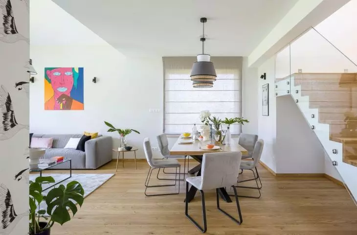
Right next to the kitchen was the dining and living room space. These zones are distinguished primarily by the floor finish. The stoneware used in the kitchen gave way to oiled planks made of oak. The walls in this space are white, and the windows were covered with gray Roman curtains.
The heart of the dining room is a large table, which is the place for family gatherings. This important place is meant to focus the lives of all household members, while also allowing for social gatherings. The table's legs, shaped like a double cross, were made of metal and painted black. A light-colored wooden top was supported on it. Around the table stood chairs upholstered in ash velour and black legs. Above the table hung two lamps with an unusual shape consisting of a smaller white circle, a wider gray one and a small openwork surround. On the wall there was a poster of the Italian brand Fornasetti.
The heart of the dining room is a large, representative table
photo by Yassen Hristov, © MM Architects
home warmth
The heart of the living room space is the sofa - allowing the whole family to meet. The sofa, was kept in a gray color scheme, referring to the overall color scheme of the interior. The uniformity of shades was broken by colorful pillows. Next to the sofa there was a small coffee table with a glass top. For the designer and investors, the most important thing was to maintain minimalism in this space. In the living room there was also a place for flowers, a monstera, among others, was placed next to the TV.
The most important thing was to maintain the right color scheme inside
Photo by Yassen Hristov, © MM Architects
internal understanding
The most important element connecting all parts of the living area is a calm gray color scheme. The division between the interiors is not emphasized by architectural divisions, making it an open space. The solutions, despite the emphasis on minimalism, create the impression of a cozy and pleasant place.
The most important thing in the interior was to maintain a minimalist character
Photo by Yassen Hristov, © MM Architects
