Living in the Netherlands for years, architect Joanna Kręgiel-Vereecke, founder of Studio Woods, took on the challenge of designing a two-story interior for an apartment located in a 19th-century building in the heart of Amsterdam. The clients' wish? To accentuate the history of the place and add color.
The featured apartment is located in Amsterdam's Jordaan neighborhood, known for its numerous galleries, stores and atmospheric restaurants. The two-story unit measures 87 square meters, and the architect made sure to emphasize and take advantage of the qualities of its interior.
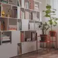
An important element of the living room is an old brick wall with a bookcase
Photo: Michal Suskiewicz © Studio Woods
focus on brick
The clients' wish was to change the interior and make the apartment a space that would express and represent them. Their new home was to be modern, colorful, but also authentic. They dreamed of reusing, and even accentuating, the original elements of the building and interior. This is where the idea to expose the 19th-century brick wall in the living room came from," says Joanna Kręgiel-Vereecke.
The resident is also a cat
Photo: Michal Suskiewicz © Studio Woods
Wanting to mark the history of the place, the architect decided not to fill the holes left by old electrical outlets and other elements. The brick wall in the living room is now a backdrop for both restored and contemporary furniture.
cobalt and pink
In the center of Amsterdam, the most common buildings are narrow townhouses, with distinctive facades and steep staircases, and the apartments they contain usually occupy several levels. Narrow rooms often lack storage space - which was also the case with the described apartment.
In the kitchen, the architect used pink tiles on the wall
Photo: Michal Suskiewicz © Studio Woods
The designer decided to make the toilet smaller, in favor of the kitchen, which thus gained additional cabinets. The architect also gave it a modern look with color accents. In the kitchen, cobalt-colored sockets and grout and pink tiles catch the eye.
Colorful tiles and lots of plants enliven the interiors
Photo: Michal Suskiewicz © Studio Woods
The author also used more classic elements in the form of mosaic tiles on the floor, interspersed with colorful chopped tiles. These distinctive tiles, produced by the Polish company Wzorcownia Gdansk, were specially imported to Amsterdam. In addition to the kitchen, the toilet was renovated in a similar style, except that instead of tiles, the walls and ceiling are pink.
The bedroom has gained a closet
Photo: Michal Suskiewicz © Studio Woods
new interior division
The former design solutions in the apartment were quite surprising. It turned out that in the middle of the bathroom there was a staircase leading to a lounge terrace located on the roof. Not a very fortuitous solution, especially when the investors were expecting guests. So the architect decided to remedy this by dividing the old bathroom into two rooms - a new, smaller one and a utility room that also serves as a vestibule. It is in this room that there is now a staircase leading to the roof and a passage to the bathroom, which also uses hexagonal tiles.
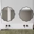
The interior of the main bathroom is kept in classic colors
Photo: Michal Suskiewicz © Studio Woods
The master bedroom gained a dressing room, thanks to the reduction of the adjacent work room. It is worth mentioning that in order to increase thermal comfort, all the exterior walls of the apartment have been insulated with a wood frame used on the inside. Taking care of air quality, all ventilation was also upgraded, adding mechanical ventilation.
It was definitely a challenging but fascinating journey that I took with the investors. Working on the project in the Jordaan neighborhood was worth all the efforts. I'm thrilled to see that the clients have gained their new home that expresses them and that they now live there happily - it fills me with pride," Joanna Kręgiel-Vereecke concludes.
Also read about the transformation of Lisbon's attic into a cozy apartment.


