We take a look into an apartment located in the center of Wilanów. A couple of young people with busy professional lives dreamed of an apartment, full of visual tranquility and harmony. Architects Daria Bolewicka and Daria Skoczylas of the bo/sko studio, helped create this effect, focusing on minimalism, quality materials and combining modern design with mid-century elements. Paintings by Polish artists add accent to the interior.
To collaborate on the design of the interior, of their Warsaw apartment, we were invited by a couple of young people with busy professional lives, for whom the private space was to guarantee relaxation, tranquility and a place to spend leisure time with their daughter. The investors value quality, they wanted the interior to be distinguished by simplicity and elegance, to be based on natural and quality materials, also the selection of furnishings and art was not accidental," the designers tell us.
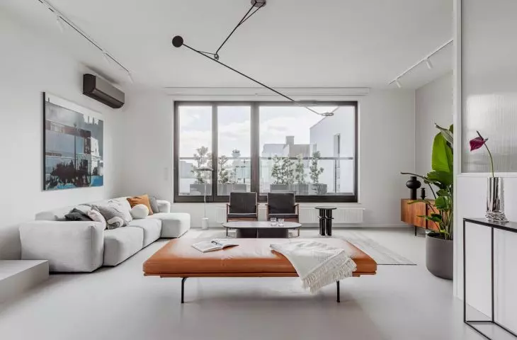
living area with access to the terrace
Photo: Jakub Nanowski © bo/sko
The described apartment with an area of 135 square meters is located on the last, fourth floor of a building of a modern housing estate in the center of Wilanów. The architect decided to divide the designed interior into two zones: a living and a private area.
The living area with a glass wall
Photo: Jakub Nanowski © bo/sko
harmony and moderation
The entrance to the apartment is separated by a glass wall, with a metal structure. The enclosure, which begins at the entrance, is continued throughout the corridor, creating a homogeneous plane.
Oskar Zięta's PLOPP stool and microcement on the floor
Photo: Jakub Nanowski © bo/sko
The living area consists of two parts: lounge and kitchen.
We designed the lounge area by combining modern Scandinavian design with mid-century furniture and Polish design. The investors appreciate art, so the apartment features paintings by young Polish artists, design classics and unique objects designed by Oskar Zięta, the architects add.
kitchen area with dining room
Photo: Jakub Nanowski © bo/sko
When working on the kitchen, the authors placed special emphasis on maintaining harmony between the structure of the black stained oak and Viscont White granite, which is used in the built-ins. The kitchen island is accentuated by lighting, and a black Scandinavian table, minimalist in form, is located on its extension.
The black dining table continues the layout of the kitchen island, on the wall a mirror by Oskar Zięta
Photo: Jakub Nanowski © bo/sko
The interiors are complemented by good-quality materials, such as granite, metal and oak wood (in natural and black stains).
monomateriality
The private zone includes a master bedroom with a spacious bathroom, a study and a children's room. The designers, taking care of consistency of style, decided to use light gray microcement flooring in all rooms. Microcement also appears on some of the walls, but they are mostly white. Interestingly, instead of the stereotypical pink, the investors' daughter's room is kept in the consistent color scheme and style of the entire apartment.
A bedroom full of light
Photo: Jakub Nanowski © bo/sko
The bedroom, is the place where a large amount of daylight, coming in through numerous glass windows, reigns supreme. Continuing the development from the hall, the architects created a minimalist, calm interior, matching it with decorative elements.
The bathrooms are kept in white and black
Photo: Jakub Nanowski © bo/sko
The bathrooms were designed with unusual layouts in mind. In both, the contrast of white and black optically shortens the rooms, and sconces and mirrors emphasize this effect.
interview with Daria Bolewicka
Dobrawa Bies: Did the apartment design also take into account the choice of art?
Daria Bolewicka: The selection of artwork was part of our work, a very pleasant one. The investor is passionate about Polish painting, her participation was significant in the selection of specific works.
Dobrawa: What was the biggest design challenge?
Daria: M135 is a minimalist interior by design, simplicity of forms, almost mono-materiality were one of the main assumptions here, which clarified at the beginning of our work on the project. Consistency in maintaining this simplicity and minimal measures was a challenge, especially since we wanted to create an interior that was pleasant and cozy; after all, this is an everyday living space, not an art gallery.
Also in the room of the investors' daughter, the architects focused on visual consistency
Photo: Jakub Nanowski © bo/sko
Dobrawa: How did you design a room for a little girl? Did you receive any guidance? You can see that she is a fan of tigers.
Daria: The owners of M135 set us a difficult task: the child's room had to correspond with the interior of the entire apartment, hence the decision to keep the same materials on the floor, walls or in the built-ins. We did not want to artificially introduce decorative elements here, to duplicate the stereotype: a girl's room must be pink. The palette of materials and subdued colors creates a gentle background for creative play and learning.
Open living area is the favorite place of architects
Photo: Jakub Nanowski © bo/sko
Dobrawa: And finally, our standard question. Your favorite place in the apartment is?
Daria: M135 is an interior where consistency and simplicity reign supreme, our favorite place is the open living area, which is the showcase of the entire apartment. We designed this space by combining modern Scandinavian design with mid-century furniture and Polish design.
Dobrawa: Thank you for the interview.
Dobrawa Bies
