How to arrange an interior in the Bauhaus style? What exactly is this style? We present 5 things that are necessary when creating such an interior.
The style originated at the Staatliches Bauhaus art school in Germany
Photo by Ross Sokolovski © UNSPLASH
Bauhaus - was born in Germany in the early 20th century, as part of the Staatliches Bauhaus art school, founded by Walter Gropius. The main features of this style are minimalism, geometry and practicality. It is characterized by a combination of simple forms and functionality. Bauhaus design often uses steel and glass. The aim of the arrangement is to achieve harmony between art and craftsmanship. The most important creators of the Bauhaus were Ludwig Mies van der Rohe, Marcel Breuer and Laszlo Moholy-Nagy, who had a great influence on the development of modern design and architecture.
Form follows function
This is the idea that guided the designers who created Bauhaus design. An example of the application of this principle can be seen in a chair , whose shape, material and construction are tailored to the comfort of the user, instead of rich ornamentation or excessive details that do not affect its functionality. We see this in famous designs in the Bauhuasu aesthetics, e.g. the Wassily and Barcelona chairs and the LC4 recliner.
The famous LC4 recliner designed by Charlotte Perriand, Le Corbusier and Pierre Jeanneret
Photo: Joel Hauck © Loft Kolasinski
Modern materials
Modern materials were popular in the Bauhaus style, which could be easily adapted to the function of the building. Mainly steel, glass, concrete and plastics were used - all for their practicality, durability and ease of processing.
A simple bookcase with metal elements will bring a Bauhaus atmosphere to the interior
Photo by Wronika Trojanowska © Pawlak&Stawarski
Harmonious arrangement
Proportion and symmetry were key tools for creating interiors in accordance with the principle: form follows function. Paying attention to these elements made Bauhaus designs both aesthetic and practical. So pay special attention to proportion and balance in space. Avoid asymmetry. Also try to maintain harmony between interior elements.
Create a symmetrical arrangement with sized furniture
Photo: Joel Hauck © Kolasinski Loft
A mix of primary colors
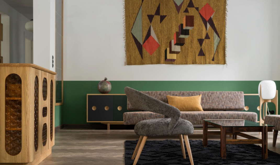
Bauhaus was distinguished by its interesting use of red, blue and yellow. These primary colors, often complemented by black, white and gray, were a key element in interior and design projects. This combination created clear contrasts. In this way, the colors helped organize the space, clearly separating different functions of rooms or furnishings. It also showed that even from something simple you could get an interesting effect.
Classic Bauhaus color combination
Photo by Wronika Trojanowska © Pawlak&Stawarski
Geometry
The use of geometric forms reflects the desire for simplicity, harmony and functionality. Hence, we often see triangles, squares and circles in Bauhaus interiors. The latter appear in particular in windows, tables, mirrors and decorations. They also balance the sharp lines of squares and rectangles, creating a more varied but still harmonious composition.
The circle is one of the leitmotifs of bauhuas arrangements
Photo: Joel Hauck © Loft Kolasinski
Check out other styles in articles from the 5 ways to interior design series
Compiled by:KATARZYNA SZOSTAK


