Natalia Kaminska from the Academy of Fine Arts in Wroclaw has created a design for a lively and attractive spot in the heart of the city. She decided to adapt the post-industrial buildings on Rainbow Street. Ceramics became the keynote, thanks to its therapeutic, relaxing and integrative character, as well as its fascinating history dating back to the beginning of civilization.
View of the Ceramics Center
© Natalia Kaminska
inspiration for adaptation
Wroclaw is a well-known artistic center and the capital of Lower Silesia, which is a basin of Polish ceramics (Boleslawiec, Meissen). It is also the location of Poland's first Department of Ceramics and Glass, which is still housed at the Wrocław Academy of Fine Arts and continues to nurture traditions and develop innovative solutions.
view of green areas
© Natalia Kaminska
The history of mankind can be told through ceramics. It is one of the best-preserved raw materials in the earth and is an archaeological clock. For Natalia Kaminska it became an interesting starting point for creating a thematic exhibition. Ceramics is also meant to be a counter answer to the prevailing oculocentrism. This is because by design it is created to be touched and in the act of touching. Contact with working, soft yet dense matter helps to free the senses and let them be carried away.
view of the winter terrace
© Natalia Kaminska
center for education and creativity
The facility serves an educational function, offering an interactive exhibition that introduces the history and function of ceramics over the centuries. The center's activities include educational workshops and thematic lectures aimed at popularizing culture and its values, encouraging the public to actively participate in cultural life. The center has created spaces conducive to talent development and is initiating the revitalization of the district, raising its cultural value for the city.
view of the center's entrance
© Natalia Kaminska
The center's cultural and social activities include organizing events, meetings with creative osabs, temporary exhibitions and providing attractive spaces for external initiatives. The facility also includes food and service space, and the recreational aspect is provided by infrastructure for classes and courses in ceramics, glazing and working on the potter's wheel, complemented by green areas.
view of the floor with studios
© Natalia Kaminska
fusion of modernity and tradition
The guiding idea for the visual overall design is to merge the new with the old. The inspiration came from the very idea of adaptation, i.e. the use and transformation of an existing form with the possibility of adding a new one. The visual sign of the new is the white cubicle, a pure modernist form breaking into the old brick material. The design is a combination of minimalism with an industrial base of the found architecture.
view of the displays and the relief of the continents
© Natalia Kaminska
The color palette and choice of materials are directly related to the center's theme, focusing on ceramics and clay. The raw materials influence the distinctiveness of the finishes of the various zones, resonating with the idea of a white cubicle. Colored concrete evokes clay, once dominant in construction. It was used on the floors to create a cohesive composition with industrial and modern design elements.
A view of a model of an ancient pottery kiln
© Natalia Kaminska
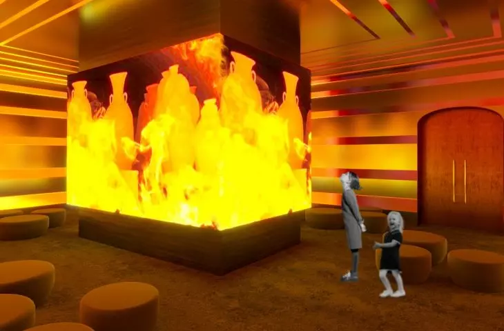
The exhibition rooms are devoid of natural light, allowing full control over the presentation of the works. A multimedia room has also been designed, introducing visitors to the theme of the exhibition. The space has been divided into thematic zones, facilitating the reception of information and engaging participants and attendees.
view of multimedia displays with screens
© Natalia Kaminska
comprehensive revitalization of the space
The adaptation was carried out in a comprehensive manner, adapting the entire available area to the new functions. Vacant areas were developed into lush green spaces, charmingly interspersed with wide alleys for walking. A terrace was planned in place of the demolished buildings, which will be used for workshops, exhibitions and outdoor meetings.
A view of part of the exhibition dedicated to KIntsugi
© Natalia Kaminska
View of the installation about the role of the elements in the formation of porcelain
© Natalia Kaminska
To offset the disharmony between the facade of the oldest building and the later addition, their facades were differentiated, highlighting their architectural differences. The newer part of the building gained a white facade, which harmoniously harmonizes with the brick monument. A winter garden was also created along the renovated rear façade, further enhancing the space.
view of the restaurant
© Natalia Kaminska


