Work submitted for the competition
"Best Interior Diploma 2020/2022".
Café Jazzclub in Bielsko-Biala is known to everyone as Gallery Wzgórze, as it is located on Wzgórze Street, and its walls are decorated with dozens of wonderful paintings. Established in 1987, the gallery was born out of the owner's passion for music and art. Thanks to him, it has been a meeting place for many generations of artists. Despite its popularity and rich history, its spaces still hide a lot of untapped potential.
The exhibition appears in all interiors of the building
© Dominika Nikiel
historical background
The first part of the building was built at the end of the 17th century after the original structure caught fire. It was handed down to successive owners, which is why the architecture of the various zones is so varied. The building was used as apartments, stables, the seat of the prince's saddler, it also housed the PSS Społem store.
Jazzclub café projection
© Dominika Nikiel
project assumptions
functional layout
The axis of the building is invariably the corridors leading through all rooms of the gallery. Locating the main bar in the center of the whole made it more easily accessible from both ends of the café. Another important consideration was to increase the number of restrooms and place them in a small space. It was also necessary to organize and better highlight the display that is so important for this place.
The bar is placed in the center of the gallery
© Dominika Nikiel
exhibition
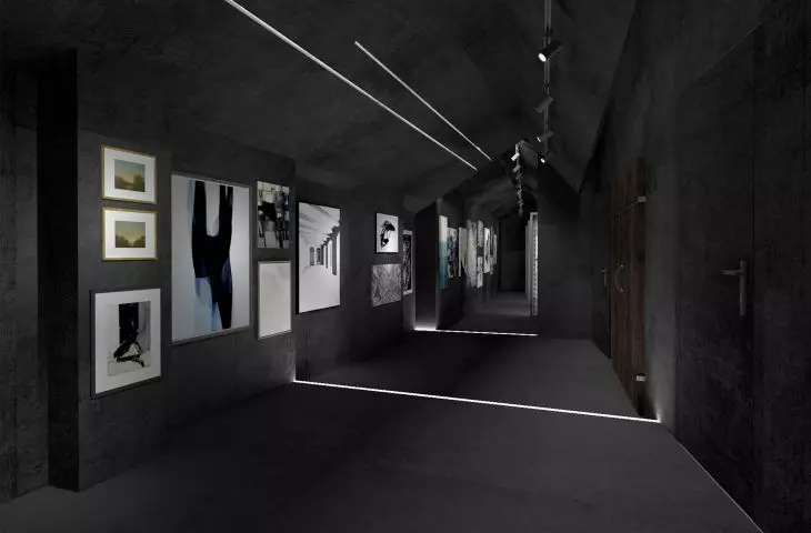
It is a characteristic element of the place, which is why it appears in all the rooms. In addition to using the walls, it has also been arranged on additional structures - black lacquered steel frames with built-in lighting.
lighting
It fulfills two main tasks: it creates an intimate atmosphere and enhances the display. In addition, the lighting emphasizes the directions in the space. It leads along the axis of the building to places where it mixes with natural light.
The exposition was also placed on black lacquered steel frames
© Dominika Nickel
materials
The austere finish of the exhibition areas stems from the desire to create a neutral background for the exposition. The use of light and dark colors increases the diversity of the space and gives more possibilities in presenting the works.
inspirations
The pondered space has a long history, so the main inspiration came from memories and how time affects them. The building in its elongated plan is itself its own timeline. It shows the changing owners and their needs at the time.
Openings made in the wall separating the room from the corridor,
enlarge the space and give the tight passage more air and light
© Dominika Nikel
design
The perforated metal walls intersecting with the wall separating the hall from the corridor already lead the viewer towards the first room from the entrance. The gallery has been primarily a meeting place for many years, so there is also a café here. One can sit for a longer period of time surrounded by the exhibited works, and the minibar also facilitates the organization of vernissages and cultural events. The corridor leading to the room with the main bar is also a space suitable for displaying paintings. This is the first place from which the long, narrow passageways so characteristic of the place are visible.
one of the café's gardens
© Dominika Nikiel
The main room is located in the largest room of the café. The bar, with its simple shape, fits into the directions of the original walls. Steel frames clad in perforated metal are used to display paintings. Lighting, harmonizing with the original wooden ceiling and brick, creates an atmospheric atmosphere. Openings made in the wall separating the room from the corridor, enlarge the space and give the tight passage more air and light.
The second of the gardens is a larger space that can be transformed, for example, into a place for exhibitions of large sculptural forms
© Dominika Nikiel
The next zone is the first of the two gardens, where a café space is located between the walls of the neighboring buildings. The irregular canopy was created so that the trees growing in this area would not have to be removed. A system of folding glass sliding doors provides the opportunity to expand the garden space with an interior room that also serves as a concert stage. Bright corridors lead to the most illuminated part - the second garden. It is an atmospheric space with a panoramic view of the city. It can be easily transformed into a place for exhibitions of larger sculptural forms and art installations.
Dominika NIKIEL
Illustrations: © Author
