{tag:studenci}, a student of the Faculty of Interior Design, Design and Scenography at the Eugeniusz Geppert Academy of Fine Arts in Wroclaw, designed the showroom of Polish fashion brand MISBHV, inspired by Brutalist architecture. The interior is full of contrasts, optical illusions and synthesized forms, which create a background for fashion presentations.
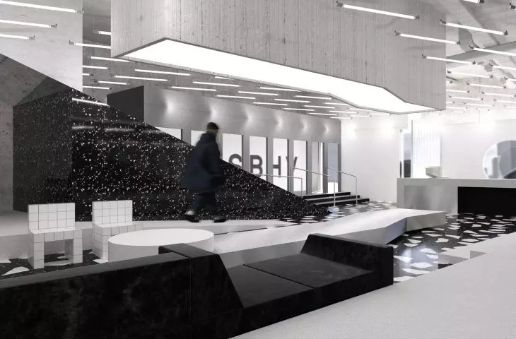
The interior is dominated by black and white colors
© Michal Werner
The concept for the showroom of the Polish fashion brand MISBHV was created as a semester project by Michal Werner during classes at the interior design studio, taught by Katarzyna Anna Jagiełło, PhD, Aleksandra Przybyła and Tomasz Taciak. The author's main goal was to reflect the stylistics behind the brand as closely as possible through the use of appropriate plastic forms.
The author was inspired by the forms of Brutalist architecture
© Michal Werner
The inspiration accompanying me during the creation of the interior was mainly the Brutalist architecture and its philosophy. It became the basis for the design of the author's furnishings proposed in the rooms. Geometric, synthesized forms, forming a spatial labyrinth, are designed to "play" with the user by creating optical illusions and interact with him, says the author.
optical illusions and contrasts
A limited color range based on contrasts of black and white is intended to create a background for the products presented in the showroom. According to the brand's philosophy, none of the display zones has been divided into women's and men's, assuming the complete non-binary nature of fashion and its separation from gender.
showroom entrance area
© Michal Werner
The open space of the showroom was divided by Michal Werner into smaller sub-zones, making the simple rectangular layout more dynamic and thus more expansive. The entrance area is a multimedia corridor separated by a metal wall and finished with a vertical sheet of black terrazzo, from which one can descend the stairs to the rest of the room.
projection of the showroom
© Michal Werner
zoning
On the left side, with its back to the storefront, the checkout area was located, separated by a white plaster wall with a circular opening and elongated structural glass. Delineated by them was a checkout counter made according to the author's design with materials present throughout the showroom: brushed steel, terrazzo and glossy black plastic.
The metal table can be used as a catwalk
© Michal Werner
Opposite was a metal table in a form resembling a zigzag, which during organized events is to serve as a catwalk for models presenting the brand's latest collections. Above it hung a block of structural concrete, in which lighting was hidden. Around the structure was placed a modular sofa upholstered in black creased velour. The entire space is surrounded by an elevation finished with white vinyl flooring; on it were a fitting room zone and two accessory zones, between which hangers, diverse in shape and material, were "scattered" to display clothes.
fitting room zone
© Michal Werner
accessory zones
The first accessory zone located on the right side is closed from the top with a sloping suspended ceiling, lined with mirrors. It features plastered shelves for leather goods, a tall standing mirror, a white Terrazza sofa designed by Ubald Klug and manufactured by DeSede Switzerland, and a unique armchair designed by Max Lamb. Subsequently, on the left side, the author placed a huge perforated cube finished with structural plaster hiding fitting rooms with three booths in the interior, obscured by curtains made of laminated metallized material.
shoe zone, seating inspired by Max Lamb's forms
© Michal Werner
Next door, through a passage separated by a metal partition, one can get to the shoe zone enclosed in a mirrored prism. Inside, further optical illusions achieved with mirrors, lights or a ceiling and floor made of illuminated steel mesh await the user. The seat, located in the center, is made of polished terrazzo, according to a design inspired by the forms of Max Lamb.
wall of chains
© Michal Werner
The zone can be exited through a second passageway, which, separated by a "wall" of metal chains, leads by a ramp to the level of the checkout and accessories area. The entire space uses lighting in the form of fluorescent fixtures suspended from the ceilings, which, arranged regularly, break the heavy, monolithic forms used in the interior and enhance the atmosphere of the place.


