The interior design studio Metro by Metro was approached by investors. They decorated their first apartment together on their own, for the second they decided to get support from professionals.
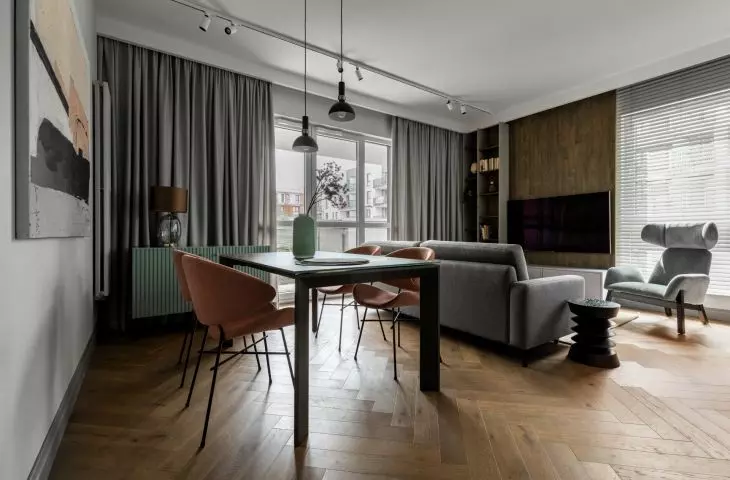
The kitchen is connected to the living room by a partially closed passage
© Metro by Metro
looking for the right division and color
One of the first things that was gently changed was the replacement of the toilet with a dressing room with a laundry room. The original layout of the apartment was to divide it into two parts: a common area with a living room, kitchen and dressing room, and a private area consisting of three bedrooms and a bathroom. The entrance to the dressing room was moved deep into the apartment next to the entrance to the bathroom. The dressing room was hidden behind wood imitation cladding - correlating with the space of the living room connected to the kitchen.
The designer's goal was to bet on an open, spacious interior that would be functional for a family of four living on eighty square meters. Four main colors dominate the interior. Shades of gray that recur in the furniture, wall coverings or baseboards. A dark shade of brown, referring to dark chocolate - visible on the furniture fronts. Sage and mint color, best seen in the kitchen area. Shades of pink, visible on the carpets and details of the apartment.
The color scheme of the interior is based on four colors
© Metro by Metro
It was also important for the investors, as well as the designer, to avoid unnecessary decoration in favor of functionalism. Every decorative element in the apartment has a functional element.
Minimalism of forms, simple lines, the realm of detail and consistency in colors, textures and materials are the main strengths of the interior. Perfectly planned eighty square meters allowed to create a comfortable and functional space for a young family of four. Taking into account the diverse needs of the residents while maintaining the comfort of use was the overriding role in the design of this apartment," says Patrycja Gubernat, owner of the studio Metro by Metro.
a place of flavors
The kitchen remained in its original place. The wall separating the kitchen from the entrance is a partition wall ending on the living room side with a structural element. The kitchen is visible only after entering the living room, opening to the common area. The upper part of the development was abandoned, avoiding spatial overwhelm. All necessary appliances were placed in the side part of the built-in. The kitchen wall was made of large-format stoneware with a shade of broken white, falling into gray-beige tones with honey-gold veins. From the living room, the kitchen was separated by a small table of white color. Under it was a small cabinet in a mint shade.
The interiors focused primarily on functionality
© Metro by meter
one bathroom
The owners of the apartment wanted to turn one toilet into a dressing room, which left only one bathroom in the house. It was important to use this space to the maximum. It was finished with two types of stoneware in shades of gray. The panels are olive and dark gray. It was necessary to accommodate enough furniture to allow a family of four to use it.
The color scheme of the bathroom is similar to the other rooms
© Metro by meter
children's rooms
The arrangements of the two sons' rooms are interesting. Both of them used a bed on high, under which there were closets and storage spaces. The theme was the child's passion for wild animals and adventures. As in the whole apartment, the room maintains color consistency - the same colors repeated on different furniture AND elements, the same fabrics on the chair, panels, cushions.
The second room, belonging to the older son, is dominated by automotive and football motifs. The decor refers to his favorite sport - soccer. The color palette, compared to the other rooms, has been opened up to blues and whites.
Also in the children's rooms I took care of the right choice of lighting, so that the children had a comfortable environment for playing, studying and resting. There was also no lack of flavor and in this part of the apartment, for example, interesting lamps from well-known Italian lighting brands," says Patrycja Gubernat, owner of the Metr by Metr studio.
A room with a wildlife theme and another with a soccer theme
© Metro by Metro
summary
The most important goal of the investors and the designer was to create a space that would provide adequate functionality for a family of four. The interior is dominated by gray colors broken by mint and pink colors. It was important to create a space friendly to each household member - which is emphasized by the individual arrangement of the rooms.
The parents' bedroom - the private part of the apartment
© Metro by Metro
