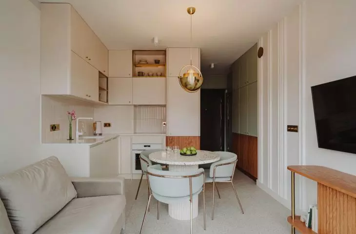
This small interior of 34 square meters is intended for short-term rental. The team of COI Pracownia Architektury Wnętrz is responsible for the arrangement of the apartment in Swinoujscie, which is kept in soft colors.
The seaside apartment is dominated by white, beige, powder pink, pistachio green and wood. Gentle colors, natural materials and cozy textures are to bring to mind carefree, sunny vacations on the Baltic Sea.
bright kitchen
Photo: Studio Resources
Maintained in bright colors, the kitchen seems to be the perfect backdrop for the play of warm spots of sunlight coming through the windows. The simple, minimalist furniture is varied by small accessories - gold fixtures for electrical outlets, shiny interiors of open kitchen cabinets, wooden fronts or a designer brass GUBI lamp hanging over the table, a 1972 design by Louis Weisdorf.
Left: GUBI brass lamp, design by Louis Weisdorf; Right: play of light and shadow on kitchen furniture.
photo: Studio Resources
The bedroom arrangement is a continuation of the subtle atmosphere of the kitchen, but it does not lack a "wink" to the guests - above the soft pink upholstered lamping/headboard of the bed are placed black patterns, contrasting with the light wall. What do these mysterious paintings represent? About that in a moment. The real gem of this interior is the small bathroom, which is almost entirely sunk in the shade of pink that dominates the coastal interior.
bathroom
Photo: Studio Resources
How, despite the small area, did the designers manage to accommodate the necessary functions in the interior and adapt it to the needs of various guests? Monika Rogusz-Witkoś of COI Pracownia Architektury Wnętrz tells us about it.
Ola Kloc: Although the apartment is small, you have fit all the necessary functions in it. What is your secret for optimal arrangement of a small interior?
Monika Rogusz-Witkoś: First of all, we start with the Investor's guidelines. At the beginning of our cooperation, we create a so-called brief based on the answers to the questions asked earlier in the questionnaire. We collect information for analysis, and then on the functional layout we try to put all the most important requirements that the Client puts before us. By way of compromise and selection of the most important preferences, we try to arrange and accommodate all the elements, sticking of course to the basics of ergonomics and functionality. A small apartment is no small challenge when it comes to functionality, sometimes you need to spend more time to dress the whole into an aesthetic form in addition to functionality. Seemingly there is less work, because there are fewer meters, but the scope of work is the same as with at least twice as large apartment.


view from the kitchen to the hallway
photo: Studio Resources
Ola: The interior is dominated by bright colors, the rooms are filled with a variety of textures and materials. What influenced such their selection and juxtaposition?
Monika: First of all, the aesthetic preferences, sensitivity and awareness of the clients. They literally gave us a free hand, indicating only the direction they wanted us to move in. That direction was powder pink and pastel green. The apartment was to attract with its originality, boldness and high quality workmanship. It is located close to the beach in Swinoujscie, and is supposed to be associated with blissful, warm vacation time.
Left: green bedroom door; right: closet in syfialia
photo: Studio Resources
Ola: Tell us, please, more about the abstract decoration above the bed.
Monica: The target was to be a wallpaper with a similar pattern, but over time we went further into a free interpretation reminiscent of beachgoers seen from a bird's eye view or also from behind screens ;)


The decoration on the wall in the bedroom is reminiscent of beachgoers seen from a bird's eye view
pic: Studio Resources
Ola: What was the most difficult part of this project, and what are you most satisfied with?
Monica: We are most satisfied that we were able to achieve a consistent effect throughout the apartment. We love the power of the bathroom :) The hardest part of this project was putting up with the contractors complaining about the complicated design. But our Investor is very consistent, stubborn and very efficient. He kept his hand in to make sure everything turned out perfectly.
Ola: Thank you for the interview.
