The 56-square-meter apartment in Poznań's Grunwald district is a design and private apartment created by Janusz Patalas-Poślednicki and Magdalena Sobanska - a pair of designers who love musicals, books and pop culture. The authors wanted to keep the entire space cohesive and simple - hence the limited color palette and minimalist accessories.
The Poznan apartment consists of a living room with a kitchenette, a bedroom, a bathroom and a guest room. The original layout was changed by the authors - they decided to demolish partition walls, thus obtaining one open space, and by introducing openwork elements, they separated the entrance area. The interior is dominated by white and wood, the details were given black, and blue - the most important furniture.
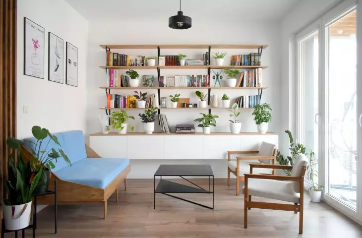
In the living room, attention is drawn to a wall full of posters and books
© Janusz Patalas-Poślednicki, Magdalena Sobanska
Author posters and a wall full of books
Entering the apartment, attention is drawn to the wall with Janek' s author posters, depicting musicals that can be seen on the boards of Polish musical theaters. In the bright, light-filled living room, the eye is caught by a sofa with distinctive legs, upholstered in specially selected blue velvet. Next to it, there is a black metal coffee table and refurbished original Polish armchairs from the communist era. The wood of the armchairs was stained with the same wax as the sofa and the openwork boards of the hallway, and the fabric of the seats was replaced with white.
A wooden shelf full of books and plants
© Janusz Patalas-Poślednicki, Magdalena Sobanska
The main element of the living room is a wooden shelf full of books and plants supported by black steel supports. The central place is occupied by a turntable along with a collection of vinyl records. Characteristic black round lamps with open shades are a recurring element of the entire apartment. In addition to posters, minimalist black flowerbeds with a light geometric form appeared on the walls.
Kitchenette with blue refrigerator and geometric flowerbeds
© Janusz Patalas-Poślednicki, Magdalena Sobanska
white kitchenette and blue refrigerator
The kitchen ette was to become a background for the living room. The white cabinets with pulls blend into the wall, and thanks to the grille, they form a single plane, facing the chimney. The main color accent of the kitchen is the blue refrigerator. In the dining area appeared a folding round table with four chairs with a bent back, supported by thin black legs. Uniform flooring in the kitchen and living room ties the space together and enlarges it optically.
The bedroom features a long work surface
© Janusz Patalas-Poślednicki, Magdalena Sobanska
bedroom / workspace
A small room of ten square meters was turned by the designers into a bedroom with a separate space for office work. In addition to a double bed, there is a white minimalist dresser and a circular mirror with a black thin frame. A three-meter-high tabletop, supported by a dresser, occupies the entire space along the wall and is used by Magda and Janek for working, designing and drawing. Above it, inspiration boards hang on the walls, with space for art accessories.
The apartment is dominated by white and accents of black
© Janusz Patalas-Poślednicki, Magdalena Sobanska
bright bathroom
The bright bathroom was intended to become a place that was easy to keep clean, and not to differ in style from the rest of the apartment. On the walls there were wide, white satin ceramic tiles with a thin black grout. The division of the tiles corresponds to the functional division of the space. The place originally intended for a bathtub was taken by a large walk-in cabin with a black rim around the glass. A similar detail was given to the countertop washbasin. The apartment's assumption of consistency was maintained by using the same countertop in the bathroom and bedroom, as well as identical round mirrors. On the bathroom floor, the designers used light gray tiles with a rubbed texture.
inspiration board with space for art accessories
© Janusz Patalas-Poślednicki, Magdalena Sobanska
conversation with architect Janusz Patalas-Poślednicki
Dobrawa Bies: Is designing for yourself different from designing for commission?
Janusz Patalas-Poślednicki: Definitely yes. I noticed the biggest difference in the design process itself. In designing for yourself, you are not limited by timeframes and client guidelines. This provides a lot of freedom, but at the same time, you constantly feel like improving an element and it's hard to consider it finished. Even during the actual implementation, changes arise that were not thought of during the execution of the project. The biggest difference, however, is the simultaneous view of design from both the designer's side and the user's side, and the attempt to reconcile the practical aspect with the artistic vision.
The designers wanted to create a coherent, bright interior
© Janusz Patalas-Poślednicki, Magdalena Sobanska
Dobrawa: What were the assumptions and design inspirations? Did you manage to achieve all of them?
Janusz: We wanted to create a cohesive, bright interior that suits both of us and shows our shared passions for the musical, art and books. Given that the apartment is located in the city, in a compact development, we wanted to catch as much light as possible. It was important to us that when we returned to the apartment we would be able to calm down from the noise, hence the simple, minimalist character without excess colors and complicated forms. I think we achieved what was most important to us.
The form of furniture and accessories was to be simple and geometric
© Janusz Patalas-Poślednicki, Magdalena Sobanska
Dobrawa: What is your method for a coherent and spacious interior?
Janusz: First of all, sticking to the initial assumptions. It was important to avoid an excess of forms, materials and colors. We started by defining a color palette, which we limited to four colors. The dominant color is white and wood, the details are in black. It was a priority for us to have all the wooden elements in the same shade. The added color accent is blue. The very form of furniture and accessories was also to be as simple and geometric as possible. It was important to us that the apartment be uniform, regardless of the room. We tried to achieve the spaciousness of the interior by using bright colors and introducing as much light as possible. We avoided introducing unnecessary decorations, and utility items were buried.
The author's posters appear throughout the apartment
© Janusz Patalas-Poślednicki, Magdalena Sobanska
Dobrawa: The biggest challenge and source of pride is?
Janusz: To select out of thousands of products those that will harmonize with each other. We reached for both furniture from Polish designers, things found in the attic (which we refurbished) and items from popular chain stores. When decorating the apartment, we didn't have a very large budget, but we managed to create an interior that we feel good in.
Dobrawa: Thank you for the interview.
