Interior architects from the BAJERSOKÓŁ team tried to create a modern interior, while creating an atmosphere of domestic warmth. Dark Brown is a realization trying to combine elegance and minimalism.
vision
Work on the design and finishing of the apartment took almost three years. This was primarily due to the determination of a specific vision of the investor. Such a long period allowed to develop compromise solutions and practical verification of the vision.
The client's expectations were simple, though not easy to implement. It was to be modern, but warm, minimalist, but with great attention to detail. There was no room for randomness," says architect Pawel Sokol of the BAJERSOKÓŁ team studio about the design process and cooperation.
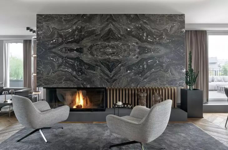
living room with a fireplace
Photo by Tom Kurek, © Bajersokół
apartment building
The apartment is located in a renowned district of Krakow. It has been divided into two parts. The upper one was arranged for a living function, while the lower one was arranged for a night function. In order to create living space, the client bought additional space from a neighbor, which was used to arrange a comfortable room with a bathroom for the investor's teenage son.
There are two entrances to the apartment, which allows guests to come directly to the living area, without going through the hosts' private rooms. On the upper level, the living room, kitchens and dining rooms were located. An internal staircase made of black panels connected at an angle of forty-five steps was placed in the room.
Living room overlooking the dining rooms
Photo by Tom Kurek, © Bajersokół
living room
The dominant point in the living room space is a magnificent, over a meter wide fireplace with glazing. It was clad in satin marble. The color scheme of the interior was dominated by grays, beiges and browns. The floor was made of darkened boards arranged in a herringbone pattern.
The problem of the living room, located on the top floor, is the heat, which is troublesome there in the summer. The wall, which was initially intended to be just a display of graphics and paintings, cleverly hid the air-conditioning system. It also became a decorative bar for glassware and spirits near the dining room. There are more such unusual solutions in the apartment," reveals Pawel Sokol.
staircase
Photo by Tom Kurek, © Byersokół
Bedroom and bathroom
The bedroom was combined with a bathroom and a dressing room. The design did not include walls dividing these rooms. They were eventually separated by wooden slats supported by a steel substructure supporting heavy stone basins. A similar solution was used in the living room, where a wall composed of wooden slats acts as a screen separating the rest area from the entrance hall.
climate
In this project it is important to note the repetition of materials. Wooden laths were used in most spaces, which helped to create a consistent character of the apartment. It is complemented by the choice of colors - limited to hues of gray. The spaces are open and bright - far from being sumptuous, the interiors create a calm and friendly place.
bedroom
Photo by Tom Kurek, © Bajersokół
