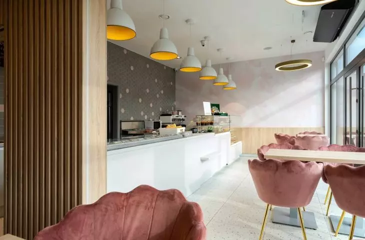
Ice Cream Parlor Zak has been operating in Osielsk continuously since 1956, offering customers not only frozen treats, but also all kinds of sweets and baked goods. Recently, the owners turned to architects GRID Studio Projektowe to create a new premises - an interior as light and pleasant as a pink cloud!
The ice cream shop is located in Osielsk
Photo: Szymon Konik © GRID Studio Projektowe
The architects began the design of the premises measuring 65 square meters by creating a set of inspirations, and so pink became the dominant color in the ice cream shop. The clouds on the wallpaper and one of the walls are pink, while the hexagonal tiles, distinguished between the gray ones, shine with pink. At the tables you can sit in pink velvet-covered chairs. Even the ceiling in the bathroom is pink.
In addition, in the interior, the architects used light wood, broken white and soft gray in the form of built-in furniture and accessories.
Gold accents shine against a background of powder pink and terazzo tiles
photo: Szymon Konik © GRID Studio Projektowe
A row of lamps illuminating the display adds agolden accent over the counters, while shimmering golden circles of lamps hung at different heights over the consumption area. The terrazzo tile floor, meanwhile, is reminiscent of ice sprinkles in its pattern. The architects also designed a new logo for the ice cream shop, making the whole aesthetically consistent.
consumption zone and projection of the ice cream shop
Photo: Szymon Konik © GRID Studio Projektowe
Dobrawa Bies: Ubiquitous powder pink, gold accessories, patterned wallpaper. How do you design such a space?
GRID Design Studio: Designing the premises, where all shades of powder pink are present, was very much to our liking. When the investor approached us to design the interior of the ice cream shop and specified his requirements, we were very happy. We hire different designers in the team and assign them to individual projects according to their predispositions and stylistic preferences matching the investor's expectations.
Dobrawa: What was the main inspiration? Did the investor set any specific requirements?
GRID Design Studio: Agreeing with the investor on the details of the project, such phrases as lightness, sky, sweet clouds, nice, pink, gold, cozy were mentioned during discussions. For us, these phrases became an inspiration and signpost when designing and choosing finishing materials and accessories.
The architects took care of every detail
Photo: Szymon Konik © GRID Design Studio
Dobrawa: What kind of atmosphere did you want to achieve by choosing such materials and colors?
GRID Studio Design: The investor expected us to design an establishment that would primarily attract women, mothers with children. Such specific requirements helped us focus on selecting materials and colors that would appeal to this group of customers first. At the same time, through the appropriate selection of finishes, we did not want to scare away other customers.
The authors believe that designing public interiors gives more freedom
© GRID Design Studio
Dobrawa: How does public interior design differ from private interior design? Does it allow for more freedom?
GRID Design Studio: Designing public interiors, in our opinion, definitely allows for more freedom. First of all, because we take into account the needs of the customers of the ice cream shop, rather than the personal requirements of the investor, when designing the interior. In addition, by design, the purpose of the premises, in addition to fulfilling practical functions related to the sale of the product, is to stand out, to surprise, to attract customers to spend pleasant moments in an attractive interior.
Dobrawa: Thank you for the interview.
