"Quadruplets" - In 1961 it was they who carried the honorable title of Mister Wroclaw. The four point-blocks designed by Konrad Jarodzki (who many years later founded the Archicom design office) located along Pilsudski Street in Wroclaw, the section delineated after the war between Legion Square and Orląt Lwowskich Square, were a novelty at the time - built quickly and cheaply, thebuilt quickly and cheaply, the premise was distinguished by relaxed development, a retreat into the plot, decorative loggias decorated with vertical ribbing, which emphasized the half-story jump in the structure, and the top floors with comb-shaped windows that provided atmospheric light to the artists' studios located on the top floors.
A view of part of the blocks of flats at Piłsudskiego Street in Wrocław
photo: S. Arczyński | source: fotopolska.eu
It was at the very top of one of the point blocks, in an apartment that was originally an artist's studio, that Angelika Fedorczuk of the JASNO studio designed an interior that, as she says, is eclectic and flexible - it can change with the needs and dreams of the owners. Angelika Fedorczuk talks about the palm tree that has adorned the space for years, the challenges of renovating a secondary market apartment and the influence of 1960s architecture on the interior design.
Ola Kloc: What was the investor's priority?
Angelika Fedorczuk: The investor emphasized from the beginning that the apartment would be intended for rental, but in the future she would like to live in it herself. So the main goal was to focus on functionality. Two bedrooms and a sofa bed in the living room were mandatory. In addition, we also depended on a large common area, where daily life was to take place. A large dining table and an open kitchen with an island were also priorities. And a palm tree. The palm tree was still in the apartment with the previous residents, and they decided to gift it to the new owner.
floor plan of the apartment after remodeling
© JASNO
Ola: The apartment is located on the top floor of the post-war point-blocks designed by Konrad Jarodzki, where studios for artists were originally planned. Did the 1960s interiors require functional changes? What kind of changes?
Angelika: When I first entered this interior, I had to pass through a dark corridor of small size before I saw the living room, only to find myself in the sun-drenched living area. There, in turn, a bookcase occupying an entire wall with stairs - a mezzanine library - awaited me. It was charming, but unfortunately non-functional. It dominated the space of the apartment and takes up a lot of space. The kitchen was also a problem, which, although partially open to the living room, turned out to be too small and non-functional. The bathroom was a similar challenge. So we decided with the investor to demolish the walls in the bathroom and put them up from scratch, and remove the wall between the kitchen and the hallway.
This enlarged the kitchen, and by adding a window between the two rooms, the hallway was flooded with daylight. By far, these changes were the most significant. Then there's the bookcase.... was also demolished, allowing us to gain more space.
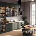
Left: in the new layout, the kitchen is connected to the living room; right: the kitchen
Photo: Bartłomiej Rąkowski
Ola: How did the architecture of the building influence the interior design?
Angelika: The buildings on Pilsudski Street designed by Konrad Jarodzki are distinguished by the fact that their top floors received characteristic large windows, arranged at an angle. It is these that give character to the entire interior. Originally the window frames were wooden, but unfortunately no longer salvageable, so we had to replace them. However, in order to preserve the old charm, I left a piece of them, namely the frames, and highlighted them with blue color.
The wall with a row of windows received a different color, just to emphasize them. Originally in the design we wanted to put a sofa there, but at the last minute we decided to put a table there, which was a fantastic idea. I think the food tastes better with such big windows.
Left: large, angled windows distinguish this interior; right: lounge area
Photo: Bartłomiej Rąkowski
Ola: The leading color of the interior is deep navy blue, what influenced such a choice of colors, materials and textures?
Angelika: The apartment used to be an artist's studio, which I kept in mind all the time while designing. I wanted it to be a mixture of patterns and colors. The design features colorful tiles, rattan, wood, metal and different colors of walls and furniture. It was meant to be eclectic. The new owner of the apartment loves to travel and has an excellent eye for second-hand finds. In the interior appeared hockers from a sale after the liquidation of one of Wroclaw's cafes, a sofa found on Olx and a rug brought from Morocco. All this together creates the character of the interior, it is cozy. I don't like strictly planned interiors, where later we are afraid to add something from ourselves. The apartment should be flexible, just as our lives change, the interior changes over time. Memorabilia brought from travels, paintings, photos appear. I wouldn't be able to live in an interior that doesn't adapt to me, and I try to show this in my designs as well. The color blue itself is just (contrary to appearances) very often chosen by investors who want a bolder interior. I also like this color very much myself.
Left: hockers the investor bought at a sale after the liquidation of one of Wrocław's cafes; right: interior detail
Photo: Bartłomiej Rąkowski
Ola: What was the most difficult part of the project, and what are you most satisfied with?
Angelika: The most difficult part was the renovation itself and bringing the interior to "developer" condition. Apartments from the secondary market have it that when we buy them, we think, it won't be that bad. Then it often turns out that there are quite a few things that go wrong. In this case, after demolishing one of the walls, the other collapsed as well. The ceilings on the mezzanine were also due for improvement. It turned out that there was more renovation work than we expected. It was stressful, because then you can't really plan much, everything happens at the same time, and the project constantly needs some changes. However, it was worth it. I am happy with the project. When we came to the apartment already for the photo shoot, I thought to myself that I could live like this.
Ola: Thank you for the interview.


