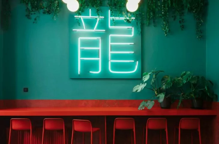
Dragon Box, a small establishment on Piotra Skargi street in Wroclaw serving Asian dishes - on-site and take-out - has recently undergone a total metamorphosis under the watchful eye of Klaudia Utracik, Paulina Sobczyk and Paulina Wolniak, designers from the klu studio. As a result, the modestly sized interior is filled with saturated colors and varied textures, and the whole thing is illuminated by neon lights, as if at a street food fair operating at night.
left: an openwork wall separating the kitchen from the customer area; right: red accents in the interior
photo: almond studio
The background for the interior design of the premises is a green coating covering the ceiling, walls and floor. The same intense color is used for the counter, which is decorated with a neon sign with the restaurant's logo. Elements of the interior furnishings - intense red chairs, countertops, radiators, as well as an openwork, geometric design of lamps and a wall separating the kitchen from the customer area - are inscribed in this green box. The whole is illuminated by round lamps and neon signs.
Ola Kloc: In the design of the restaurant with Asian cuisine you relied on two intense colors - from the floor to the ceiling reigns turquoise green juxtaposed with equipment and accessories in a juicy red shade. What influenced such a choice and color combination?
Klaudia Utracik: The method of trial and error. We wanted to propose two strong colors and these two eventually won out. The strength of this design is the contrast. An important element, in addition to red and green, is the lighting, which complements the two-color whole. The investors wanted to refer to the night streetfood, so neon lights appeared in the interior.
left: interior of Dragon Box restaurant; right: red chairs
photo: almond studio
Ola: The area of the premises is small, how did you functionally solve the space you found?
Klaudia: Yes it is true, the area is small. A considerable number of customers order takeaway, so we created a zone for comfortable waiting for a box. The tables are modular, we can put them together at will and sit comfortably in a larger group. Investors wanted a hungry person not to feel uncomfortable coming alone. That's why the part with hockers appeared, where we can sit facing the window.
Ola: The project involved the renovation of an existing establishment, what were the challenges involved? What was the most difficult part of it?
Klaudia: The scope of work was considerable. The most difficult thing is usually to incorporate the found elements into the project. Fortunately, here the investors were not attached to anything. We started the renovation with a concrete demolition. The electrical system, the floor and all the fixtures were replaced.
left: turquoise green reigns from floor to ceiling; right: neon lights illuminate the interior
photo: almond studio
Ola: What was the priority for the investors, and what effect did you want to achieve as interior designers?
Klaudia: An effect that cannot be passed by indifferently! We wanted the décor to be deeply memorable upon entering the premises, even for a moment, to pick up an order. And I think we succeeded.
Ola: Thank you for the interview!


