Residents of the Szerokie district of Lublin have not had an adequate cultural and educational institution since the 1950s. Finally, after many years, they lived to see a branch of the Municipal Public Library that also serves as a neighborhood community center. The Library on the Level project by GK-Atelier is a modern open-space building with multifunctional spaces.
A branch of the Municipal Library in Lublin is an open space type space
photo: Piotr Arnoldes
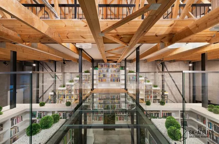
The design of GK-Atelier was to create an open, modern and bright space with soft loft elements. In the library, the architects arranged many modern functions to integrate the local community. Here you can find a space with computer workstations, a room with audio books, a projection zone and children's corners hidden inside bookcases. The mission of the Library on the Level is to disenchant the stereotypical view of the library and prove that such centers can be innovative and effectively follow the expectations of modern users.
Library on the Level, first floor plan
© GK-Atelier Grzegorz Kloda
Library on the Level
Library on the Level is a unique project for many reasons. Among others, because of the ease and time in which the concept was developed. In fact, a fairly concrete vision was born on the first visit to the premises. Even then, the library director and I agreed that the roof truss had to be uncovered, the library would be open space without introducing divisions with walls, and we initially discussed additional functions of the future premises. In my mind the idea of a bright, somewhat sterile interior broken by the color of books appeared. After receiving standard investor guidelines, including the number of books, audiobooks or computer stations, we got down to designing. After a month, the concept was ready. Knowing how strongly innovative the project was, I went to the presentation in Lublin full of anxiety. It turned out that completely unnecessarily. The design and the name were received with great enthusiasm and without a single amendment. In this particular case, the investor's clear guidelines and clear vision meant that the goal was achieved in no time at all without looking for inspiration," says Grzegorz Kloda.
The library is characterized by an exposed roof truss and mezzanine floors
photo: Piotr Arnoldes
Today's libraries need multifunctional spaces, that is, spaces that have the ability to adapt as needed. Knowing this, the architects tried to arrange the interior in such a way that it offers the possibility of free and unrestricted use. Such a place allows the creative team of librarians to tailor library activities to the needs of increasingly demanding users. For readers who value peace and seclusion, recesses in the bookcases with individual seats were created.
The architects have hidden recesses in the bookcases with seats and spaces for children
photo: Piotr Arnoldes
bookcases-stairs
The library's interior also includes two, thoughtfully designed mezzanines. The challenge for the designers was the small space they had to use for the needed library functions.
When we analyzed the investor's expectations and confronted them with the available space on the premises, it quickly became clear that it was simply too small. We could either give up and give up some of the functions or try to create additional space. During one of the many conversations, an idea came up: what if we could walk around the shelves? We quickly set about to see if our idea had merit. We checked the height and it was OK! - says architect Grzegorz Kloda.
Library on the Level is also a lot of unusual solutions
Photo: Piotr Arnoldes
This led to the creation of bookcase-stairs. The architects spaced them wider than usual, such that they created passageways and additional usable spaces. In this way, it was even possible to separate a room for listening to audiobooks. A special structure in the form of brackets and trusses, hidden between the bookcases, is necessary to make the bookcase space safe. The upper part of the finish of the bookcases forms the floor and partly a large pot filled with gravel and artificial plants.
A special space has been set aside for listening to audiobooks
photo: Piotr Arnoldes
hidden mezzanine
Nevertheless, the space was still lacking. Then we analyzed the construction of the prefabricated roof truss. It turned out that we could successfully place a mezzanine there. Unfortunately, two problems arose: first, the truss was not prepared for the load of the mezzanine, and second, we did not have space for the stairs leading to such a high mezzanine, says chief architect GK-Atelier
Library on the Level, mezzanine floor plan
© GK-Atelier Grzegorz Kloda
The architects once again redesigned the bookcases so that they could serve as safe and aesthetically pleasing stairs, in which they placed small niches for children. In addition, they created a steel structure extending above the lower belt of the roof truss, which gives a slightly industrial atmosphere to the interiors. On such a structure they hid a high mezzanine, which can be accessed by climbing up the bookcases. Someone who enters the library only for a moment, may not even notice the mezzanine hidden high under the roof. while from above there is a beautiful and inspiring view of the entire library.
The high mezzanine is occupied by a multimedia space
photo: Piotr Arnoldes
filet moss and interesting details
Detail was also an important aspect of the project. It is no coincidence that the railings of the stairs and mezzanine are glass. The architects wanted them not to be a visual barrier in the space, but only a protection. The structure of the building itself is also an impressive detail - a reworked roof truss, which gives the interiors a pleasant rhythm and, from a certain perspective, even introduces dynamics. Greenery, even artificial greenery, is also a graceful detail, as it provided an opportunity to be used in the demanding environment of the library. The introduction of artificial greenery allowed the architects to come up with non-standard forms, shapes and colors. Here we can find green balls, purple moss and leafy inserts between the books.
On the mezzanine the decorative function is performed by artificial moss
Photo: Piotr Arnoldes
Despite the fact that three years have passed since the opening, I am constantly invited by the library community (including at the invitation of the Polish Librarians Association) to various conferences and webinars such as "Library of the 21st century - modern architecture, functional equipment, ingenious arrangements" to talk about the Library on the Level as a library that respects its traditional aspect while opening up to new functionalities and new needs of the modern reader. The invented name of the library refers to the levels created by the use of mezzanines and consciously introduces a certain ambiguity that suggests the modern character of the branch," concludes Grzegorz Kloda.
Purple moss is a color accent and a space for children
Photo: Piotr Arnoldes
The Library on the Level received a nomination and second place in the vote of Internet users in the 2018 Polish Architecture XXL poll, as well as an award in the 2020 International Property Awards.
Grzegorz Kloda is also the author of BIOTEKA , a library full of greenery and natural materials, which has been in operation since January 2021, created with sustainability in mind.


