Architecture has gone beyond utilitarianism. Four walls are not enough to make us feel at home, and an ill-conceived urban plaza scares us with emptiness. However, there are places and buildings where we want to stay, attracting us by some invisible force, a unique energy, the source of which lies in a design that takes into account the emotions of future users.
The term architectural psychology has been around since the end of the 19th century, but treatments by which the emotions of viewers and users of buildings were influenced by their form have been part of design for centuries. The flagship example of this type of approach is the sacred architecture of medieval Gothic. The soaring grandeur of the cathedrals, the high vaults, the smoky stained glass light, the mysterious twilight, are a set of deliberate procedures used by designers of the time. On the other hand, the buildings of minimalist modernism, with their simplicity of form and colorful restraint, were intended to heighten the sense of order, tranquility and order.
The foundation of architecture is science, but quality buildings are always a combination of technical thought with art, a certain artistry and knowledge drawn from psychology and sociology precisely. Through the structure and type of materials used, the scale and size of individual building elements or the choice of color schemes, architects can evoke specific emotions and influence the way we perceive their final work.
architecture after hours
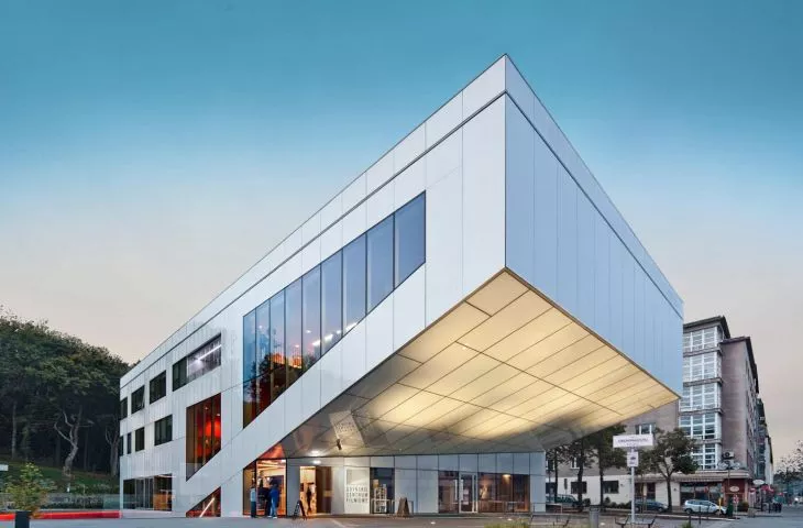
Museums, theaters, cultural centers, hotels or city squares - where we spend our leisure time is often determined precisely by the emotions a place evokes in us. Architects from Arch-Decoknew this when working on the concept for the Gdynia Film School building and the new look of the surrounding Grunwaldzki Square. The entire area was designed as a modern urban living room. Ubiquitous, but kept in a minimalist order, the greenery contrasted with the white body of the building catches the eye and makes the passer-by stop, if only for a moment. The well-thought-out spatial composition - including the undercutting of the block on the first floor, inviting pedestrians into the square - means that the place is always full of people on sunny days.
Gdynia Film Center at Grunwaldzki Square
© FPFF Gdynia
The building itself is a separate story, "written," as the creators say, almost like a movie script. The building's bright glass facade is broken by the red of the outdoor, terraced staircase used for seating, with a southern exposure. The choice of color is a reference to the favorite hue of the world of film festivals and galas and the red carpet. Anyway, the color also runs through the center's interiors: on the staircase or in the cinema halls.
Our intention was to gently blend the center's headquarters into the landscape of the modernist city," explains Zbigniew Reszka, president of Arch-Deco. - However, as one approaches the building, the red accents begin to reveal its second nature, sparking curiosity. The color works more and more intensely with each step, to reach its greatest strength inside the cinema halls. The perception of the building planned in this way was inspired by a classic movie script, which builds a broader narrative at the beginning and introduces tension, heading towards the final scene, Zbigniew Reszka adds.
Free time is almost sacred these days. We don't want to waste it by staying in poorly designed buildings and places that don't evoke positive emotions in us. This phenomenon is very clearly illustrated by the trend of more and more beautiful, interesting and better thought-out hotel interiors.
Kamil Kowalik of Iliard Architecture & Project Management, a studio largely involved in hotel design, says:
Every person is different, and in hotel interiors everyone should be able to spend their time the way they like. It's a cliché, but it's also a basic principle of designing these facilities. As designers, we need to provide opportunities to use hotel spaces in different ways, depending on habits and individual tastes.
He cites the Gwiazda Morza hotel in the seaside town of Władysławowo as an example of such a design approach.
Gwiazda Morza, design: Iliard
All the interiors in it have been designed so that the guest can comfortably enjoy the attractions of the hotel itself, as well as its location, and feel relaxed during their vacation. There is free-standing furniture - armchairs, pouffes or tables, which have different finishes and materials. With this treatment, we achieved the effect of intended chaos. Guests can freely adjust the configuration of certain elements to their own needs and tastes. This possibility makes us feel at home, like at home," says Kamil Kowalik.


