Work submitted for the competition
"Best Interior Diploma 2020/2022".
The project for the bookstore and art reading room envisages the development of the interior of a tenement house at 28 Marcinkowskiego Avenue in Poznań and covers two floors of the building: the first floor (bookstore) and the first floor (reading room). In the past, the tenement housed a cinema, a discussion club or an art gallery.
The neighborhood is often visited by tourists due to its proximity to the Old Market Square. Also in the neighborhood are the National Museum, the Raczynski Library or the University of Arts. Thus, the character of the place was partly dictated by the already existing institutions nearby, the history of the building and the observed needs of people staying in this part of the city. The bookstore together with the reading room become an oasis of calm in a lively, busy neighborhood.
To responsibly and effectively serve users, the space was thoughtfully tailored to its function. Analysis of data collected by the National Library, book market research or studies on the effects of the immediate environment on focus and concentration proved helpful here.
A bookstore profiled for art would serve to promote it and emphasize its value in society
© Joanna Kulpa
A bookstore profiled for art would serve to promote it and emphasize its value in society. I paid special attention to the display of books on furniture, shifting customers' attention from the spines of books to their covers. This emphasizes their artistic value and treats them as separate works of such techniques as photography, typography, graphic design or even bookbinding. This is also helped by the use of classic and uniform materials, which become a background that compliments the products on display.
The combination of white and naturally colored wood is broken by shiny gold elements
© Joanna Kulpa
The combination of white and wood with natural coloration is broken with shiny golden elements. Soft, warm lighting and natural fabrics add to the cozy atmosphere. All furniture was individually designed to focus on the unusual way of displaying the product.
There is a bookstore on the patera and reading rooms on the first floor
© Joanna Kulpa
Part of the space on the first floor can be transformed into a venue for lectures, meetings with authors or other events. The sofas, bench and armchairs can be easily rearranged, and together with the seats on the windowsill and the chairs hidden in the bookcase standing next to it, create more than thirty seats.
The bookstore also has space for used books
© Joanna Kulpa
The bookstore also has space for used books in good condition, which can be left here, for example, in exchange for a discount on bookstore purchases. In addition to the retail area, the first floor also has space available for employees - a warehouse and a social room.
The reading room space has been divided into zones
© Joanna Kulpa
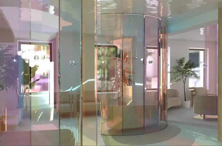
The reading room is a place that helps focus and stimulates the mind to work. The space was divided into zones to prevent visitors from disturbing each other. To create the divisions, I used colorful, transparent acrylic panels, which delineate the zones much more delicately and subtly than regular walls, allowing the interior to remain spacious.
There is also a small bar on the first floor
© Joanna Kulpa
The first floor also features a small bar with hot drinks and snacks, as well as men's and women's restrooms. Also convenient for visitors are two closets hidden behind sliding doors for outerwear or larger luggage.
To create the divisions, the author used colorful, transparent acrylic panels
© Joanna Kulpa
In designing the interior space, I was accompanied by the slogan "shifts". I treated them as a bonding element of the interior architecture of the entire building and tried to weave them into the details of the designed buildings and furniture. Parallel shifts can be seen in the layout of tables, free-standing bookcases, the layout of the upstairs bar, the forms of ceiling and wall light fixtures, the composition of bookshelves or the lights on the walls and ceilings.
The reading room is a place to help focus and stimulate the mind to work
© Joanna Kulpa
The entire interior was transformed to meet building standards and standard ergonomic principles. Various solutions were applied, trying to respond to the needs of as many people as possible, so that the interior would be a space that is as versatile as possible without losing its unique character. The result was a project that fulfills many tasks and combines several functions that compose into a coherent whole.
Joanna Kulpa
Illustrations: © Author
