Work submitted for the competition
"Best Interior Diploma 2021/2023".
The diploma project concerns the interior design of an existing hotel. The facility is located in Jastrzębie-Zdrój, a mining town today, but a spa town in the 1860s. The Dabrowka complex is located in the heart of the former spa; the designed resort was planned in a newly constructed building, which with its architecture refers to the existing buildings. The main idea was to create a resort that would be a place to relax, allowing you to get away from the reality of the gray city, and at the same time serve as a showcase for the natural cosmetics brand Uzdrovisco.
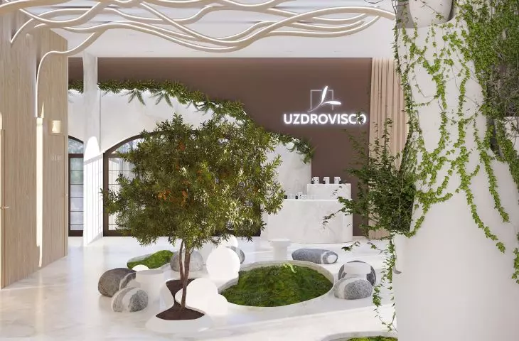
design of the resort in Jastrzębie-Zdrój, entrance area
© Natalia Piksa
The brand's premise is based on natural care, referring to the idea of slow care, and various plants and herbs are used in the production of cosmetics. The idea of the brand coincides with the idea of the project. My goal was to create a space in which an important element is communing with nature, feeling it, without having to go to greener areas of the country, requiring a longer journey.
The concept includes the design of the first floor and the first floor
© Natalia Piksa
The concept includes the design of the first floor and the first floor. The whole can be divided into zones: 0.1 - entrance and reception area; 0.2 - conference room; 0.3 - bar and restaurant; 1.1 - relaxation area connected to the circulation path; 1.2 - double suite, with accommodation for four people; 1.3 - double suite. Each of the zones has a distinctive element. The interior design is inspired by organic architecture, which is based on analogy with nature, plastic and fluid formation of forms, biomorphicity.
Entering the building, we are transported by thoughts to the forest, to a green clearing
© Natalia Piksa
Entering the object, we move with our thoughts to the forest, to a green glade. This is caused by a group of "green carpets", which takes center stage in the entrance area. The author's shape is cut into the quartz sinter flooring. By raising the floor, the resulting niches can accommodate an installation that acts as a green carpet. The whole design is based on Unitika's innovative Terramac® fabric.
The author designed columns made of plaster casts and a wall of water
© Natalia Piksa
Another element that introduces a piece of nature is a pot embedded in the floor, designed for sea buckthorn shrubs. The shrub refers to the Uzdrovisco brand - it is one of the ingredients used in its cosmetics. We are also transported to the world of nature by a wall of water, mounted on a glass wall separating the entrance area from the conference room.
Another element worth noting are the author's columns made of plaster casts. They have irregular shapes and holes for pots of ivy that creep upwards, giving the interior a unique atmosphere.
The restaurant zone to the garden placed on the ceiling
© Natalia Piksa
The restaurant zone impresses with a green garden on the ceiling, it is about 60 square meters. The ceiling is made of panels on which compositions of stabilized plants are mounted. These are live plants, which maintain a fresh and natural appearance thanks to maintenance.
The relaxation zone is distinguished by the author's wall design
© Natalia Piksa
The relaxation zone, already located on the first floor, is distinguished by an almost eight-meter-long author's wall design, in which an opening of an organic shape filled with stabilized moss was made. The zone is kept in a minimalist style, so that the main role is played by this wall. To connect this zone stylistically with the rest of the building, there was a repetition of the author's columns.
In the apartments, compositions of stabilized and natural plants have been planned
© Natalia Piksa
Compositions of stabilized and natural plants were planned in the apartments: a ceiling of stabilized plants, a vertical garden or an openwork partition overgrown with ivy architecturally complement the interior. They provide an opportunity to commune with nature and plants during daily activities. They support a time of contemplation and relaxation.
The design is kept in earthy colors
© Natalia Piksa
The project is kept in earthy colors. The main motif is bottle green combined with quartz sinter, colorfully inspired by alabaster. The whole is complemented by shades of beige, brown and oak elements, while a brass detail emphasizes the subtlety of the materials and adds elegance. The entire interior is based on the use of plants in an original way - so that they become an integral part of the interior architecture. The surrounding area of the building complements the design of the arrangement and allows you to move to nature in the center of the city.
Natalia PIKSA
Illustrations: © Author


