The work submitted for the competition
"Best Diploma Architecture"
The subject of this study is the adaptation of the park of an abbey located in Goleto, in the central Italian region of Campania, in the province of Avellino, into an art pavilion with a projected additional museum function.
The abbey at Goleto is a little-known monument in Italy, being a "casket of faith" and a deeply symbolic site. The abbey grounds are now covered with tall vegetation, and the monastery itself and complementary buildings have been partially restored and rebuilt after the 1980 earthquake.


diagram of the idea of the solid
© Kamila Lorenc-Ptasznik
The project originated from the desire to continue and complement the monastery buildings, to create a kind of dialogue between medieval and baroque architecture. Its idea is to show the new building - the pavilion - as a "mirror image", a complement through the phenomenon of obverse and reverse.
The main goal of the project is to create a space that does not overwhelm the ruins, but interacts with them. The project is intended to improve and expand the services and possibilities of the complex, both for visitors and those living in the area. The designed pavilion is intended to create a clear transition from the entrance gate to the female area of the monastery while preserving as much of the existing greenery as possible. The pavilion brings freshness and innovation to the monastery grounds, while continuing the dialogue of architecture. Thanks to its partial placement underground, it fits into the existing tectonics of the site. With its shape it refers to the layout of the plot and the monastery building above.
situation and first floor plan
© Kamila Lorenc-Ptasznik
The main idea of the project was an attempt to continue and develop the space adequately to the existing buildings. This idea was realized by referring to already existing forms and simultaneously introducing new, non-invasive objects. The introduction of an appropriate function ensured the possibility of developing the place (artistic/educational function). The new facility is intended to ensure the continuity of the development.
One of the goals of the project was to visually enhance the existing buildings of the Abbey of San Guglielmo in Goleto. The designed building would complement the form of the existing buildings while preserving the monastery's dominant features.
{Image@url=https://cdn.architekturaibiznes.pl/upload/galerie/78374/images/original/294bd2c503621dd4bcedef262fabadef.jpg,alt=elewacje west and east,title=west and east elevations}
western and eastern elevations
© Kamila Lorenc-Ptasznik
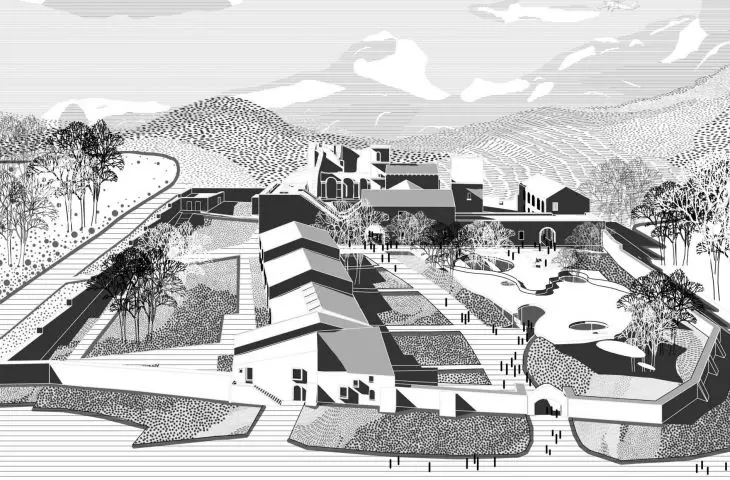
The project site is a polygon built by means of a broken line, with a near trapezoidal shape with its longer base adjacent to the monastery. The plot is characterized by a slope of the land towards the entrance gate (south). At each corner and in the western part of the plot there are valuable clusters of trees.
The concept owes its external form to the shape of the terrain, the desire to preserve the existing greenery, and the symmetrical reflection of the path leading to the male part of the monastery, through which a path to the female part is created. The lump has been leveled with the ground level at the monastery, while at the entrance gate it is slightly raised, which encourages visitors. The roof has been kept in a rectangular plane, the walls holding it have been undercut and rounded, which softens the shape of the pavilion. The materials used in the massing are intended to emphasize the lightness and naturalness of the new architecture; a double-glazing system, cavity walls and a green roof were used.


visualization
© Kamila Lorenc-Ptasznik
The interior form of the pavilion is based on the obverse and reverse of the pattern created on the basis of the monastery's plan. The most distinctive elements were used: the courtyard and the mosaic in the church. Based on these, the layout of the walls was formulated, these shapes created closed zones. Taking advantage of the dominant features of the monastery: the defensive tower, the bell towers and the trees on the plot, cutouts in the pavilion (skylights) were created, which, in addition to natural lighting and various lighting effects, provide a constant view of the monastery, highlighting its significant and interesting elements.


interior visualization
© Kamila Lorenc-Ptasznik
The pavilion was divided by a pathway leading to the female part of the monastery. On the right side the cultural part was designed, on the left - the administrative and storage part. Thanks to such zoning by means of the roof, the height was adjusted to the function the rooms serve. The lowest rooms are the sanitary facilities and the storage area, the highest - the exhibition area. In order to connect the pavilion with the greenery, the sunken elements were glazed and an exit to the roof was provided. Part of the exhibition was planned under an open-air canopy.


