Coworking spaces combine many functions. There must be a place to work and relax, a conference room and a space to stimulate creativity. The Nest office combines all these aspects. But it has another feature that sets it apart from other offices: design. It surrounds the users and makes the boundaries between work and life blur , as intended by the designers at Beza Projekt.
Coworking The Nest is located in a Warsaw office building designed by design studio Grupa 5 Architekci. The sheer uniqueness of the space necessitates an unusual approach to the design of such an interior. Anna Łoskiewicz-Zakrzewska and Zofia Strumiłło-Sukiennik leaders of the project implemented by Beza projekt, together with a team consisting of Ksymena Kucharska, Weronika Jarońska, Katarzyna Sobolewska, Tomasz Korzewski and Krzysztof Benke created a total space, designed in every detail, which at the same time meets the functional expectations of users.
coffee bar
© Jacek Kolodziejski
freelancers
The basic design assumption was to match the character of the designed space with the work model. Who uses coworking spaces? They are mostly freenalners, people who run their own business but work in a light, agile model, or digital nomads who can work anywhere, but occasionally need a haven. In these cases, the line between work and daily life is blurred. The business call is handled over coffee, the predawn hours serve as a break for yoga practice, and emails are answered while lying on the couch. Therefore, The Nest's space combines traditional office forms with more homey ones. Each floor has a slightly different character. Both common spaces, with a casual café feel, and separate offices are available for work. The Nest also has meeting rooms a space designed for larger events and a space for children along with babysitting.
common spaces
© Jacek Kolodziejski
soothing blue
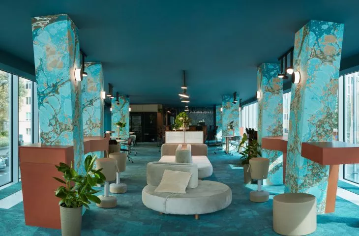
The entire space is kept in blue tones, but these are not fuzzy pastels but distinctive colors. Gold or copper-colored accessories blend well. The consistent use of this color scheme and its tonality promote concentration. An interesting effect was achieved by juxtaposing different materials. Ceramic tiles sit next to simple mdf, creating a surprising juxtaposition. However, the element that attracts the most attention is the marbled wallpaper. These are author's patterns invited by Kasia Korzeniecka. They were applied on the pillars of all floors, which gives the impression of uniformity to the interior. They are ornamental and very decorative, but at the same time the marble pattern has a natural character, which gives them unpretentiousness.
desk with cabinets
© Jacek Kolodziejski
office furniture differently
The space is filled with furniture specially designed for it. The designers thought of two types of furnishings. The first is the furnishing of open spaces. This is modular furniture combining tables and sofas, which can be put together in various combinations. They can be used for both work and relaxation. They also include flower holders. The second type of furniture is office furnishings, with a more traditional character. They consist of desks and cabinets, which can also be freely combined.
table for work or meetings
© Jacek Kolodziejski
total work
The Nest is a total project: from the idea to the smallest detail. The designers and projketants from Beza Projekt also collaborated with Futu, the authors of the brand's visual identity. This resulted in a very cooperative interior that redefines office space.


