What do you associate the 1990s with? Karolina Kulis, born in the 1990s. the designer associates them with a combination of simplicity and strong color, which she used in the interior design of a spacious 100 m² apartment located in one of the buildings in Warsaw's Solec district built by the PAN housing cooperative in the late 1990s.
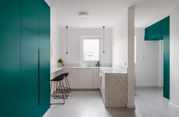
living room with open kitchen
Photo: Hanna Połczyńska | studio chronicles
You can feel the spirit of the old times in the building," writes Karolina Kulis. - Entering the staircase, one immediately sees the contrast between the white walls and the dark gray stone floor. Large glazing in the communicating area provides plenty of light, which allowed the residents to turn them into lush winter gardens, the designer adds.
Most of the apartments in the building are large and spacious, wanting to adapt the designed apartment to the needs of the new owners, Karolina Kulis decided only to make minimal adjustments to the existing walls - enlarging the toilet, removing the lintel in the hallway leading to the bedroom, and setting up a separate laundry room in the large bathroom. The result was a spacious living area - a living room with an open kitchen, two bedrooms and a study.
view from the living room to the study
Photo: Hanna Połczyńska | kroniki studio
Thanks to these procedures, it was possible to create space, save the old parquet floor and avoid large costs, says the designer.
contrasts in the interior
The designer was keen on simplicity in the interior design, which she sought in purity of form and contrasts - a wooden floor of herringbone planks was juxtaposed with aA wooden floor of herringbone planks was juxtaposed with a gray, uniform surface of micro-cement, white walls contrasted with high buildings in an intense green color, and in the bathrooms light gray terrazzo is warmed by ash furniture. The entire interior is tied together by distinctive black elements.
interior details
Photo: Hanna Połczyńska | kroniki studio
Accessories play a big role in the minimalist interior - in the living room there is a Danish chest of drawers from the 1960s, over the table hangs a characteristic Les Acrobates lamp designed by Albin Gras from the 1920s, and in the study there is a vintage chair sophisticated in Warsaw's Praga district.
A characteristic Les Acrobates lamp designed by Albin Gras hangs over the table.
photo: Hanna Połczyńska | kroniki studio
simplicity and strong color
Ola Kloc: What was the priority for the investor?
Karolina Kulis: The investor's priority was to keep the design uniform and use as few materials as possible. Everyone can understand differently what the minimum used means. That's why it's important for a designer to isolate the most important elements at an early stage and combine them into a common whole.
Ola: The apartment is located in a building from the 1990s, what changes in the functional layout did this metamorphosis require?
Karolina: The building was designed in the 1990s and put into use in 2000. The layout of the apartment appealed to the investor and he did not want to change it very much, although this was largely due to the desire to preserve the old parquet floor - it would have been very expensive to reposition it. Nowadays, it's cheaper to take off the old parquet and apply new parquet (of course, this is a generalization). For customers, this was producing unnecessary waste. Ecological aspects often appeared in this project, for example, the old fireplace was replaced with a bio-fireplace - this was a decision worked out with the PAN cooperative on the basis of the amendment of regulations for multi-family buildings larger than four stories. As you know, smog in Polish cities is a big problem, so it's important to think about the socio-ecological consequences of our decisions, even if it's just renovating our own apartment. However, I don't always succeed in persuading clients to go green, I try to meet their expectations and, importantly, the budget they have.
Left: glass door between the study and living room, right: green armchair in the living room
Photo: Hanna Połczyńska | kroniki studio
Ola: In arranging the apartment's minimalist interior, you used vivid, colorful accessories, including cabinets in an intense emerald hue and textures, such as the ornamental glass in the door between the living room and study. Where did you get the idea for such a selection of colors, textures and materials?
Karolina: I'm born in the 1990s, and I've always associated them with a combination of simplicity and strong color. We used to have less choice, but at the same time everything was colorful, such as in the old photographs where our parents wore colorful tracksuits and the background was white walls without much decoration.
