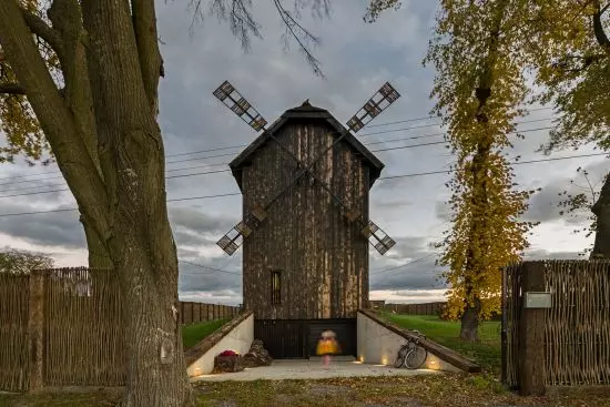
Photos of projects such as this one are viewed with bated breath - unobvious objects often hiding unusual stories, which thanks to the creativity of architects and the courage of investors get a second life and a new function spark the imagination. In front of you is the Windmill House - an old wooden mill, which today, although they no longer had grain, gives a cozy shelter to its new residents.


view from the front
Photo: Rafał Chojnacki Fotografia Architektury
contemporary country house
Seven years ago, the project of two then-students from the Silesian University of Technology, Tomasz Padlo and Michal Kucharski, was awarded in the national stage of the international competition for a contemporary country house - Contemporary House 2014 - Village House. After years and necessary modifications, the competition's idea of a Windmill House in an old mill in the Lublin region was successfully realized.
The creation of this building is a combination of a bold and innovative design idea, technical workshop, as well as the bold approach of the Investor, the authors of the project explain.
The Windmill House fits into the picturesque rural landscape
Photo: Rafał Chojnacki Fotografia Architektury
new program in an old framework
The original design was developed by Michal Kucharski in cooperation with Mateusz Piwowarski and Sylwia Ciesielska - while preserving the picturesque shape of the block, which fits into the rural context, they introduced a new functional and utility program into the interior. They started by creating a new structure - four columns were brought out from the lowest, earth-covered reinforced concrete floor, on which the subsequent levels were supported.
rear elevation
Photo: Rafal Chojnacki Fotografia Architektury
The original vertiginous building on a plan with external dimensions of 6.5 × 6.5 meters was divided into three above-ground floors (living space with a kitchen and reading room on the first floor, andbedrooms with bathrooms on the upper floors) and an additional mezzanine with work space, while a garage, a technical room and a spacious living room were placed underground in the new section.
The 


a garage, technical room and spacious living room have been placed in the new part underground
photo: Rafał Chojnacki Fotografia Architektury
Old elements that were still usable were cleaned and restored. Preserved beams were used in the exterior walls, creating a half-timbering pattern inside . Also inside were the original trestle from the demolished windmill and a historic pile wheel placed in an opening between the top floors.


elevation detail
photo: Rafał Chojnacki Fotografia Architektury
history and modernity
The finishing of the building is a combination of old and new, history and modernity. Planks from the old structure were used on the facade. The new planks were partially tanned by fire, the project's authors say. - In some places the other important material - reinforced concrete - shines through. It is it that "carries" the building and surrounds the embankment created around it. Another is glass. Used most on the first floor, in the underground section and on the mezzanine. This allowed the interior to open up to the surrounding nature and role. In the higher parts of the building, tall vertical windows were used. This treatment allowed them to blend in with the repetitive rhythm of the facade boarding. Wooden shingles were used as roofing. The Investor's interesting idea for fencing the property is the use of old railroad sleepers as span posts, the architects add.


Windmill House
photo: Rafał Chojnacki Fotografia Architektury


