The article is from A&B issue 11|23
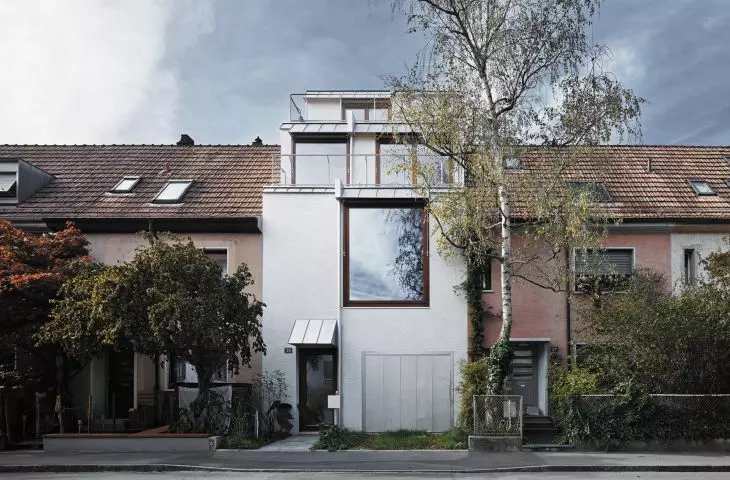
The perspective of the street is defined by a row of small two-story 1920s tile-roofed houses with attics. Among the faded beiges, reds and pinks of the plastered facades, attention is unexpectedly drawn to the pure white and the face of the building coming slightly, nomen omen, out in front.
Furkastrasse 35, Basel, original state, 2020
photo: Valentin Jeck
The door is wide open, the narrow sidewalk leading to the entrance is cluttered with countless pairs of shoes of all sizes: some people take off their shoes, others put them on, someone is constantly going in and out. Inside, guests are everywhere: in the living room, in the kitchen, in the garden, in the office; they peek into the bathrooms and dressing rooms, chat with the hosts, stroke the cats, andthey are especially eager to admire from the attic terraces the view of the neighboring roofs and the vast open space of the inner garden bounded by a quarter of the nearby houses. This unusual influx of visitors interested in architecture took place in May 2023, when, as part of Open House Basel, everyone was able to take a look inside a single-family house designed by XM Architekten that had been completed the previous year: Piotr Brzoza and Daniel Kiss.
Furkastrasse is an inconspicuous side street in Basel's quiet residential Bachletten neighborhood, or more precisely, in its part known as Neubad. Its center is the nearby Neuweilerplatz, where the most active part of life takes place and stores, cafes, services and public transportation stops are located; the star-shaped streets diverging from the square are filled almost exclusively with a variety of low-rise residential buildings. A few streets further west and south are the administrative boundaries of the city of Baselland and begin the suburban towns of the canton of Baselland, such as Binningen and Allschwil, the favorite locations of single-family homes of the wealthier middle class. Neubad, with its mix of dense but low-rise terraced housing and more spacious detached villas, is still a reminder of the neighborhood's historic roots, most of which were built between 1920 and 1940 mainly for less affluent residents, like many of the housing estates and colonies built in Basel after the end of World War I.
view of the facade from the west (garden) side
photo: Valentin Jeck
The starting point for the new design was an existing residential building with typical dimensions of 5.5 meters wide and 8 meters deep, located in the middle of a terraced housing development. The house had not been inhabited or renovated for many years, and its layout reflected the constraints of the historical housing typology: cramped rooms and bedrooms and a bathroom in the basement. In the end, also due to the technical weakness of the workmanship, insufficient sound insulation from neighboring buildings and the possibility of a much better volume, the investor decided to design a new building instead of a reconstruction or expansion. According to the current provisions of the local plan (two-story residential zone), the permitted development is 7 meters wide and 12 meters deep, as well as two stories and a roof with a 45-degree pitch. The architects' premise was to make maximum use of the existing limitations of the plot and the strict regulations to create an urban villa (hence the term Stadthaus/townhouse appears in the project's name) - a comfortable home that is a statement of commitment to city life, while at the same time offering more spacious interiors and a connection to the open space around, which are usually sought in a suburban context.
Garden terrace in the ground floor at kitchen and dining room level
Photo credit: Valentin Jeck
The key to the design is the sectioning and offsetting of the various floors by creating half floors connected by an open flight of stairs. It was from the shaping of the interiors as a set of carefully considered, interconnected spatial volumes that the design process began, with the goal of creating the modern equivalent of a traditional bourgeois house with its panache of classic room layout in place of a cramped and non-functional row house on a small plot. It is no coincidence that Piotr Brzoza mentions Adolf Loos' Raumplan as an inspiration and reference point in his working method. Nothing in this project seems haphazard or superfluous, and everything is tailored to the size and needs of the residents. The connections between levels and floors in the interior and the illumination by large windows open up the space and connect it to the surrounding area: the street, the garden, the city above the rooftops, the sky above Basel. The layout of the rooms on both sides of the house ensures, while maintaining the impression of openness and spaciousness, the comfort of privacy, also provides a varied experience of the interior space, because nothing is automatically repeated here.
mock-up - from the front and from the garden side
Photo: Valentin Jeck
The entrance to the house, unlike in neighboring buildings, is located exactly at street level, adjacent to the garage entrance. From the vestibule, a staircase leads down to the open kitchen with dining room and up to the living room. Both of these levels, facing west, are lit by large windows and glass doors leading from the dining room to the garden terrace. Their space is also linked by a rounded opening in the corner of the living room, sheltered by a steel screen, from which one can peek down into the kitchen. While the kitchen and dining room, by being lowered to ground level, gain a more secluded character with a view of the greenery in the immediate garden, the piano nobile of the raised living room offers a more open perspective on the vast green area located inside the quarter of the houses. From the living room level, a staircase leads to the east side this time. Here is the library and office/workroom, the relatively small space of which is augmented by a huge window overlooking the street, the height of the room, and a clearance in the rounded cutout corner of the floor above (analogous to the clearance between the kitchen and living room). A work table has been installed along its entire length under the window: it is a command center, so to speak, but also a link to the public space of the street and neighboring houses. From the outside, it is the most dominant element of the facade visible to a passerby, framing a slice of the residents' lives against the backdrop of the library, while from the inside it is a vantage point: one can always wave to the letter carrier while working or watch the wanderings of the neighbors' cats. From the studio, a staircase leads again to a mezzanine on the west side to the most private part of the house: a bedroom with a dressing room and bathroom, occupying the second floor. Another mezzanine, meanwhile, leads to the first attic, set back according to regulations from the level below, where there are two more bedrooms with terraces on either side of the building. And finally, the finale: a second, even more set-back attic, with a sauna and terraces opening up to a spectacular view of the countryside, as well as a space ideally suited to accommodate an exercise mat or mattress for an additional guest in the house.
The kitchen with dining room overlooking the garden from the west side
Photo credit: Valentin Jeck
The investor purchased the property just before the pandemic broke out; it took a year to prepare the design and obtain a building permit. Working under pandemic conditions had its positive and negative sides - the architects had more time to think about and work out the details of the design, but the implementation side was much more difficult under conditions of shortages and interruptions in the supply of materials. The house got its own side walls (in the historical layout, the wall was shared by neighboring buildings), thus providing much better sound insulation, which also proved to be an asset in arrangements with neighbors during preparations for construction. A submersible heat pump combined with photovoltaic panels on the roof, an integrated awning system on the windows and robust thermal insulation ensure virtually zero-energy cooling of the building in summer - increasingly important in view of prolonged and intensifying summer heat waves in the city. A similar function is performed by the stone floor in the vestibule, on the stairs and in the dining room connected to the kitchen in the ground floor - travertine provides a pleasant coolness, while visually and materially separating this zone from the rooms above, where the floors are lined with ash planks.
Living room on the second floor level overlooking the garden
photo: Valentin Jeck
The interior is defined by a narrow and clear choice of materials: stone on the floors adjacent to the surrounding grounds, wood floors and stairs above, raw concrete ceilings and built-in bookcases and cabinets. It provides a great backdrop for the strongly present contemporary art on the walls, whose narratives and forms emphasize the home's individual, tailored character and harmonize with its stated commitment to an urban lifestyle.
The front door and staircase connecting the different levels of the house
Photo: Valentin Jeck
The traditional plaster on the facade has been replaced by a more refined Japanese ceramic mosaic, which gives the exterior walls a luminous sheen and an intriguing, decorative and sculptural character, without cutting back on historical materials and techniques. Against this minimalist backdrop, the window frames of brown meranti wood and the garage door and awning covers of silver sheet metal stand out.
When I ask architect Piotr Brzoza about neighbors' reactions to his project, he replies that they are mostly positive, but violent criticism has also happened. This is not surprising in view of the rather monotonous, standard architecture dominating the street's development. At the same time, in Basel, the historical fabric often intermingles with architecture layered over decades to the present, with centuries-old tenements on one side adjacent to modernist blocks and austere concrete facades, and glazed new buildings on the other. Sometimes the changes are hidden behind the historic facade, as in the case of the neighboring building on Furkastrasse, which from the street side does not betray the expansion from the garden. As a rule, however, the streets retain a consistent character due to strict regulations and controls. The XM Architekten project also had to be approved by an architectural and urban planning commission, which not only checked its compliance with regulations, but also how it fit into the local spatial context. The composition of the development, which was not homogeneous at all costs, turned out to be a priority, and the quality of the new architecture, whose distinctiveness emerged as a contemporary interpretation of the surroundings and a contribution to the development of the city, received a positive evaluation.
The clearance between the library and the next floor
Photo: Valentin Jeck
Kaja PAWEŁEK
photo: Valentin Jeck
