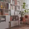
Bright, spacious and well thought-out.... These are the terms that perfectly describe an apartment in a Warsaw tenement from the 1950s, which recently underwent a general metamorphosis. The space is decorated in soft, subdued colors, and plenty of sunlight makes the apartment look much larger.
The apartment is located in a 1950s tenement building on Niepodległości Avenue in Warsaw. Its small area of 45 m² posed an architectural challenge. The design and creative agency Jam Kolektyw, composed of Jola Skóra, Anna Olga Chmielewska and Agnieszka Warnowska, made a metamorphosis of this unusual interior and brought out the potential of the property by increasing its functionality.
Photo: Jola Skóra
Apartment with history
The property, bought a few years ago and furnished with equipment from the 1980s, needed a general overhaul. Designers from Jam Kolektyw proposed two solutions to the investor. The first consisting in refreshing the interior of the apartment while maintaining the old layout of the walls, and the second involving a comprehensive metamorphosis and rearrangement of the rooms. The owner decided on a general renovation. The result of this decision was an interior with a much better layout. Jam Kolektyw made full use of its previous experience in designing and implementing interiors in secondary market apartments and old tenement houses, which resulted in a great final result.
Functional and spacious
The apartment is intended for rental, and the goal of the metamorphosis was to increase the sense of comfort of future tenants. The owner was keen on bringing out the potential of the space, better planning the function of the rooms while maximizing the use of usable space. Thanks to the reconstruction, which included the demolition and relocation of some partition walls, the interior has changed beyond recognition. Previously, there were only two rooms, while thanks to the proportions of the rooms and the arrangement of the windows, the apartment had a much greater arrangement potential.
As a result of the renovation work, three rooms were created from two. A common living area with a kitchen, dining room and lounge area was created, as well as two rooms. Thanks to these improvements, the property can be rented both for residential purposes and as a comfortable, intimate office or co-working space.
Photo: Jola Skóra
The interior has been kept in a light, neutral color palette conducive to tranquility. The dominant color is the white of the walls, while shades of brown, beige and olive green consistently appear in the accessories and furniture. The apartment contains only the necessary, carefully selected furnishings, making this small space seem more spacious. The designers managed to save and refresh the old oak parquet floor, and in the living area, lobby and toilet a micro-cement floor was made.
Bathroom for a medal
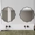
The room that has undergone the biggest metamorphosis is the bathroom. Now it is dominated by white, gray and black, and the whole is kept in a minimalist style. Due to its small size, the design of this interior was not the easiest one, but all the necessary equipment was accommodated here - an elegant toilet, a large sink and a comfortable shower. The washbasin placed on a dark gray, minimalist geometric-shaped cabinet is a strong accent in the room. This is the KOŁO Nova Pro model, which combines functionality with high-end design.
The materials of which the under-sink cabinet is made are resistant to moisture, and the front and body of the furniture are coated with UV-resistant varnish. When selecting furniture for the interiors of rental properties subjected to intensive use, designers pay attention to durability and the materials used. The toilet bowl, suspended on a concealed rack, also comes from the Kolo Nova Pro collection. Its size makes it ideal for a small bathroom. Despite its small size, it does not lose functionality and will ensure high comfort of use. The bowl is made with Rimfree® technology, which, thanks to the removal of the flange, ensures absolute hygiene of use.
Photo: Jola Leather
The minimalist shape of the toilet is matched with a chrome-plated, glossy flush button by Geberit, making the whole look classic and elegant. The button, made of durable plastic, has two flush ranges, which saves water used for flushing. The room has a shower with a cabin with chrome details, and the whole is complemented by a large oval mirror with a thin black frame. Due to the small volume in the bathroom, the washing machine was abandoned, which was placed in a built-in piece of furniture in the hall. This procedure saved valuable space in the bathroom and created a convenient space for the laundry room.
Interior design: JAM KOLEKTYW
Photography: Jola Skóra
Styling: Anna Olga Chmielewska
For more information, visit the company's GEBERIT Sp. z o.o. page on the A&B portal.


