Lessness is a young studio that follows the art of moderation and minimalism in its projects. In the spirit of such assumptions were designed the interiors of the gallery, which is a creative hybrid in the very center of Krakow. In one area of the spacious loft, art, design and business were combined, creating a space for collaboration between artists from different design disciplines.
A&B: What was the main inspiration for this project?
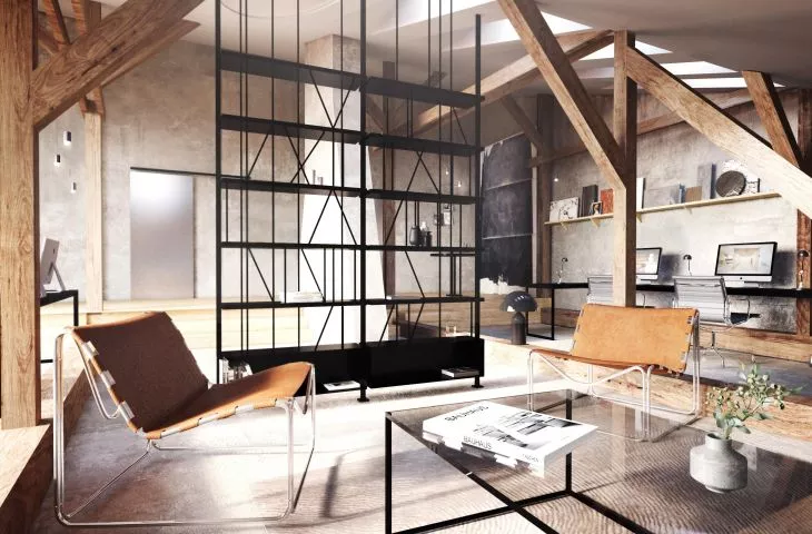
Lessness: The foundational space of the historic attic - its nontrivial, intricate geometry, the interesting shape of the chimney in the interior, 7 meters high at the top and the exposed, original truss - is inspiring. We wanted to preserve the veracity of the materials, creating a new elegance - hence the combination of rawness and light brutality of concrete walls with rough structures, with sophisticated modernist additions.
The authors wanted to preserve the veracity of the materials while creating a new elegance
© Lessness
A&B: Please tell us about the idea of this place.
Lessness: It's a unique place that is meant to bring together in one space many creators from different design disciplines - graphic designers, architects, designers, audiovisual artists. To give them a space to work and exchange experiences. To connect them both business-wise and creatively, to create new opportunities for their industries to intersect, to inspire. The gallery is a creative hybrid in the very center of Krakow - combining art, design and business on one surface. In this unique space, the line between work and passion is blurred; here, in the spirit of collaboration, designers will find their home. Half of the loft is to be used as a multidisciplinary studio, the other is a kind of living gallery, with a busy calendar of cultural events.
A&B: What were the investor's expectations and needs?
Lessness: To separate the two zones, but also to keep these large spaces as open and transparent as possible, as well as the flexibility of the rooms to accommodate different activities.
The place is supposed to bring together in one space many artists from different design disciplines
© Lessness
A&B: Where did the idea for this combination of colors, patterns and materials come from?
Lessness: Respect for the historic fabric of the loft, the industrial flair of the sliding metal doors, the wooden trusses, the richly textured walls. Drawing on good design to create a sophisticated, contemporary interior connected to the building's history.
A&B: What gave you the most satisfaction in creating this project, and what was the biggest challenge?
Lessness: The challenge was the leveling of the levels, which was achieved through the use of a platform system - so the large beams lying on the floor serve as zoning and a form of seating. Satisfaction comes from the fact that an undiscovered space in the center of the city, from where the main square can be seen from the roof, will gain new life and will be home not only to pigeons.
