Patrycja Czeluśniak, a graduate of the Faculty of Interior Design at the Jan Matejko Academy of Fine Arts in Cracow, has designed a space for the youngest. The kind ergarten of her design is a friendly place where colors, special furniture tailored to preschoolers and functional division of the interior are of great importance.
The designed kindergarten is intended for about twenty preschoolers. The area of the facility includes changing rooms, two integration rooms, dining rooms, bathrooms and a catering area. The project is a master's thesis carried out under the direction of Prof. Rafał Ziembiński and Dr. Małgorzata Zbroińska-Piątek.
The color basis of the nursery school interiors is white
© Patrycja Czelusniak
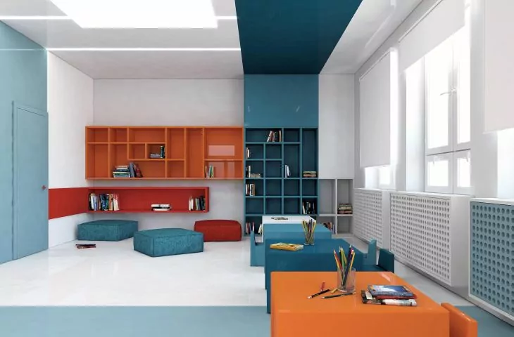
When analyzing the premises, the key was to separate the play area from the room where the children will study. This is important because in these two spaces functions of an extremely different nature are carried out. In the learning room, the child has to concentrate, calm down, nothing can distract him, while in the latter he activates his imagination and can organize various games for himself. This is a much more active part of the kindergarten," explains the author.
The colors at the interface of the functional zones intersect, interact and create continuity in the space
© Patrycja Czelusniak
practical shelving
One of the main goals of the architect was to solve the interior design of the nursery in such a way as to obtain a large amount of storage space - optically not taking up much space. The author created bookcases on the entire wall surfaces, up to the ceiling. Some of them are equipped with closed cabinets, there are also open shelves, which the youngest can easily access. Thus, the bookcases can serve as a place to present manual works. The lower parts are intended for children, and the upper parts for educators to store necessary educational materials, or as an archive. The bookcases by their form are integrated into the adopted design. Depending on the place, they are more or less marked in color.
The bookcases are placed on the entire wall surfaces
© Patrycja Czeluśniak
mobile furniture
Another important point of the work was the design of lightweight and mobile furniture. This allows children and teachers to freely adjust the room to changing needs and ideas. The set consists of a table and four seats. The table is equipped with a table top with a large surface, fully sufficient for four preschoolers. The chairs are created ergonomically - so that the child sitting on it can lean back comfortably. Looking at the furniture, it is worth noting the indentation for the legs. Through this procedure, the child can use the seat in a comfortable way.
The designer created light and mobile furniture
© Patrycja Czelusniak
An important design consideration was that the furniture should fit into the character of the entire interior. The seats form a whole with the tables and when the whole set is assembled, they are a unified, coherent and unobtrusive block. The furniture was made of acrylic plastic. The designer chose it for its many advantages, including non-toxicity, high hygiene, durability and a wide color base. Acrylic plastic was also used for the construction of the playroom. Polyurethane resin was used to create the floors. It is a material that perfectly fit Patrycja Czelusniak's concept. It features an aesthetically pleasing appearance, a uniform surface, and is non-slip, which is ideal for a kindergarten. The resin floor has no joints and gaps and is easy to keep clean.
The play space is maintained in energetic colors
© Patrycja Czeluśniak
the power of colors
The right choice of colors affects the perception of interiors, following this principle Patrycja Czeluśniak, created a variety of interiors. The color basis of the nursery interiors is white, which is the base for the other colors. It makes the rooms optically appear larger, brighter and cleaner. Each room of the nursery is different - its base is white, and the addition of a chromatic set of selected colors. This makes it easy to distinguish zones.
The chosen color palette is not accidental, as for all rooms, colors were selected to harmonize with its function. The preferences of preschool children have also been taken into account, because, after all, it is for them that these interiors are designed and it is they who will spend time in them," explains the designer.
An addition to the white is the chromatic bar set
© Patrycja Czelusniak
Shades of blue predominate in the study room. According to the author, cool colors improve productivity, create order and calmness in the interior. As a result, the child is able to focus on the activities in force and create without distractions. The playroom is characterized by energetic colors that encourage participation in games and activities. It consists of shades of yellow, orange and red. In color psychology, these are colors that evoke joy, creativity and increase motivation for action. They promote development and positive emotions. The locker room is dominated by shades of purple, which have a calming effect. They are great for relieving symptoms of stress and helping to calm down, which is a very valuable solution during the time when the child separates from his caregiver. Colors at the junction of functional zones intersect, interacting and creating continuity in the space.


