Metamorphosis of a tenement apartment
Interior design in old tenement houses is quite a challenge. Designs for this type of space often require facing radical transformation of the functional layout or changes built up over the years by successive tenants. On the other hand, however, it is precisely these hidden treasures, preserved architectural details, high rooms and picturesquely illuminating the interior with large windows that create an unusual atmosphere. Hanna Brzozowska of the Inbalance studio talks about the design of an apartment in an old tenement in Gdansk.


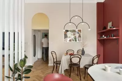
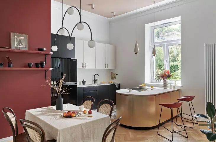
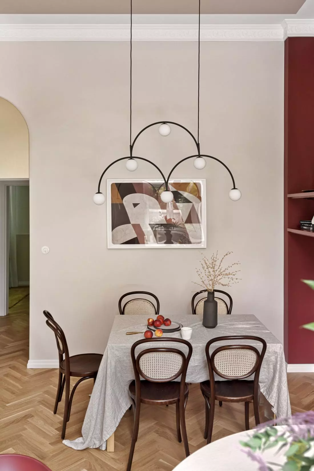
view of the dining room and the golden arch over the corridor entrance
photo: Tom Kurek
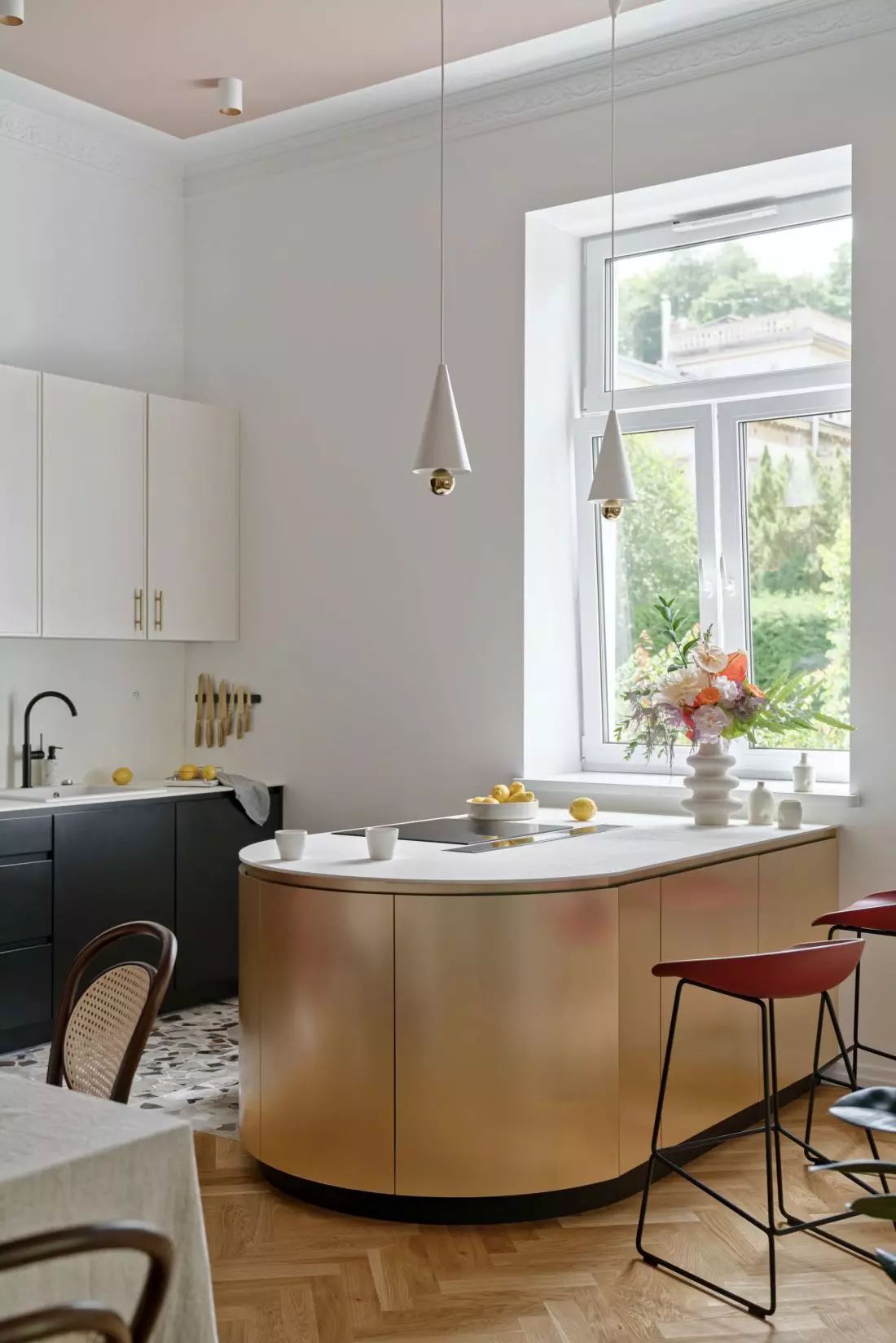
The 120-square-meter first-floor apartment has undergone a complete metamorphosis, according to the project's author. An open kitchen with a dining room was moved to the first floor, where the rooms are much higher, and its place on the lower level was taken by the master bedroom. This procedure made it possible to create a new heart of the house - it is in the spacious kitchen with black and cream cabinetry and a stylish golden kitchen island that the household members and their guests meet. The dining area is highlighted by a deep shade of red on one of the walls and designer accessories - graphics and lamps (including an eye-catching decorative pendant lamp designed by Monika Mulder for the Pholc brand).
Left: a stylish gold kitchen island is illuminated by lamps by Petite Friture; right: a decorative lamp designed by Monika Mulder for the Pholc brand in the dining room.
photo: Tom Kurek
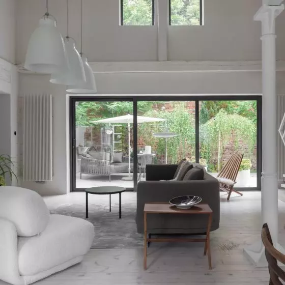
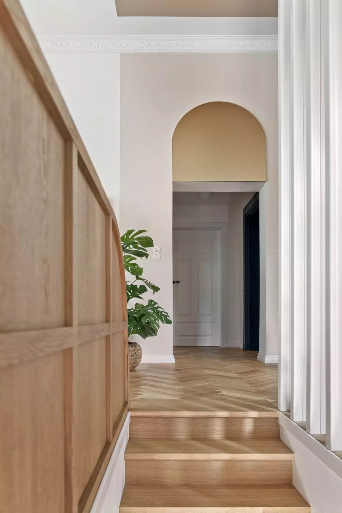
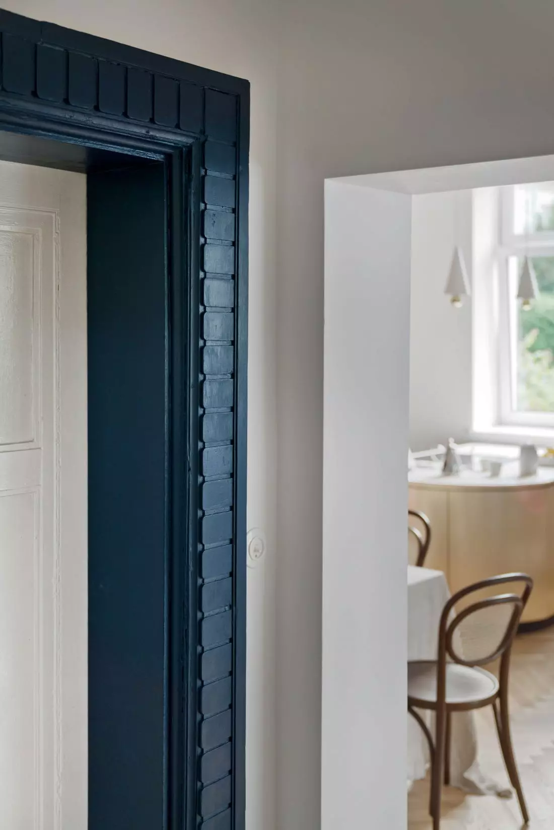
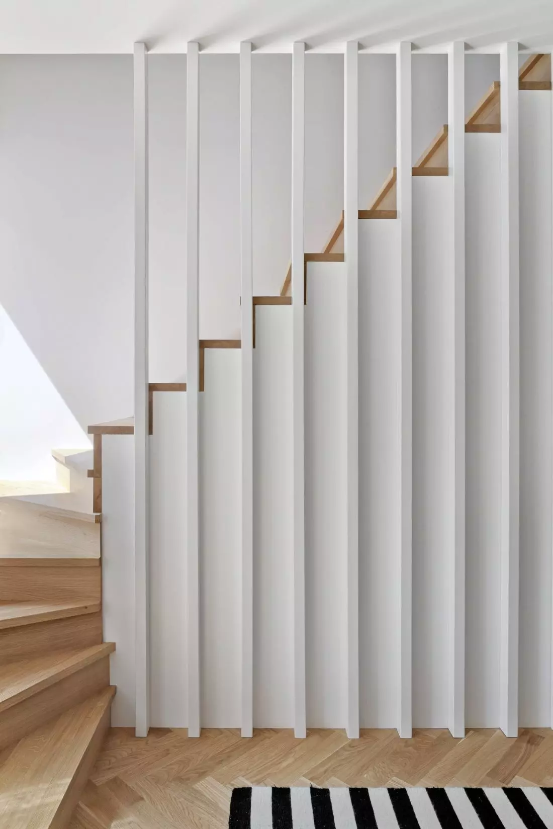
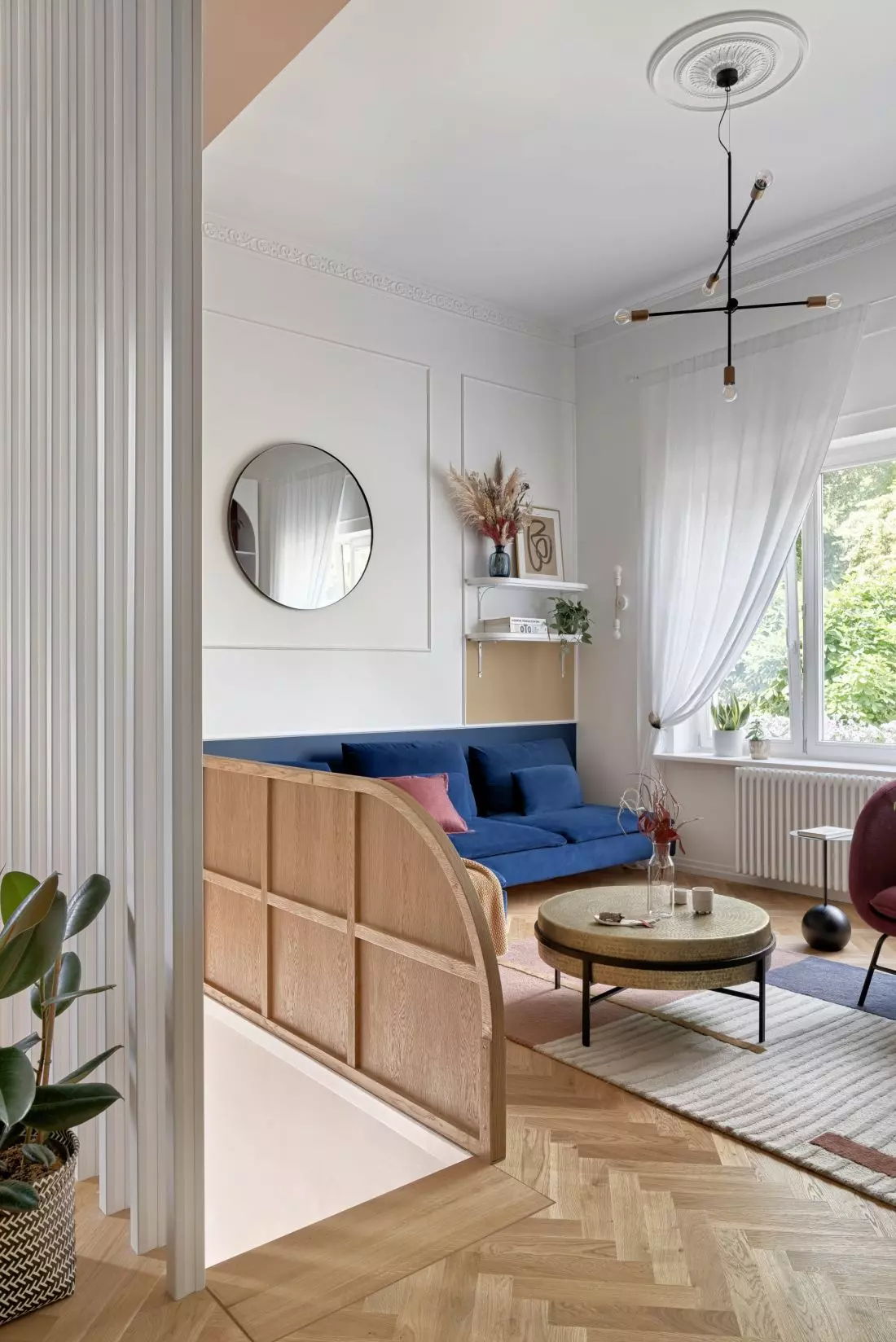
Between the kitchen and the living room, the architect introduced ceiling-length wooden laths, thanks to which the rooms are separated and at the same time devoid of a restrictive barrier. Hidden behind the openwork part ition is the staircase leading to the lower floor. This part of the apartment also overlooks the corridor, the way to which is indicated by a golden arch, and the main entrance, highlighted by a decorative band, which the investors renovated on their own.
Left: the staircase and wooden laths between the kitchen and living room; right: the decorative band around the wooden entrance door
Photo: Tom Kurek
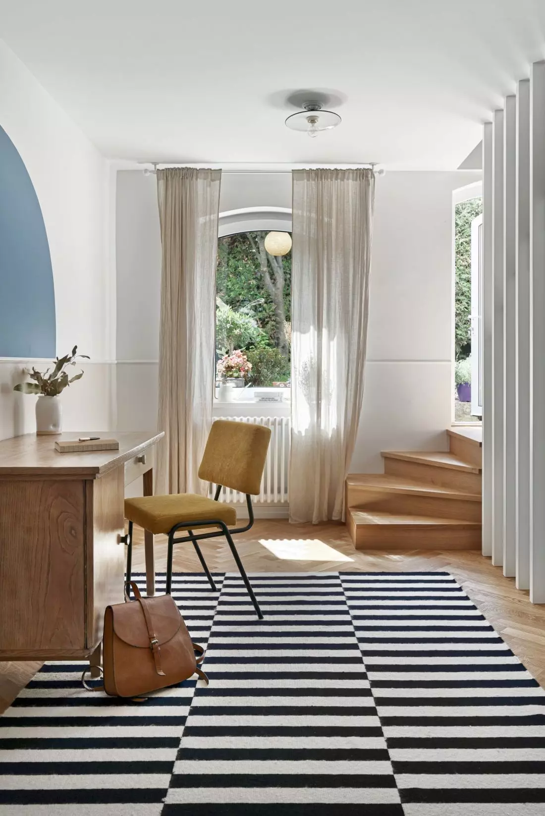
On the first floor, there are other rooms in a style consistent with the living area - a guest room and an additional bathroom. Downstairs, in addition to the aforementioned bedroom overlooking the garden and with a private bathroom, there is the apartment owner's study with direct access to the garden.
Left: the striped pattern on the study's carpet alludes to the vertical arrangement of slats by the stairs; right: the staircase
Photo: Tom Kurek
The interior is maintained in the studio's style, familiar from other projects - full of color contrasts, geometric forms, intriguing textures and a variety of patterns. Hanna Brzozowska of the Inbalance studio talks about the challenges of designing interiors in historic buildings and how the design process was carried out.
Ola Kloc: What was the priority for the investors?
Hanna Brzozowska: The investors expected unique and original interiors. They were open to a large number of colors and unusual solutions, which allowed me to design without major limitations. The dialogue between the arrangement and the historic building was also important - the interior could not stand out from the historic fabric. I was also asked to use some furniture that was already in the owners' possession. Old furniture and memorabilia is something that constitutes the spirit of the arrangement and captures the character of the residents, and I very much enjoy weaving them into my designs.
Left: the laths and stairs leading to the lower floor; right: the arch in the bookcase by the TV refers to the golden arch above the entrance to the hallway
Photo: Tom Kurek
Ola: The apartment is located in a nearly 100-year-old building. What are the challenges and what are the pros of designing interiors in this type of building?
Hanna: In such an old building it is not difficult to find surprises. Unfortunately, very often we find out about certain technical obstacles long after the project is passed - during renovation work. It happened more than once that for reasons beyond our control we completely had to change the ready-made, previously approved concept. Such situations often happen, and it is worth bearing this in mind when starting a renovation in a townhouse. In the case of this project, however, we were lucky. The implementation work went smoothly - no surprises. What are the advantages of designing interiors in this type of building? There are a whole lot of them! Usually we have to deal with very high rooms. This opens up a whole range of possibilities, both in terms of designed built-ins, the use of interesting lighting, and filling large expanses of walls with art and decorations. Large, often ornate windows, unusual interior layouts, which sometimes manage to play off each other very well, architectural details that we can save and use in a new arrangement.... Each such interior is actually a completely different, original story to tell.
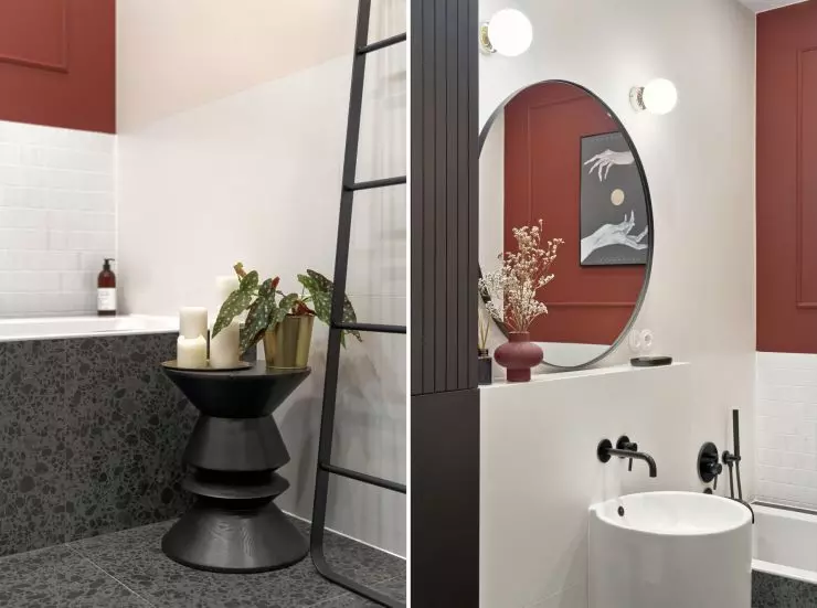
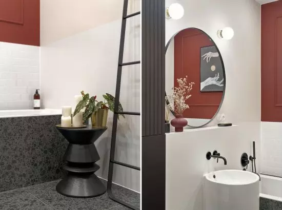

Intense red color and tiles in terrazzo pattern in the bathroom
photo: Tom Kurek
Ola: Did the functional layout require any changes? If so, which ones?
Hanna: The functional layout underwent quite a revolution. The kitchen was originally located on the lower floor - there was much less space and less light, the rooms were also lower. Now the living area has moved to the level above and is the real heart of the house. In addition, we demolished the wall adjacent to the staircase. The entrance to the first floor and the living room now occupy a much larger area, are bright and well-lit.
The 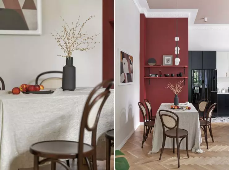


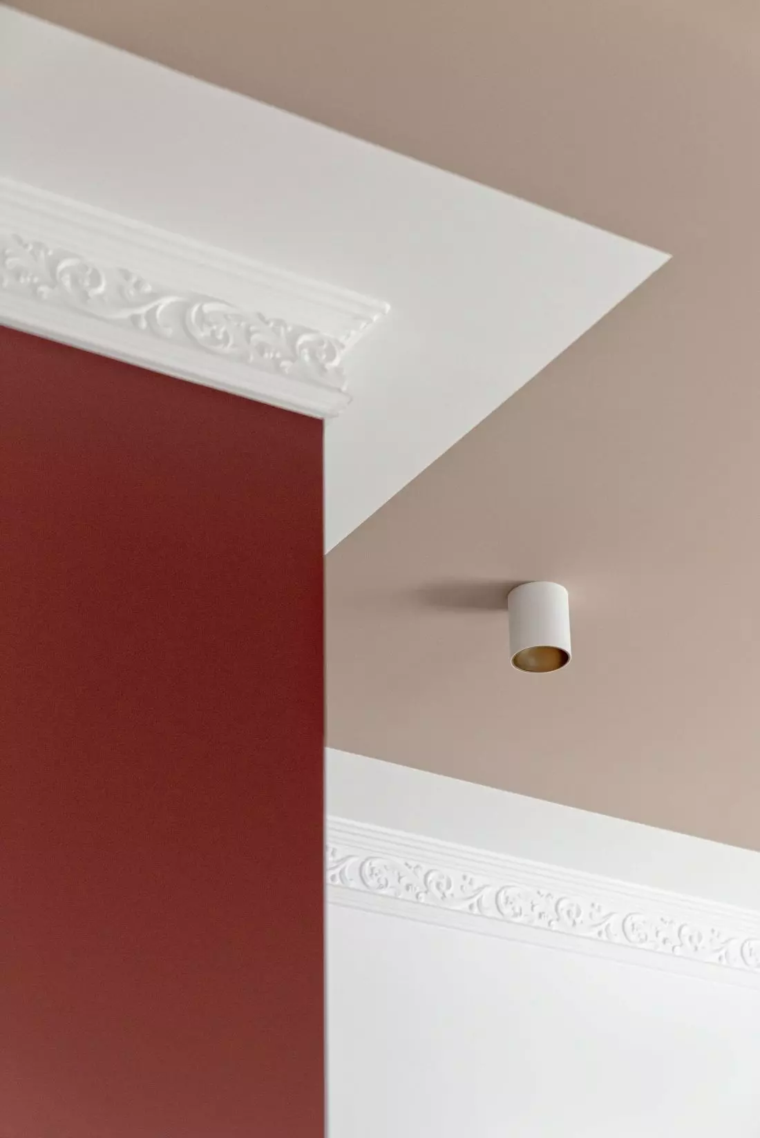
Part of the dining room is highlighted with an intense red wall
photo: Tom Kurek
Ola: The interior is full of expressive colors contrasting with bright surfaces. What influenced such a choice of colors and their combinations?
Hanna: Such treatments are a characteristic way of designing at Inbalance. I like contrasts, I like a very large amount of color, graphic forms and shapes. However, I don't like exaggeration and lack of balance. Strong graphic accents work best in contrast to bright and clean elements.
Left: color contrasts in the dining room; right: colors in the bedroom.
Photo: Tom Kurek
Ola: What are you most pleased with in this project?
Hanna: When designing in old buildings, there is a lot of risk that something can go wrong. Sometimes the concept has to be changed, because something in the course of construction work becomes impossible. Here, the design idea was realized 1:1. All the functional changes, custom-designed furniture - the whole project approved by the investors was put into practice, and I consider this the biggest success.
Ola: Thank you for the interview.
