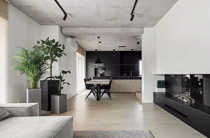
The project called BAR_21 by {tag:pracownie} is the interior of a two-level house located in Elizowka - a small town located in the Lublin district. As the architects say, the project is designed for a 2+2 family that values minimalism and authenticity. The characteristic element of the space is the unplastered, reinforced concrete ceiling in the living area and the dominant black, which have been warmed by wood and vegetation.
The interior is characterized by a limited range of colors and materials
Photo: Rafał Chojnacki © 081 architekci
Dobrawa Bies: The project we are talking about is the interior of a single-family house. What were your assumptions and design inspirations? Where did you start your work?
081 architects: We always start our work on the interior by preparing the functional layout under the investor's guidelines. In this case, our main assumption was to clearly divide the space into living and private zones. We made full use of the potential of the storied house: the first floor is the living area, we have an entrance zone with an adjacent garage and toilet, and a kitchen with a dining room open to the living room and exit to the terrace. The first floor, on the other hand, is the private area housing all the bedrooms, bathrooms and dressing rooms.
The first floor is the living area
Photo: Rafał Chojnacki © 081 architekci
Dobrawa: Did the investors approach you with a specific idea and special requirements?
081 architects: In this case, the starting element was to leave the concrete ceiling in the living area. The investors are also fans of interiors where black dominates. So we had to create a space where, despite the raw concrete and the predominance of dark colors, it would be homely and cozy.
An important element was to leave the concrete ceiling
Photo: Rafał Chojnacki © 081 architekci
Dobrawa: The interior is characterized by minimalism, a limited range of colors (mainly white, gray and black), and austerity, such as the concrete ceiling. Where did such decisions come from?
081 architects: Our studio is characterized by minimalist designs, and investors who come to us decide on us mainly by the style we present. We feel best in such projects, and we are happy that we meet on our way so many wonderful investors who share our tastes. The best projects are created precisely when the investor and the designer feel a similar aesthetic.
The bed material flows seamlessly into the wall
Photo: Rafał Chojnacki © 081 architects
Dobrawa: Interesting solutions catch the eye, including a wooden wall and bed enclosure, a wall prepared for a projector in the living room, and an open staircase. Tell us about the design work.
081 architects: We always try to make sure that every space in our projects is as well thought out as possible and designed in a way that is at once ergonomic, logical and aesthetically pleasing. We like continuity of materials, compositions in the form of simple solids, and the abandonment of elements that serve only decorative functions. Hence, for example, the wooden wall and bed enclosure cited in the question. The bed material flows seamlessly into the wall, which not only serves as a partition, but also as a headboard. The result is a simple minimalist block, which by itself delineates intimate passageways: on one side to the dressing room, on the other to the private bathroom.
Architects like compositions in the form of simple solids
and the abandonment of elements that perform only decorative functions
Photo: Rafał Chojnacki © 081 architekci
Dobrawa: How do you arrange the space of the house so as to maintain visual consistency?
081 architects: One of the fundamental principles of visual consistency is the choice of a specific "color and material palette". It should be a maximum of two - three materials through which we arrange the entire space in the house. In this case, we have a dominant black and light wood, the background for them are the remaining white walls.
Dobrawa: Thank you for the interview.
