A small apartment in Gdansk with an area of just over thirty square meters for the architects of the studio Ministry of Interior was a challenge, in which they set as their goal - despite the small square footage - to create the largest possible, yet functional space.


view of the kitchen and living room
Photo: MSWW Marcin Konopka
compact interior
The beginning is a good plan. Working on a floor plan for small spaces is especially important. It is in this first phase that we can think about functionality, take care of new divisions, apply new communication solutions.... This was also the case here," write the authors of the project. - The idea of a compact interior, which, depending on the needs, changes its function, found its outline already in the first projections, they add.
As a result, the apartment can be divided into two main functional zones - the living area with a kitchen connected to the living room and the night area, which is formed by a bedroom located on the platform. Raising the night area allowed the creation of additional storage space and seating areas on low steps.
The 


The bedroom can be separated from the living room thanks to sliding doors
photo: MSWW Marcin Konopka
The strength of this interior is the variety of available functions - especially storage and seating areas. So we can rest on the stairs to the bedroom, on an armchair, a sofa, a seat under the window, at the table, on the bed, or on one of the poufs, according to designers from Ministry of Interior.
The bedroom is partially separated from the rest of the apartment by a narrow partition wall, which can be closed on both sides if necessary thanks to sliding doors, and with the help of long curtains you can also separate the seat under the window in the bedroom and a small bookcase.
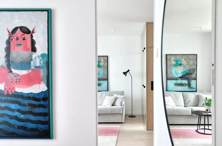
right: view from the kitchen to the bedroom; left: the bookcase in the living room
Photo: MSWW Marcin Konopka
apple with cherry
The architects found inspiration for the interior design and choice of materials in the culture and energy of Japan and New York. Although most of the walls are kept in white, and the floors and furniture are made of light wood, strong color accents appear here and there, for example, in the form of an upholstered pink headrest in the bedroom or colorful, large-format paintings. The small interior is optically enlarged by large, round mirrors hanging in both the kitchen and the bedroom.
Mirrors optically enlarge the space of a small apartment
Photo: MSWW Marcin Konopka
This small apartment combines the energy of two cultures. The New York energy of the Big Apple, combined with the spirit of minimalism from the Land of the Cherry Blossom. A mixture of juicy apple and cherry freshness, the architects write. - From the beginning, we focused on a certain minimalism in materials. White and light wood set the aesthetic, pointing the inspiration toward simple, yet extremely functional Japanese interiors. We softened the severity of the geometry with warm fabrics," they add.
The bathroom, located just inside the entrance, was clad in light wood on the outside, facing the kitchen, while mirror-lined fronts of a capacious closet were placed on the living room side. Inside the resulting cubicle, the architects accommodated a shower and a washing machine, as well as mirrors, making the bathroom seem larger and more spacious. The walls were lined with pale pink tiles with a large terazzo pattern, which the designers called to mind the Japanese technique of gluing broken ceramics - kintsugi.


