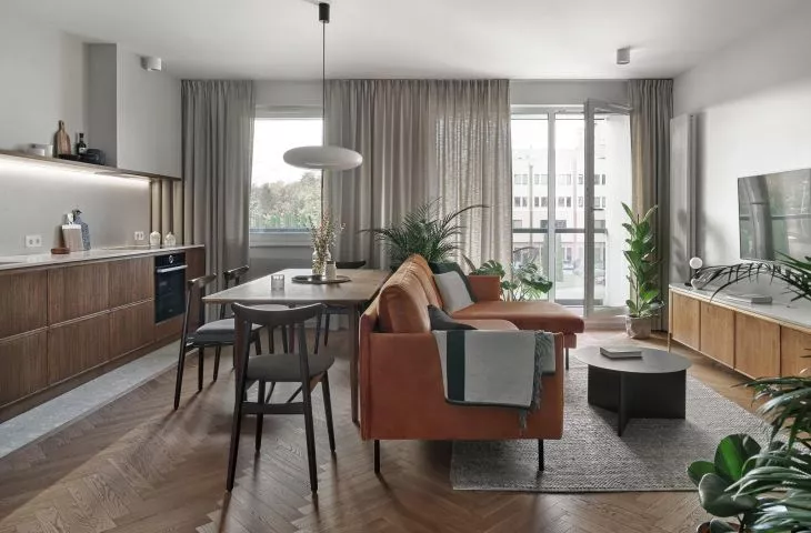
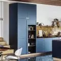
Design from the 1950s, natural wood, subdued colors and delicate graphics, is the Gdansk apartment of the {tag:pracownie} project. The inspiration of the mid-century modern style is emphasized by the color scheme, dark veneers and a wooden floor laid in a classic herringbone pattern.
The mid-century modern style apartment is located in the newly built Harmonia housing development near Oliwski Park in Gdansk.
As the architects say about the project:
The apartment came to us in a development state, and its layout dictated the location of the kitchen opposite the TV wall. Both parts - the living room and the kitchen with a dining table occupy a similar area of the living zone. We placed a table and a sofa in the central area right next to each other. This layout is very conducive to social gatherings. The table has become the heart of the house and, with more guests, allows you to comfortably gather around it.
A characteristic element of the apartment is the floor laid in a herringbone pattern
Photo: Tom Kurek © RACA ARCHITECTS
The living area is separated from the entrance area by a white carpentry cabinet, which hides a wardrobe closet on the corridor side and a cupboard with groceries and dishes on the kitchen side. In this way, the architects added lightness to the space. The hood was hidden in the plasterboard, and the countertop and the wall above it were finished with gray quartz conglomerate. The fronts of the lower cabinets were made of veneered board, stained a darker color. Thin frames of the cabinets introduce a vintage atmosphere. The dining table with a light form was designed by the architects.
plan of gdansk apartment
© RACA ARCHITEKCI
The highlight of the living room is a large velour sofa in red color. This strong accent is softened by a gray carpet and metal tables. There is also a bookcase with a comfortable reading chair and an architect-designed RTV cabinet. Brass legs and rounded feet add to its lightness, and a brass strip is placed as a detail under the tabletop.
Delicate graphics are drawn in one stroke
Photo: Tom Kurek © RACA ARCHITECTS
In the entrance area and in the kitchen, the designers used cream-gray tiles with a natural stone terazzo pattern. The same tiles also appeared in the bathroom. This room is kept in the same color as the rest of the apartment, and stained furniture fronts were used here as well. Opposite the entrance to the bathroom, the architects placed a hanging cabinet with a sink, a shelf and a mirror. The countertop and the wall above it are finished with gray quartz conglomerate, and the mirror is actually a shallow cabinet for cosmetics. White faucets and bathroom accessories are an accent.
The architects dispensed with upper cabinets in the kitchen
Photo: Tom Kurek © RACA ARCHITECTS
Dobrawa Bies: What were the assumptions and design inspirations? Did you manage to achieve all of them?
Miachl Raca: The clients really liked the mid-century chairs, and we convinced them to make the whole apartment in this style. The investors wanted there to be a lot of wood and for the apartment to be warm - all these assumptions were met. Even the red velour sofa, which appeared in our heads, already found its place after the first meeting with the clients :)
The fronts of the cabinets were made of stained veneered board
Photo: Tom Kurek © RACA ARCHITECTS
Dobrawa: The apartment is kept in shades of gray, whites. Elements made of oak wood are visible. Delicate graphics on the walls are also an interesting addition. Why such a design decision? Was the final appearance of the interior also influenced by investors?
Michal Raca: Clients always have an influence on the aesthetics. We start working on the project by interviewing and reviewing the investor's inspirations, then we present him with our vision, which comes directly from our discussions. These collaborative thoughts, long conversations and listening to the client's needs make the design look just right.
The whites and grays play well with this stained wood, they make the apartment not so heavy. We wanted the apartment not to be overloaded. That's why the kitchen is without upper cabinets, the furniture is quite simple with delicate detailing, and the graphics on the walls are light, drawn in one stroke.
The bathroom uses gray tiles with a stone pattern
Photo: Tom Kurek © RACA ARCHITECTS
Dobrawa: Do you have a golden mean for a good layout of the space of a not very large apartment?
Michal Raca: There is no single way to layout the space in a small apartment. It's a very individual thing, we design for a particular person, and it is known that we all have different needs. However, we really like the solution that is also used in this apartment - a dining table set behind the sofa, which stands in the middle of the living room. This solution allows us to use a large dining table for everyday use, and during a social gathering to place all the guests in one place. We have designed this way several times, and this solution has worked great for everyone.
Dobrawa: Thank you for the interview!
Dobrawa Bies
