Warsaw hides architectural gems. Apartments smelling of Art Nouveau, impressively tall, sun-drenched, with elaborate details - woodwork, tiled stoves or stucco. Sometimes you can come across them among estate sale advertisements. However, buying such a morsel is a subject for the brave. And not only because everyone repeats like a mantra "renovation of old spaces is always a surprise". First of all, because working with old architectural fabric is working with collective memory and a kind of unwritten obligation - a declaration to be attentive.
Agnieszka Komorowska-Różycka found this out, who, with the support of her partner at Nasciturus Design - Katarzyna Kiełek - gave a second life to an apartment in a tenement from the early 20th century. Starting a new chapter of her life near Constitution Square, she began, in a way, a new path as a designer. Nasciturus design studio has been operating for 15 years, but in fact this apartment stole the hearts of the designers and made them fall in love with interior revitalization for good.
Before Agnieszka Komorowska-Różycka and Katarzyna Kiełek began their 1.5-year-long adventure with the apartment in Warsaw's Śródmieście district, their studio specialized in industrial interiors. Concrete, steel and glass were their trademark. Climbing the stairs of the historic staircase to the 3rd floor of a 1904 tenement building, however, they felt that their previously beloved language was no longer adequate. They breathed in the atmosphere of old Warsaw, sensed its former splendor and longed to dust off what was left of that splendor. They did not want to stop at correct restoration of the space, creating an aesthetic open-air museum. They decided to capture in the project the spirit of the metropolis they know and love; to design a new quality that would emerge in conversation between what is old and what is modern.
Archistory - Nasciturus Design
photo by Hamish Cox
confronting what's old
Besides, not everything they found on site was acceptable. Certain standards had changed, so the first fire was the functional layout of the apartment, which necessarily had to be modernized. In the original plan, the 120-square-meter space was divided into several tiny rooms, separated for servants, among other things. The designers combined them into one living area consisting of a kitchen, dining room and living room with an adjacent guest bathroom, and an intimate hosts' area, which consisted of a large bedroom with a bath room open to it.
To this day, the designers recall with a smile the action of transporting the substructure, which turned out to be necessary to reinforce the arched ceiling after demolition. Carrying the 6-meter beam up the stairs required no small amount of eccentricity. It was also a very tedious and labor-intensive job to scrape off dingy plaster and lay new plaster. The nicest part of the process was the discovery of a beautiful pre-war brick, which was exposed on one of the representative walls. They also looked at the woodwork with great sensitivity. While the original one was saved (it was fitted with modern Linea Cala handles), the windows unfortunately had to be replaced. The stucco - characteristic of the era's style - became one of the apartment's leitmotifs. Artful patterns decorated the walls and their finial with the ceiling.
A transformed kitchen
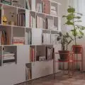
The designers also introduced a discreet and artful pattern on the fronts of the minimalist built-in in the kitchen. The pantry, lined with elegant veneer and backlit, has plenty of shelves and cargo cabinets inside. There are, by the way, more clever solutions in the kitchen - a Bora co oktop with an extractor placed between the cooking fields was installed on the island, and at the sink - a Franke faucet that folds and retracts without disturbing, when not needed, the clean lines. A great deal of lightness in handling geometry is evident throughout the apartment. The designers chose for the interior very impressive and distinctive lamps signed with the names of the world's greatest designers. Above the island hang three "spiders" from Vibia from Erick Levy's collection, and next to the sofa a characteristic lamp on the arm "265" from Flos. A regular rhythm is introduced into the living room by a bookcase powder-coated in black and made by a friend of the designers. Geometry is also evident in the marital bedroom - starting with the upholstered bed headrest, the cantilevered bedside lamps or the author's design prepared for the shower. The glass framed in a graphic way goes well with the streamlined Zucchetti fixtures.
Archistory - Nasciturus Design
photo by Hamish Cox
attention to detail
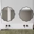
The same finishing materials were consistently used throughout the apartment, using a play of contrasting colors and temperatures. The kitchen countertop and the shelf under the hanging cabinets in the living room featured a noble black Nero Marquina marble with a beautiful pattern of white veining. Thin and deceptively similar to natural stone, but much lighter milky quartz sinters were chosen as cladding on the kitchen island and the walls of the bathroom integrated with the bedroom. The floor in all rooms was laid with a grayed, oil-wax-protected oak parquet.
Designing for one half of the Nasciturus design duo, the interior architects, for the first time in the history of the studio, could decide everything themselves and make their dreams come true. Therefore, they allowed themselves more avant-garde ideas - a free-standing bathtub in the bedroom or visionary design. The quintessential example of the latter are Marcel Wanders ' designs in the apartment - the white, overscaled "Faro" lamp and the floral, large-format "Fool's Paradise" rug from Moooi, which reign in the living room. When asked if they would repeat the experience, they answer unanimously: "yes, definitely, we want more of these!".


