Work submitted for the competition
"Best Interior Design Diploma 2022/2024".
The design of a school for visually impaired children is an attempt to arrange the space in accordance with the principles of universal (accessible) design, which aims to minimize the impediments to the daily life of people with disabilities.
axonometry
© Aleksandra Kupidłowska
In Poland, this issue is developing, more and more such attempts can be seen in public spaces. After reading the regulations, one can come to the conclusion that the recommendations from accessible design are limiting rather than inspiring. Among other things, it is necessary to observe the appropriate distances and heights in a room, the intensity of natural and artificial light, the use of acoustic solutions or appropriate non-slip surfaces - this significantly narrows the area of aesthetics in which we move. It might also seem that visually impaired people are not sensitive to the beauty of the space they are in, but considering that in Poland in 2014 more than 7 percent of the population had impaired vision, and within this group a minority of people were completely deprived of it, and the fact that children are rarely fully blind, and lose their visual acuity with age, it is possible to approach the issue from a completely different perspective.
visualization of the school interior
© Aleksandra Kupidłowska
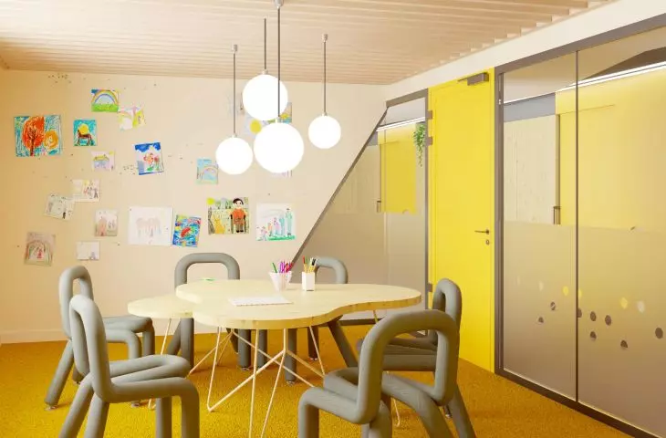
In an interior adapted to the needs of people with impaired perception, we can distinguish the following principles: use of contrasts, good sound insulation, even lighting (4000K) and guiding lighting, varied texture of materials; marking of dangerous places (tiflographic information); limiting collision areas and access to daylight and vegetation. When it comes to contrasts, yellow is important, creating the strongest contrast with black.
visualization of the school interior
© Aleksandra Kupidłowska
Acoustic insulation is intended to reduce reverberation, thus facilitating communication of the visually impaired through the sense of hearing. Such assistance is also provided by trailing (homing) elements, such as LED strips marking the path of movement or tiffographic paths and other signage, for example, in Braille, which enable communication through the sense of touch. The design of such solutions is particularly important in the school development of children, who are just learning how their senses work and how they can supplement information from the world that sight does not provide them with. For the proper development of such children, it is also important to provide appropriate sensory and psychological rehabilitation and therapy.
visualization of the school interior
© Aleksandra Kupidłowska
I began the design process by clearly dividing the space and removing unnecessary partitions so as to maximize access to daylight in the corridor. To the right are placed the classrooms and bathrooms, and to the left are the checkroom, the room for SI therapy and quiet work, and, a little farther away, the world experience room and the teacher's room, near which there is a play corner. Through the middle, I ran a division of the floor, which was paved with contrasting boards. On the darker part there is a tiflography path that leads to classrooms and a toilet. In the school space, it has an educational rather than navigational function, to prepare the children for navigating public spaces as well.
visualization of the school interior
© Aleksandra Kupidłowska
A characteristic element is an irregular wall with a yellow door, which, in addition to navigating(trailing), also has an acoustic function. In addition, the wall is a cassette for sliding doors, and has recesses on top for pots. The space also features other solutions, such as sensory wheels, which are a form of tactile play, and suspended laths. The corridor also features safe furniture with rounded shapes and soft seating to reduce the risk of injury. Bathrooms, too, are designed using contrasting elements to make it easier to use the stall, sink and dryer. The fixtures are placed at two heights due to users of different ages, so that everyone is comfortable.
visualization of the school's interior
© Aleksandra Kupidłowska
Aleksandra KUPIDŁOWSKA
Illustrations: © Author


