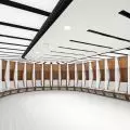
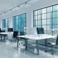
Modern offices, which we happen to write about very often, are now chambers of mystery full of nooks, crannies, dead ends and secluded meeting places. We look at another realization in search of the purpose of these solutions.
Meeting rooms can be separated by means of partitions and curtains
photo by Kinga Skalik, © Tétris
The office for a corporation like Circle K, unlike in the case of PepsiCo's Warsaw headquarters, was designed by designers from Tétris, which is involved not only in the design process, but in leading the entire implementation from the first ideas to handing over the keys. The challenge for the designers was primarily to adapt an office building built almost seventeen years ago. Its internal layout was adapted to a completely different working environment, based on a complex of small offices with limited common areas and conference rooms. It's obvious that this didn't suit a modern work culture. The project was created for a total of 1,400 square meters spread over three floors.
The common areas were located in the office
photo by Kinga Skalik, © Tétris
looking for solutions for the modern office.
The space used for work had to, above all, respond to the changes in work culture caused by the COVID-19 pandemic , as well as create an atmosphere of a place that is friendly and open to internal collaboration. In this case, the solution that replaced rows of offices turned out to be open space zones to which conference rooms of varying sizes are adjacent. Working in open spaces is a complete norm nowadays, as is the avoidance of uniform interior design.
The client's main concern was to create a warm, friendly and comfortable space for employees, which at the same time would promote integration and cooperation between them. We proposed replacing the existing layout, filled with undersized offices, with open space and numerous conference rooms. The change was a big one, requiring the demolition of most of the structure. This procedure made it possible to achieve a spacious interior with plenty of natural light," points out Pawel Pikus, Contract Director at Tétris.
One of the main arguments of opponents of open space in offices is the lack of adequate space to make phone calls in silence. The solution used in this office was primarily "phone booths" in which we can lock ourselves in and isolate ourselves, but also lockable partitions - modularly allowing the rooms to be adapted to individual users' needs. Above all, the new work culture requires flexibility.
In the remodeled space, small offices have been abandoned in favor of open space and conference rooms
photo by Kinga Skalik, © Tétris
When designing the space, we thought about relaxation zones, those conducive to concentration, as well as areas for video calls and teleconferences. There were also phone booths and rooms for quiet work, and we equipped the conference rooms with movable partitions to accommodate the number of participants," says Aleksandra Wyczółkowska-Gajowniczek, Senior Architect at Tétris, about the project.
Energetic color scheme and wild greenery
The elements that distinguish this office among other projects are primarily the color scheme. The entire interior was dictated by three colors: red, orange and yellow. The choice is not accidental, but results primarily from the corporate identity of the corporation using the office. The color scheme used by the designers was primarily tried to soften with the use of wood and gray, which appears in different tones. An additional element turns out to be green. Which is injected into the space with different effects almost everywhere.
Each floor is finished in a different color.
Photo by Kinga Skalik, © Tétris
We proposed greenery not only in pots, but also decorated walls and ceilings with it. They warm up the atmosphere and improve humidity in a natural way. In places where access to plants is difficult or there is no natural light, we used artificial greenery. The murals and open painted ceilings are interesting accents," adds Aleksandra Wyczółkowska-Gajowniczek.
working condition
The office designed by Tétris may, at first glance, scare us away with its unusual but rarified color scheme, but it efficiently shows us the mechanisms of shaping today's offices - the need to be flexible, to bet on openness, or to create recreational and common areas. This is one formula that may allow us to stop the remote exodus in favor of hybrid work.
The choice of furniture, too, points to diversity - we can sit on a pouffe or a high hocker.
photo by Kinga Skalik, © Tétris


