A Neurological and Senior Rehabilitation Center Neuroport has been built near Lake Kierskie in Poznań, whose interiors indicate a new direction in creating spaces for long-term care and convalescence. The young design studio Zawieja Studio from Poznań is behind their design, as well as the entire visual information system. The result? A cozy atmosphere associated more with a vacation getaway than a stay in a medical facility.
The reception area of the Neurological and Senior Rehabilitation Center
Photo: ZASOBY STUDIO © Zawieja Studio
The most important design determinant for the team led by Martyna Zawieja was the needs of Neouroport's future patients - often with limited mobility. The designers also paid attention to psychological and social aspects.
The cafe space, on the wall a mural referring to the flora of the nearby lake
photo: ZASOBY STUDIO © Zawieja Studio
taming the space
The center's space is large, at about 3,500 square meters, with 48 rooms and a rehabilitation wing. To tame it, the architects created a number of common spaces, including - day lounges, activity rooms, a dining room and a cafeteria. The plant-filled conservatory, with a comfortable lounge set, has become a favorite gathering place, they say. One can sit there and observe the garden outside the windows, with a designer lamp hanging from as many as two stories attracting attention.
Subdued colors are combined with accents in terracotta shade
Photo: ZASOBY STUDIO © Zawieja Studio
inspired by nature
The building is located in the vicinity of a lake, so its fauna and earthy colors became an inspiration during the design work. Motifs of the surrounding vegetation appear in murals in the café, dining room and conservatory. The subdued color scheme, with accents in terra cot ta tones on elements of the furniture, door ironwork or the central staircase, corresponds with the surrounding nature visible from the windows.
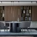
The interior of the dining room
Photo: ZASOBY STUDIO © Zawieja Studio
design from the 1960s and 1970s
The design of the interiors was preceded by diligent research - the team used studies on the impact of the environment on the psyche of the elderly. They proved that stylistic references to the surroundings from the years of early adulthood, stimulating memory centers, help seniors adapt to the new space and make it easier for them to move around the building. What followed was the introduction of design references from the 1960s and 1970s into the modern interior. The architects also didn't forget about a place for personalization - in the rooms, users can fill their immediate surroundings with private photos and mementos.
The surroundings are reminiscent of the design of the 1960s and 1970s
photo: RESOURCES STUDIO © Zawieja Studio
color zones and appropriate light
The interior architecture is closely linked to the visual information system, dividing the building into color zones. Keeping in mind the deteriorating eyesight with age, the designers used color contrasts to emphasize elements such as stairs and doors. In turn, building contrasts on the basis of subdued colors, positively affects the perception of people with neurological problems.
The corridor, and behind the glass door, the living room
photo: STUDIO RESOURCES © Zawieja Studio
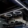
One of the most important elements building the center's interiors is properly designed lighting with even distribution and intensity. A well-lit space that does not cause glare (also for people lying down) required the designers to use non-standard solutions. Natural light from the many windows and skylights is supplemented during the day by an intelligent lighting system, while at night the system adjusts the lighting to suit the residents' lives.
The architects also designed the furniture
photo: ZASOBY STUDIO © Zawieja Studio
ergonomic and aesthetically pleasing furniture
The team from Zawieja Studio is also behind the design of fifty patterns of aesthetically pleasing and ergonomic furniture, made specifically for the center. Each piece of furniture, thanks to its form, as well as the handles used, can be operated by people with disabilities. Importantly, due to the purpose of the building, all materials used in its finishes and furnishings had to meet the requirements imposed on medical spaces. Despite such restrictions, the designers managed to create a cozy atmosphere.
The living room is one of the places to spend time together
Photo: STUDIO RESOURCES © Zawieja Studio
interview with Martyna Zawieja
Dobrawa Bies: We're talking about the Neurological and Senior Rehabilitation Center Neuroport - these types of spaces are usually not associated with good design and friendly interiors, but you've managed to prove that it doesn't have to be that way at all. Your team drew on research and made stylistic references to design from the 1960s and 1970s. Please tell us more about the pre-design process and inspiration.
Martyna Zawieja: The project really required gathering a lot of knowledge, we found a lot of useful materials, research and practices already in use in the world from which we could draw information. We wanted to create a space that was not only safe, adapted to the needs of people with disabilities and conformed to the sanitary standards of medical spaces, but most importantly we wanted to create the right atmosphere. This was inspired by the investment's location. A few dozen meters from the center is the largest lake Kierskie, surrounded by forests and green areas. The atmosphere of relaxing in a house by the lake, vacationing in a hotel seemed a natural direction.
rooms can be personalized
Photo: RESOURCES STUDIO © Zawieja Studio
Dobrawa: how did the design process go. Did you also talk to senior citizens, potential users of the space?
Martyna Zawieja: The target users of the space were constantly in the spotlight for us. The beginning of the project fell right in the middle of lockdown in 2020, so we were unable to carry out our plans to visit reference centers. We had to rely on photos of other implementations and conversations with elderly members of our families. The project required us to be extremely empathetic and gain the best possible knowledge about the daily functioning of people with disabilities, the elderly and neurological patients.
all spaces are adapted to the needs of people with disabilities
Photo: STUDIO RESOURCES © Zawieja Studio
Dobrawa: And how did the developer approach this bold project? Did he have any comments?
Martyna Zawieja: After choosing one of three style concepts, the investors largely trusted us to guide the visual side in the chosen direction. The cooperation with the investors and the entire team of everyone involved went smoothly and in a very good atmosphere. In my opinion, it is thanks to the commitment and openness of all parties that the project was so successful.
convalescent spaces don't have to be sad
Photo: RESOURCES STUDIO © Zawieja Studio
Dobrawa: The biggest source of pride, and the biggest challenge in this realization is?
Martyna Zawieja: Undoubtedly , the challenge was to create a cozy, homey atmosphere using materials designed for healthcare buildings, while staying within budget. In addition, external circumstances such as the pandemic and the war in the east also translated into soaring prices and availability of some materials during the implementation, which required efficient adaptation of the project. I am very proud of the result we have achieved, but what I am most pleased about is the feedback from users that I had the pleasure of receiving after the opening of the center. I'm glad that the patients are satisfied and feel comfortable in this space. I hope that this realization will be a step towards changing the current stereotypes about recovery spaces in Poland.
Dobrawa: Thank you for the interview.


