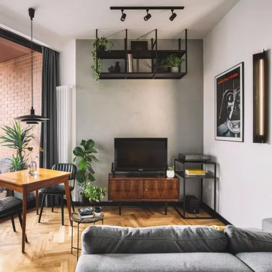
This apartment is "a story about Japan beyond Japan," as the designers themselves describe it - Diana Żurek and Bartosz Girek. The interior combines minimalism and vivid colors.
The apartment was designed for a young woman, an art collector and enthusiast of Eastern culture. The priority was a simple form and an uncluttered interior, which will provide a good background for the owner's growing art collection. Eastern minimalism was a perfect fit for this premise.
apartment from IN Design Studio
© IN Design Studio
Geometry in the interior
In accordance with these assumptions, the designers created a space that is clean and full of simplicity, in which works of art and design are perfectly displayed. In such a situation, it was important to maintain consistency throughout the apartment. It was achieved by opening the spaces to each other and connecting them with geometric elements. As the designers say:
We wanted to achieve the effect of interpenetration of the entire interior, through the selection of appropriate shapes, as well as materials - natural, warming the seemingly cold space. The geometric approach allowed us to create a path that unfolds from the entrance, drawing us in and connecting the various rooms into a single whole. The owner also wanted some playful elements, something that would catch the eye, give the apartment a playful touch. This was achieved by adding color accents, drawing lines on the walls, as well as a wow effect in the mini wc, where an ultraviolet light was installed, specifically for one of the paintings. In this interior, art is a permanent part of it.
apartment from IN Design Studio
© IN Design Studio
cozy void
The biggest challenge in the project was to create an interior that, despite its minimalism and emptiness, does not give the impression of coldness in perception. The authors wanted to combine comfort and a good place to display art. As they emphasize:
We struggled with the selection of appropriate fleshy materials, so that they were of the best possible quality and built up the interior, but did not dominate it, also in terms of form. Hence the idea to create a central, rounded development, a center from which a bright space is distributed, white, but with texture. A space dressed in harmonious circles, dashes and art.


