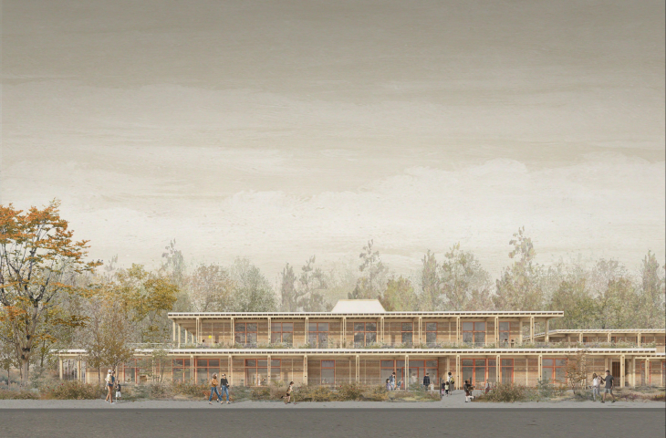
A {tag:studenci} from the Faculty of Architecture at the Warsaw University of Technology designed a friendly and open early childhood education facility. Her proposed building could be built in the vicinity of Warsaw's Wilno estate and ROD allotment gardens. Her work received as many as two awards in the Mies+ WAPW competition - in the "school" category and the Audience Award.
Mies+WAPW is a competition for the most appealing design idea organized by the Faculty of Architecture at the Warsaw University of Technology. The subject matter of the evaluated projects is broad. The competition work can be a design of a house, a public building or a complex urban planning solution. The results of the competition were announced in early December this year. You can watch the broadcast here.
Interior of one of the classrooms
© Matylda Wolska
In the "school" category, the jury considered the work of Matylda Wolska as the best project. Her proposal was also liked by the audience, which awarded her its prize.
I treated the school project as a manifesto and a leaven for discussion and a question about what a school should be today. I set three themes for myself, which were the foundations for thinking about the project: a place to learn, not be taught; healthy architecture; and the school as a generator of social life. I wanted the building to have a cozy, domesticated character to stand in contrast to the image of the school as a serious and momentous institution, with Prussian 19th century traditions. The school is not to intimidate, but to invite, so that everyone arriving there feels at ease," explains Matylda Wolska.
The design of the school in Warsaw, the development of the block
© Matylda Wolska
zoned building
The student began her work on the project by post-zoning the form into age-appropriate parts for the younger and older users, a sports area and a public area with no age restrictions. The school was also divided into functions: a sports section and an educational section, as well as a noisy zone on the first floor with classrooms and a cafeteria, and a quiet zone on the first floor with a library.
diagram of the modules
© Matylda Wolska
possible modifications
The author has tried to create as compact a facility as possible that can be easily adapted to different needs and curricula. As she says, it's hard to predict what will happen in a few years, for this change is written into the design of the building.
The startingmodule was two square rooms with a common atrium. When the movable walls are assembled, the rooms form one common unit, which can be closed by sliding pocket doors. This module was the starting point for the designer to create a structural grid, which she then zoned to divide into sections.
A staircase separates the public area from the one for students only
© Matylda Wolska
clear division
Immediately behind the main entrance is a staircase, separating the public part from that for students only. On the left side, the author has placed rooms for younger children, a foreign language room and a computer room. Across from the entrance is the section for older children and the common room. There you'll also find the school's canteen, a teachers' room and a connector to the sports section. Going up the stairs to the upper floor, we find ourselves in the library, administration, psychologist's office, pedagogue's office, speech therapist's office, preventive medical care and an accessible roof garden.
ground and first floor plan
© Matylda Wolska
open halls
After receiving the skeleton of the school, Matilda began "dogging" the initial module, completing it. Between the structural elements, she added furniture - cabinets, lockers and benches. She then connected the classrooms to the main corridor, placing large glass windows.
I wanted to give the whole school a "transparency" and gently blur the boundaries of the classrooms to give the children a sense of familiarity with the building and a friendly and open character, the designer added.
Each classroom has thick curtains that are meant to cut off the classroom during lessons, limiting additional stimuli, improving the acoustics of the building and domesticating its character throughout. The classrooms open both to the inside of the building and to the outside. Each classroom has a dedicated garden of its own, which the students take care of, thus learning responsibility. Greenery also demarcates the boundary between the public space and the outdoor classroom area.
diagram of classrooms
© Matylda Wolska
outdoor classrooms
The school's outdoor area has also been divided into zones. On the right side of the building is the play area, with a field and a playground. On the left side, the author proposed a space for learning - there are work tables and educational gardens.
The whole area is surrounded by IV nature, i.e. plants growing spontaneously in the area. I wanted native nature and the ecosystem developed here to "pour into" the facility and surround the whole," explains Matilda.
The building's structure is made mainly of wood and hemp concrete
© Matylda Wolska
healthy architecture
In 2015, the University of Salford published the results of a study that focused on the impact of architecture on children's education. According to the report, factors such as light, sound, temperature, air quality and connections to nature can improve academic progress by up to sixteen percent. Harvard researchers came to similar conclusions when they published their 2017 study, where they listed the biggest problems in educational facilities as mold, poor ventilation, inadequate lighting, and noisy conditions. According to this research, one in every 1/13 missed school days is caused by poor building conditions. During the design process, I focused on solving each of these aspects to create the healthiest possible development environment," says the PW student.
Guided by research, Matilda relied on harmless, hypoallergenic materials. The designed building consists mainly of wood and hemp concrete. The school's structure was made of wood glued with polyurethane glue, which does not contain formaldehydes. The wooden structure simultaneously serves as a lost formwork for the rammed hemp concrete. The OSB boards used for the rammed walls have been reused - cleaned, protected with epoxy resin with a bit of white pigment, they form the floor.
The school is equipped with four skylights, and the entire building is surrounded by projecting eaves. It is meant to reduce overheating in the halls in the summer and let in light in the winter. There are also plenty of plants in the interiors, benefiting the microclimate and the students.
Cross-section of a school in Warsaw
© Matylda Wolska
generator of social life
The area where the school could be built - the area of Swojska Street and the Wilno estate in Warsaw functions mainly as a bedroom community. In close proximity are single-family houses, multi-family developments, as well as ROD gardens. The school is located in a place that residents pass by, and this was one of the sticking points for the student, who wanted to invite them to the facility and introduce the neighborhood character and cooperation seen, for example, among the ROD gardeners.
The facility, in addition to its main function of early childhood education, is intended to be a place for learning, open to residents. The building is to continue to function after the lessons are over and open to the local community. My goal was to create a facility that residents identify with. It is supposed to be a place where one goes willingly, and which is gradually transformed into a space for leisure activities. You can come, read a book, play ball, walk through the garden, have lunch and get to know your neighbors, " Matilda Wolska concludes.


