A permanent exhibition entitled "What Does a Photo Do?" has opened at the new headquarters of the Cracow Museum of Photography at 22A Rakowicka Street. What can be found on it, what distinguishes it and why it is worth visiting, will be told by one of the designers of the exhibition, Aleksandra Gryc of the JAZ+ Architects studio.
Wiktor Bochenek: The new main exhibition is located in the former armory. How did the architecture and interiors of this complex influence the design?
Aleksandra Gryc (JAZ+ Architects): The exhibition "What Does a Photo Do?" is located in the building of the former Austrian armory. We tried to choose stylistic means that would not overwhelm the viewer or the existing architecture. We opted for elegance and minimalism, thus avoiding creating a "baroque" and overstylized exhibition. Certainly, a huge challenge was the inability to fix the exhibition elements to the floor or walls, so we had to design structural systems that would be safe for both the historic building and visitors.
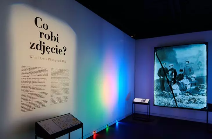
The permanent exhibition "What Does a Photo Do?"
© Museum of Photography in Krakow
Wiktor: The exhibition was divided into several areas concerning the history of photography, prominent individuals, camera collections and artistic photography. How did you try to divide and diversify the space for such diverse needs?
Alexandra: The exhibition begins with an introduction - a prologue, and further on it was divided by the curator into five main sections. They are successively: Technology, Photographer, Photographed, Information and Future. In the prologue section, we wanted to "draw in" and interest the viewer, as well as give a nod to Valery Rzewuski, MuFo's patron, so we included a photograph by him at the very beginning.
The technology section tells the story of techniques for taking photographs. We took inspiration from the darkroom, so tables and bookcases referring to the laboratory and red scenographic elements appear here. This section was also the pretext for creating the entire architectural language we use on the first floor of the exhibition. In the next section we focus on showing the personalities of selected photographers. In this section, we wanted the displays to resemble closets, where we uncover various, more private secrets of individual artists. Photographs and information about them were hidden behind doors and in drawers. Section three is a space of respite - a place to contemplate the content of the photographs and quietly look at the photographs. In the fourth section - Information - we focused on the reportage and informational function of photography. We used paper as a reference to newspapers, printed photography and its widespread use in the world.
Permanent exhibition "What does a photograph do?"
© Museum of Photography in Krakow
The biggest stylistic move between the first floor and the exhibition floor, i.e. the historical part and the one dedicated to the future, is the change of the leading color - from dark to light. Minimalist and straightforward furniture is replaced here by elements with streamlined shapes, mirrors are introduced and a play with light is undertaken. This section also includes a display of more than three hundred and fifty original cameras showing how at each stage of the history of photography technological innovations built the future.
The permanent exhibition "What Does a Photo Do?"
© Museum of Photography in Krakow
Wiktor: How did you work with the curators of the exhibition?
Aleksandra: We designed the exhibition during the pandemic, which made direct contact difficult, which was a big challenge. However, the contact with the curators was very close and important for the design process - mainly with Dominik Kurylek, but in individual sections we also discussed conservation guidelines or how to display with the people responsible for them on behalf of the museum. It was also important to take into account the needs of people with disabilities.
MuFo has a tour path not only for people with mobility impairments, but also for the blind. Each section has elements listed in the form of tiffographs - reliefs or three-dimensional models that allow visitors to explore the exhibit by touch. We wanted to make these elements accessible to everyone as an interesting part of the exhibit. In a museum as visual as the museum of photography, we managed to present the exhibition in such a way that it is accessible to everyone.
Permanent exhibition "What does a photograph do?" © Museum of Photography in Krakow.
© Museum of Photography in Krakow
Wiktor: What was the most difficult thing when designing this space?
Aleksandra: The biggest challenge in designing the exhibition was that the main curatorial idea was to present the originals themselves, which is an unusual procedure in a photography museum. There are about a thousand of these original exhibits. It should be remembered that photographs are often delicate and photosensitive materials. The exhibit had to be designed to show them and protect them at the same time. It was also important for us that the exhibition should not be overwhelming, despite such a large number of exhibits, and that both a layman and a photography enthusiast could find their way around the space.
Wiktor: Thank you for the interview!
Permanent exhibition "What does a photograph do?" © Museum of Photography in Krakow
© Museum of Photography in Krakow


